
Blog
Why Outdoor UV Printed Signs Fade Too Fast?
The email did not look dramatic. No capital letters. No complaints. Just two photos attached and one short line: “Vincent, does this look normal to

The email did not look dramatic. No capital letters. No complaints. Just two photos attached and one short line: “Vincent, does this look normal to

The showroom looked perfect on paper. Clean layout. Soft lighting. Strong brand colors. Yet visitors kept slowing down near the entrance, scanning the walls, and

The installer did not sound angry on the phone. He sounded confused. He stood in front of a large outdoor acrylic sign that had just

A photo once landed in my inbox. The sign looked beautiful. Deep blue background. Sharp white logo. It had only been installed for eight months.
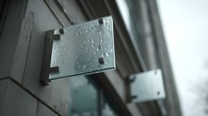
A client once sent me two photos of the same outdoor sign. The first photo was taken the day it was installed. The colors looked
People only notice directional signage when it fails. They miss a turn. They get annoyed. Then your front desk gets the same question ten times
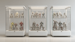
The air in our workshop had that clean “fresh-cut acrylic” smell, and the CNC was still humming in the background. I was checking edge quality

Creative signage still matters. I know this because I see what happens when it is missing. A brand can have a great website, clean ads,

I notice the same pattern every time a new retail buyer sends me a signage request. The design file looks clean. The brand colors are