Skip to content
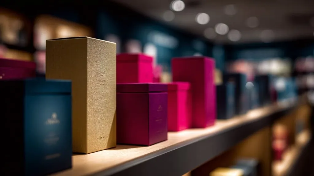
In a world packed with products screaming for attention, it’s often the display box—not the product—that gets noticed first. Ever stood in front of a store shelf and felt drawn to one brand over another? Chances are, color had something to do with it. Whether it was a soft matte beige that whispered elegance or a neon splash of magenta that screamed energy, that color combo made you pause.
That’s the power of design. And when you’re dealing with custom display boxes, it’s not just about choosing a nice color. It’s about building a connection, creating emotion, and guiding the buyer's eye—sometimes in just a fraction of a second.
In this post, I’ll break down the thinking behind choosing the right color combinations for your custom boxes. I’ll walk you through color theory, emotional impact, branding choices, context awareness, tools, and common traps. It’s not just theory—it’s what I’ve learned working closely with brands that care deeply about every visual detail.
In this article, I explain:
- why color combinations are key for display boxes
- how perception, sales, and brand identity link to color
- what you can do: theory, branding, context, tools, best practices, and common mistakes
1. Understanding Color Theory Basics
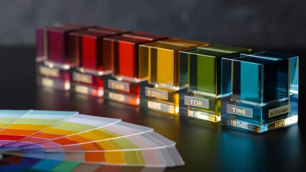
Color theory often sounds fancy. But really, it gives you a map. I learned this when first designing acrylic displays: without understanding what “shade” or “tone” means, choosing color is guessing.
What are hues, tints, tones, shades
- Hue: the basic color (red, blue, green…)
- Tint: hue + white (makes it lighter)
- Shade: hue + black (makes it darker)
- Tone: hue + gray (changes vibrancy)
- Example: pastel pink = tint of red; deep burgundy = shade of red
From a critical angle: sometimes designers overuse “shade” thinking darker always means more premium. But that misses how lighting and material affect how dark looks. Acrylic transparency can make a shade look lighter than expected.
Color models: RGB, CMYK, Pantone & spot colors — relevance for display materials
- RGB: screen works (digital mockups)
- CMYK: printing (if there’s printed parts on or around acrylic boxes)
- Pantone / spot colors: helps ensure consistency across batches
- For acrylic, color mixing / dyes behave differently than printed ink. What looks right on monitor might shift under showroom lighting
Color wheel methods
- Complementary: opposite colors on wheel (e.g. blue & orange). Strong contrast. Good for visibility, accent.
- Analogous: next to each other (e.g. blue, teal, green). Harmonious, calm.
- Triadic / Tetradic: three or four evenly spaced. Risky but vibrant if balanced well.
- Monochromatic: variations of single hue. Safe, elegant, subtle.
When I first tried a triadic scheme for a cosmetic rack, I ended up with too much clash. I learned: contrast is powerful—but without balance, it overwhelms.
Now, color theory is useful—but it is just one part. Let’s see how psychology & branding push these choices further.
2. Color Psychology & Branding
Color isn’t just pretty. It tells a story. It makes people feel something. Sometimes the wrong color tells the wrong story.
Emotional responses to colors
- Red → energy, passion, boldness :contentReference[oaicite:0]{index=0}
- Blue → calm, trust, reliability :contentReference[oaicite:1]{index=1}
- Green → nature, health, freshness :contentReference[oaicite:2]{index=2}
- Yellow/orange → warmth, optimism, fun :contentReference[oaicite:3]{index=3}
But one size doesn’t fit all. Example: If I design display boxes for skincare infused with natural ingredients, green and earthy tones feel right. But if it's luxury cosmetics, maybe gold, black, deep purple will speak more prestige even if green says “natural.”
How color conveys brand values (luxury, fun, natural, tech etc.)
- Fun brands often use bright, saturated colors.
- Luxury tends toward muted tones, metallics, high contrast.
- Natural / eco brands lean into greens, browns, off‑whites.
- Tech brands often use blue, gray, silver for trust and modernity.
I once worked with a startup that said “we’re premium but playful.” We tried deep navy + coral accents. That combination let “premium” show through via the navy while coral added the playful spark.
Cultural differences in color meaning — for global markets
- In North America, white often means purity; in some parts of Asia, white can mean mourning.
- Red is lucky in China, but in some African countries red can mean danger.
- Think of market: if display boxes will go to multiple countries, what you pick must avoid unintended signals.
I know theory and branding can feel overwhelming. But when you combine them smartly, you get display boxes that speak your brand—and catch eyes. Next, let’s see how the physical context and environment affect these color choices.
3. Matching Color to Display Box Context
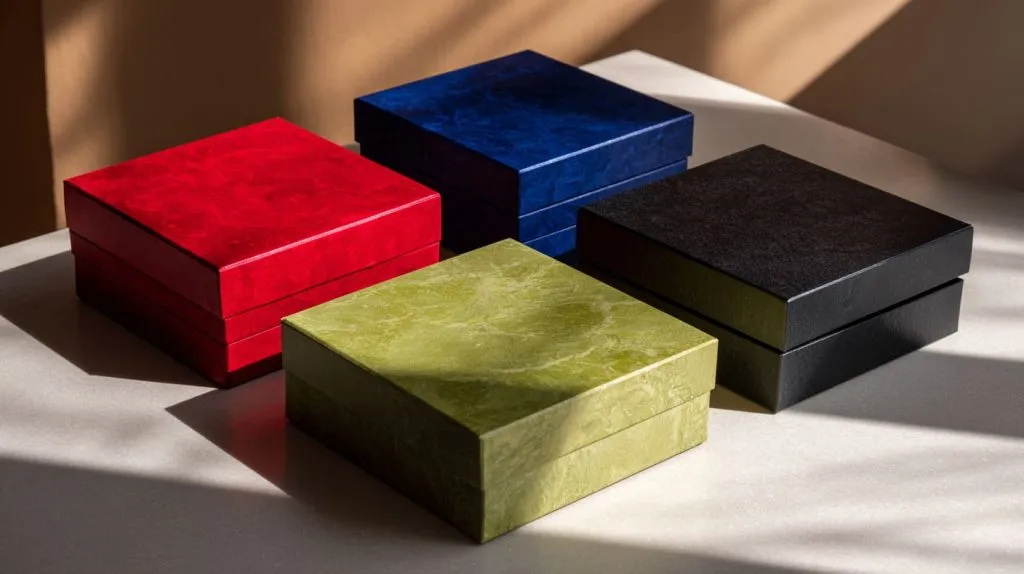
I remember visiting Feilong’s factory during a prototype phase. We had a clear acrylic box with tinted edges. Under one light it looked perfect. Under different shop lighting it looked too blue. Context changed everything.
Material & finish effects
- Transparent vs opaque acrylic changes how color shows. Edges of acrylic sometimes act like prisms, influencing perceived color.
- Glossy finish reflects light; matte softens it.
- Thickness: thicker acrylic can deepen color or make color drift.
Example: a 5mm thick red acrylic block looked almost burgundy under showroom light; same color but 2mm looked bright red.
Product category & target audience
| Category | Typical Color Vibe | Why It Works |
|---|---|---|
| Cosmetics (makeup, skincare) | Soft pastels, clean neutrals, subtle metallics | Feels elegant, clean, feminine or modern |
| Electronics / tech | Cool tones (blues, silvers), black, sharp contrast | Feels high‑tech, sleek, trustworthy |
| Fashion / accessories | Bold colors, contrast, luxurious accents | Feels expressive, stylish |
| Food / natural beauty | Greens, earthy tones, off‑whites | Signals freshness, sustainability |
- Younger audience may prefer bold, vibrant combinations. Older or luxury demographic may lean to subtlety.
Environment / setting of display
- Retail shelves vs trade shows vs window displays: lighting differs, background differs.
- A display box that works under bright LED trade show lights might wash out under warm indoor lighting.
- Competing products nearby: if your display blends in, you lose attention. Contrast with surroundings matters.
You’ve now got theory, psychology, context. Next I’ll share tools and methods that help you build better color combos without blind guessing. Stay with me—this is where trial becomes more exact.
4. Tools & Methods to Develop Color Combinations
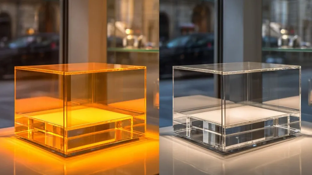
I used to sketch color by hand, then paint small swatches. Now, I combine tools + prototypes. It saves time, money, and heartbreak when the final display comes back wrong.
Using color wheels, palettes & digital tools
- Adobe Color, Pantone’s tools, color palette generators help pick harmonies (complementary, analogous, etc.)
- Use digital mockups early. But don’t trust screen completely (see material effect above)
Pulling inspiration from competitor & market trends
- Notice what top brands in your category are doing. What colors dominate? What feels fresh vs saturated?
- Use trend reports (packaging, color forecasting). But with a critical eye: trend doesn’t always equal fit with your brand
Sampling, prototyping & mock-ups
- Get small acrylic samples in your chosen colors. Test under real lighting.
- Try mock display boxes in situ (in store, shelf, trade show) to see how they read from distance.
Testing: consumer feedback, A/B tests, in situ trials
- Show two or more color options to real customers or coworkers. Ask: which attracts more? which feels more premium?
- Use situational trials: how they look in customer‑facing space. Distance, lighting, surroundings matter.
After you try tools + tests, some patterns emerge. But there are practical rules and best practices you’ll want to hold on to. Because sometimes “nice idea” fails in real life.
5. Practical Tips & Best Practices

Here are some rules I use. I break them occasionally. But knowing them makes you smarter when you break them.
Keep contrast vs harmony in balance
- High contrast helps focus: e.g. dark logo on light box, or bright accent on neutral base
- Too much contrast → harsh, overwhelming eyes
- Too little contrast → boring, invisible
Limit the number of colors
- Usually 2‑3 main colors + one accent works well
- More can clutter; harder to manage consistency
Consider finishes or effects
- Transparent colored acrylic, tinted edges, frosted surfaces, layering can add depth
- Metallic foil prints or inlaid colors—use sparingly so they don’t clash
Ensure color consistency across batches
- Use Pantone or similar spot systems if possible
- Quality control: check each batch under same light source
- Beware variation in acrylic sheets (different suppliers may have slight differences)
Even with all these tips, people still make mistakes. I’ve made some myself. Let me share what to watch out for.
6. Common Mistakes to Avoid
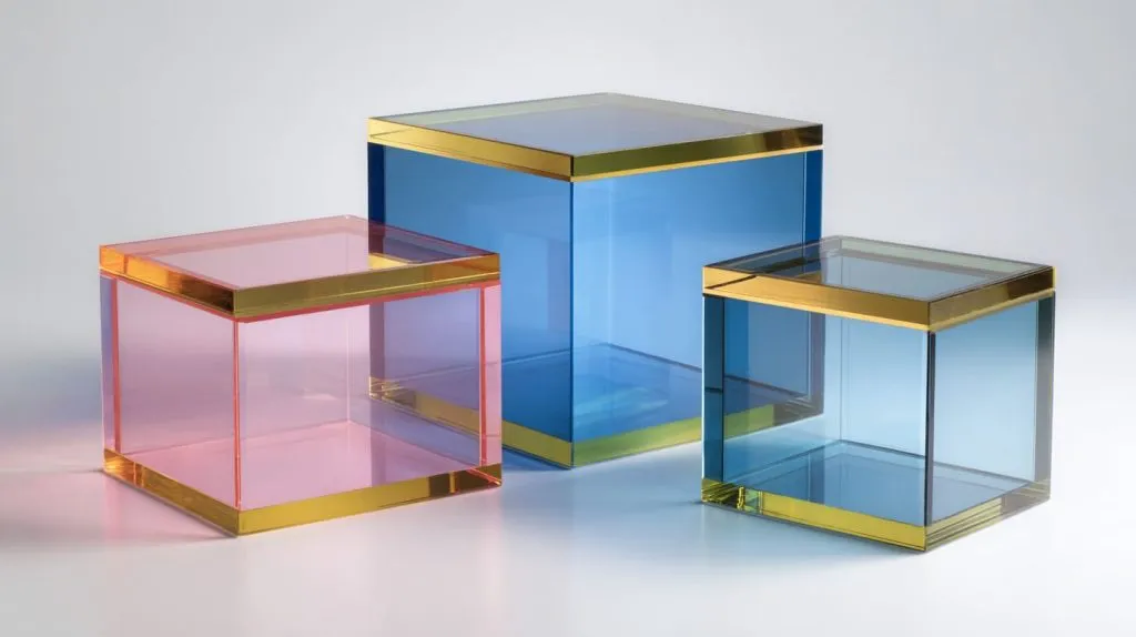
Over‑reliance on digital display without testing real material
Screens lie. They handle color differently. If you skip physical mockups, expect surprises.
Ignoring lighting conditions (store lighting, daylight, indoor lighting etc.)
Light changes color. Warm bulbs vs daylight vs LED strips all affect perception.
Picking colors that conflict with logo, brand guidelines or competitor colors unintentionally
If your logo uses emerald green, but your box base is dark forest green, the logo may vanish. Or worse—confuse customer.
Using trendy colors without considering longevity or how they age
Trends fade. What’s hot now might feel dated in two years. Also color dye in acrylic could fade or yellow.
Conclusion
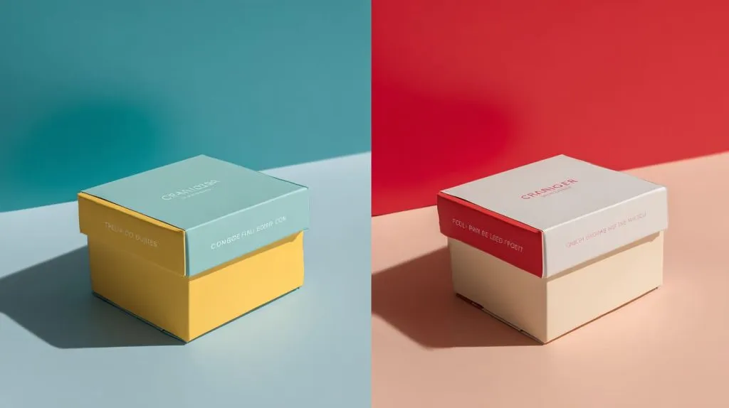
I started by seeing two display boxes in a shop. What struck me wasn’t the product—it was how color made one box feel loud, one feel gentle. That moment taught me this: color combinations are decisions. They are powerful.
Here are the key steps again:
- Learn color theory basics
- Tie your color choices to brand values and psychology
- Match context: material, audience, environment
- Use tools + samples + testing
- Follow best practices (contrast, limited palette, consistency)
- Avoid the common pitfalls
When you get it right, display boxes do more than hold product. They tell your brand story. They stop customers, draw them in. And over time, they build trust. If you decide to work together (e.g. with Feilong Acrylic), clear communication of what you want—color, finish, mood—makes all this possible.
If you like, I can show you sample color palettes tailored for acrylic display boxes (cosmetics, retail) that work well in real life. Interested?