Skip to content


A buyer once asked me a question that sounded simple, almost innocent:
“Vincent, should I pick smoke gray or frosted white? It’s basically the same, right?”
He was not a beginner. He was a smart product guy. But that sentence told me he was about to walk into a classic trap: color and opacity are never just “looks.” They change how a product feels, how it sells, how it ages, and sometimes whether it fails.
In custom acrylic work, I see this every week. People choose color like they choose a T-shirt. But acrylic is not fabric. Acrylic is closer to a lens. It plays with light. It bends it, blocks it, spreads it, and sometimes makes your “perfect” design look cheap under the wrong lighting.
I write this for people like Jacky in Canada. You have buying pressure. You have brand pressure. You also have the reality that the first sample often looks great… and the first full batch is where problems show up.
So let’s make this practical.
Color and opacity decisions usually come down to a few trade-offs:
- Appearance vs function
- Light transmission vs privacy
- Clean clarity vs “hides imperfections”
- Matching brand color vs stable mass production
Now let’s break the words down in a way that actually helps.
And yes, I will be honest: most regrets I see do not come from “bad material.” They come from bad assumptions about how light behaves.
What Are Acrylic Sheet Color and Opacity?
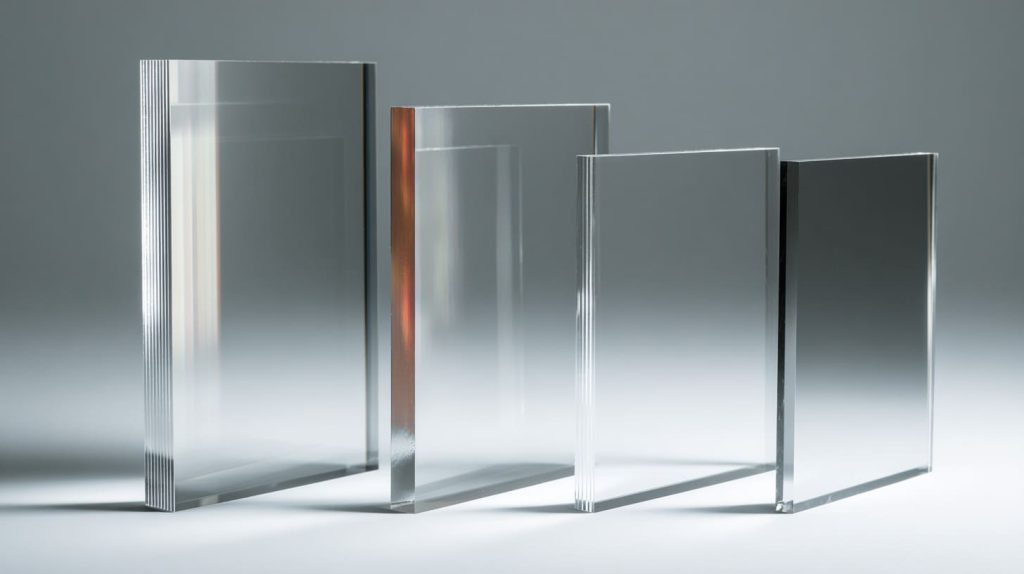
Before we talk about “what to choose,” I want to lock down language. In B2B projects, confusion often starts with one messy email thread where everyone uses different words for the same thing.
What does "color" mean for acrylic sheets?
When people say “color acrylic,” they often mean different categories. Here is the simple map I use with buyers:
| Category | What it looks like | What it does to light | Common use |
|---|---|---|---|
| Clear | Like glass | Lets most light pass | Display covers, windows, guards |
| Transparent color | Clear but tinted | Passes light, adds color tone | Decorative panels, lighting accents |
| Translucent | “Milky” or diffused | Passes light, spreads it | Light boxes, soft glow panels |
| Opaque | Solid color | Blocks light | Sign letters, privacy panels, bold design |
Here is the critical thinking part: color is not only hue. It is also:
- how deep the color looks at different thickness
- how it shifts under warm light vs cool light
- how it hides scratches or fingerprints
- how stable it stays after UV exposure
I have seen a beautiful “pure white” look perfect in a sample room, then look yellow-ish under store lighting. Same sheet. Different light.
So when someone says, “This is white acrylic,” I always ask:
White under which light? Daylight? LED? Warm indoor?
What is opacity and light transmission?
Opacity is basically: how much light gets blocked.
But in real life, we care about the result, not the definition. The result usually shows up in 4 ways:
| Visual goal | What you need | Why it matters |
|---|---|---|
| Show the product clearly | High transparency | Any haze looks “cheap” |
| Hide internal structure | Medium opacity | Hides screws, glue lines, wiring |
| Create a soft glow | Translucent | Avoid hot spots from LEDs |
| Strong solid color | Opaque | Clean, bold, high contrast |
A small but important truth: opacity is not fixed. It changes with:
- thickness
- surface finish (gloss vs matte)
- distance to the light source
- viewing angle
That is why I never trust a color photo online. Acrylic is a “light behavior” material. Photos lie.
Bridge to next section (keep reading): Once you see color and opacity as “light control,” the next question becomes simple: what is your real goal, and what problem are you trying to avoid?
Key Factors When Choosing Acrylic Sheet Color

When I help buyers choose acrylic color, I do not start with color charts. I start with purpose. Otherwise, the project becomes a “pretty sample” contest.
Match to application purpose
If the sheet is part of a product, color must match the job.
Here’s a simple table I share with buyers to stop overthinking:
| Purpose | Best color direction | Notes |
|---|---|---|
| Premium display | Clear, low haze | Fingerprints show more, so plan cleaning |
| Retail brand highlight | Transparent color, strong contrast | Keep brand colors consistent across batches |
| “Calm and clean” look | Frosted, soft neutral | Helps hide dust and minor scratches |
| Industrial covers | Smoke gray, neutral tints | Hides internal parts, looks technical |
Now the critical thinking angle: sometimes the “best looking” option is the wrong option.
Example:
Clear acrylic looks high-end. But if the inside has messy wiring, clear acrylic will broadcast that mess.
So the better choice might be:
- smoke tint to hide clutter
- or translucent white to blur the internal structure
You are not hiding problems. You are controlling what the user sees.
Environmental and functional considerations
This is the part many designers skip. Then they email me later with regret.
Here are the real-world stress factors that change how acrylic behaves:
| Environment factor | What can happen | Better choice |
|---|---|---|
| Outdoor UV | color shifts, yellowing over time | UV-stable grades, avoid “cheap clear” |
| Strong cleaning chemicals | haze, micro-cracks | test cleaning routine before mass order |
| Strong lighting behind sheet | hot spots, uneven glow | translucent diffuser, correct thickness |
| High touch area | fingerprints, scratches | matte/frosted, or darker tones |
One story: a customer used glossy black acrylic as a counter display base. It looked amazing in the first photos. After two weeks in the store, it looked like a crime scene. Fingerprints everywhere. Scratches everywhere. They blamed “bad acrylic.” It wasn’t. It was the wrong finish for the job.
Custom vs Standard Colors
Custom colors feel like a dream. But custom colors also carry risk.
Here is the practical truth:
- Standard colors are safer for repeat orders
- Custom colors are great for branding, but need control
| Option | Pros | Risks | My advice |
|---|---|---|---|
| Standard color | stable supply, easier repeat | limited brand match | best for long-term SKUs |
| Custom color match | brand consistency, unique look | batch variation, longer lead | demand approval samples + spec control |
If you are Jacky buying for a brand, your worst nightmare is this:
- Sample looks perfect
- Production batch looks “close but not right”
- Your boss asks, “Why is this blue different from last month?”
That is why I push for:
- a physical approved sample
- a clear tolerance range
- and batch-to-batch control
Bridge to next section (keep reading): Color is one half of the story. Opacity is the other half. Many “color problems” are actually opacity problems in disguise.
How Opacity Affects Performance and Aesthetics
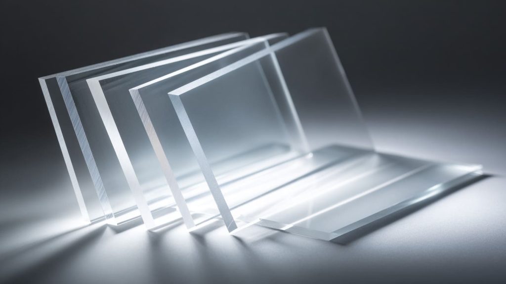
Opacity is where the magic lives. It can make a product feel clean, soft, premium, or cheap. It can also save you from ugly internal details.
Let’s go through the practical types.
Clear acrylic — maximum clarity
Clear acrylic is like a clean window. It does not forgive mistakes.
When it works best
- showroom displays
- product covers
- museum-style presentation
- protective guards where visibility matters
Hidden trade-offs
- dust and scratches show easily
- glue marks and polishing lines become obvious
- internal parts look “messy” if not designed cleanly
Here’s a quick decision table:
| If you want... | Clear acrylic works when... | Avoid clear when... |
|---|---|---|
| “luxury clarity” | internal structure is clean | wires, screws, glue lines are visible |
| full visibility | product is the hero | background is cluttered |
| maximum light | you want brightness | glare is a big issue |
Critical thinking: clear acrylic is not “better.” It is just “less forgiving.”
Transparent and translucent colors
This is where design becomes fun, but also risky.
Transparent colored acrylic:
- passes light
- adds a color “filter” effect
Translucent acrylic:
- passes light
- spreads it
- reduces harsh glare
For backlit designs, the difference is huge:
| Sheet type | Light effect | Best for |
|---|---|---|
| Transparent tint | vivid, sharp light | decorative panels, accents |
| Translucent | soft, even glow | light boxes, diffusers, signage |
If you are doing LED work, I always ask:
- How far is the LED from the sheet?
- Do you want the LED dots visible or hidden?
Because translucent acrylic can save you from “hot spots.” That one detail can change the whole product feeling from “DIY” to “professional.”
Opaque colors
Opaque acrylic is bold. It blocks light and gives strong visual weight.
Best uses
- privacy panels
- solid signage
- base plates
- premium “color block” retail fixtures
But think critically: opaque also hides problems. That can be good. It can also hide alignment issues until the last step. So I suggest:
- do a simple mockup
- check edge quality
- confirm the finish under your final lighting
Bridge to next section (keep reading): Now let’s stop talking in theory. The fastest way to choose is to start from your use case and work backward.
Practical Scenarios: Picking Color & Opacity by Use Case
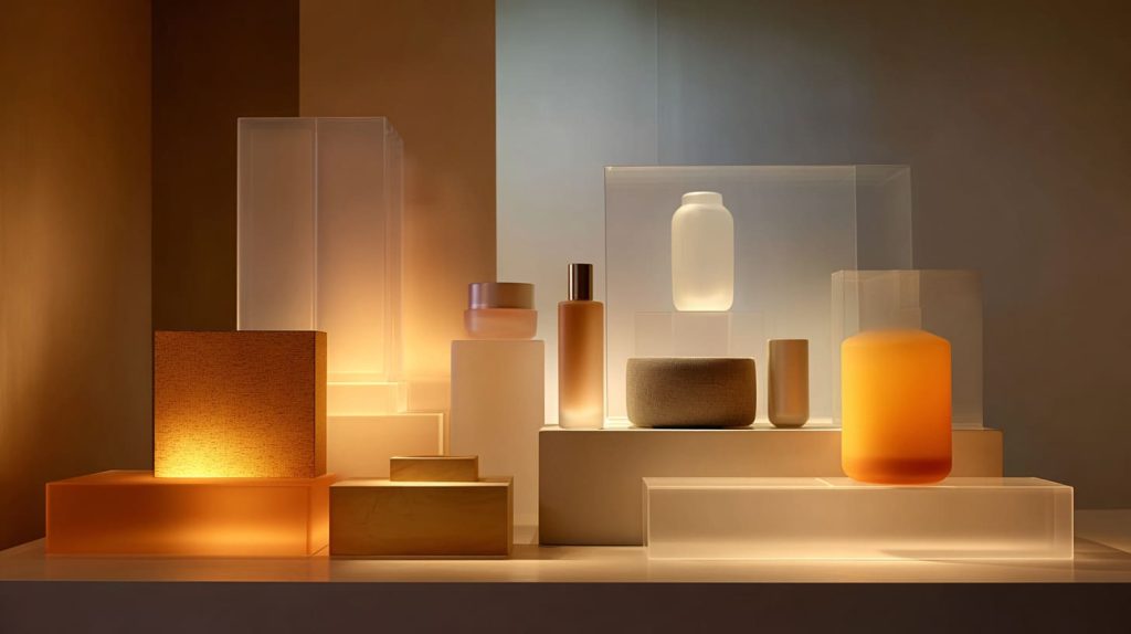
When buyers get stuck, I tell them: “Don’t choose a sheet. Choose an outcome.” Then we match the acrylic to that outcome.
Signage and Wayfinding
Signage has one job: be readable. Everything else comes second.
| Sign type | Good choice | Why |
|---|---|---|
| Front-lit sign | opaque background + high contrast text | readability under many lights |
| Backlit sign | translucent face | even glow, less hot spots |
| Premium letters | opaque or translucent + polished edges | clean edges sell quality |
Critical thinking: “more light” is not always better. Too much light can wash out contrast. A slightly more opaque diffuser can make text clearer.
Retail Displays & Fixtures
Retail is emotional. Acrylic helps control that emotion.
A simple rule:
- clear = premium and honest
- frosted = soft and calm
- opaque = bold and strong
- tinted = modern and “tech”
Here is a practical guide:
| Retail goal | Acrylic choice | What it signals |
|---|---|---|
| “expensive and clean” | clear + polished edges | luxury, clarity |
| “soft and gentle” | frosted / translucent white | calm, skincare vibe |
| “bold promo area” | opaque bright colors | urgency, attention |
| “modern tech” | smoke gray tint | sleek, controlled |
I once saw a lipstick display that looked cheap, even with great products. The reason was simple: the base and dividers had the wrong opacity. Too clear. Too busy. We changed only the dividers to translucent white. The whole wall looked calmer. Same products. Same store. Different feeling.
Interior Design & Partitions
Interior panels are about space and privacy.
| Need | Better choice | Why |
|---|---|---|
| privacy | frosted or opaque | blocks direct view |
| light but no glare | translucent | soft transmission |
| clean look, low maintenance | matte finish | hides fingerprints |
Critical thinking: people often pick “frosted” for privacy. But frosted is not always enough. Thickness and distance matter. Always test in real space.
Lighting & LED Applications
Lighting is where acrylic either looks stunning or looks like a mistake.
I use this checklist:
- Is the LED dot pattern acceptable?
- Is the light uniform?
- Does the acrylic color shift under LED?
Here’s a table I often share:
| LED setup | Common problem | Fix |
|---|---|---|
| LED close to sheet | hot spots | thicker translucent diffuser |
| high brightness LEDs | glare | matte surface or higher diffusion |
| color LED lighting | weird tint mix | test acrylic color under actual LEDs |
Bridge to next section (keep reading): Use case tells you “what you need.” Now we need to make sure your acrylic choice also works in manufacturing, not only in design.
Material & Processing Considerations

This is the section designers love to skip. Then production happens, and suddenly the “perfect look” becomes hard to repeat.
Acrylic sheet types and their inherent visual properties
Two common types:
- Cast acrylic
- Extruded acrylic
I will not overload you with chemistry. I will keep it practical:
| Type | Visual feel | Good for | Watch out |
|---|---|---|---|
| Cast | often better optical depth | premium displays, polishing | cost can be higher |
| Extruded | consistent thickness | large panels, budget runs | can show stress marks in some processes |
Critical thinking: if your project depends on perfect edge clarity and deep color, cast is often safer. If you need tight thickness control for assembly, extruded can be easier.
Surface finish trade-offs
Glossy looks “sharp.” Matte looks “soft.” Both have pros and pain.
| Finish | Looks like | Pros | Cons |
|---|---|---|---|
| Glossy | shiny, reflective | premium, vivid color | fingerprints, glare |
| Matte | soft, modern | hides marks, lower glare | color can look less “deep” |
One time a buyer insisted on glossy black. I warned him about scratches. He insisted anyway. Two months later, we switched to matte black. He emailed me: “Why didn’t we do this first?” I did not say “I told you.” I just smiled.
Fabrication implications
Processing changes how acrylic looks:
- Laser cutting can change edge appearance
- Flame polishing can improve clarity but can also highlight waves
- Bending can change visual density in color sheets
Here is a quick checklist I use before production:
| Process | Risk | What to check |
|---|---|---|
| laser cut | edge haze or burn marks | edge sample under real light |
| engraving | reduced clarity on tinted sheets | test engraving depth & contrast |
| bending | color density shift | confirm bend radius and final look |
| bonding | glue lines visible | choose opacity that hides or control bonding |
Bridge to next section (keep reading): Even if you choose the “right” sheet, you still need to prove it before mass order. That is where sampling saves budgets.
How to Evaluate Color and Opacity Before Ordering

I trust samples more than promises. Every time.
Sample testing and mockups
If you only take one thing from this article, take this:
Test acrylic under the real lighting.
Not in your office. Not in the factory. In the real environment.
Here is my simple sample test plan:
| Test | How to do it | What you learn |
|---|---|---|
| daylight check | near a window | true color tone |
| warm indoor check | under warm LEDs | yellow shift risk |
| cool LED check | under cool LEDs | blue shift risk |
| fingerprint test | touch it with clean hands | maintenance reality |
| scratch test | light rub with cloth | durability feeling |
Critical thinking: many buyers want to skip samples to save time. But the cost of a wrong batch is not “money.” It is reputation. It is rework. It is delay. Samples are cheap insurance.
Working with suppliers
A good supplier helps you translate “I want it more milky” into real specs.
When you contact a supplier, I suggest you send:
- application photos (real environment)
- the lighting type (warm/cool, LED distance)
- target color reference (Pantone or physical sample)
- target opacity goal (hide internals? diffuse light?)
- thickness range
Here’s a simple communication table you can copy into your RFQ email:
| What you should specify | Example |
|---|---|
| Color target | “match Pantone 433C” or “match this physical sample” |
| Opacity goal | “hide internal screws at 30 cm viewing distance” |
| Lighting condition | “warm white LED 3000K, LED strip 15 mm behind sheet” |
| Finish | “matte on one side, glossy on one side” |
| Thickness | “3 mm ±0.2 mm” |
Bridge to next section (keep reading): Most mistakes I see are not technical. They are human mistakes. People assume. Let’s talk about the common traps so you can skip them.
Common Mistakes to Avoid

I see the same mistakes again and again. They are boring. But they cost money.
Overlooking lighting conditions in final installation
Acrylic can look perfect in one place and wrong in another.
| Lighting change | Common surprise |
|---|---|
| warm light | whites look yellow, clear looks “soft” |
| cool light | blues look stronger, some colors look harsh |
| direct spot light | glare and reflections dominate |
Critical thinking: design teams often test in a bright office. Retail reality is very different. Home lighting is different again.
Assuming online color swatches match physical materials
Screens lie. Cameras lie. Even “good” product photos lie.
So I never approve color from:
- a phone photo
- a website swatch
- a PDF chart
A physical sample is the only real truth.
Ignoring how thickness alters perceived opacity
This one is sneaky.
Acrylic thickness changes:
- color depth
- opacity
- how “milky” the sheet looks
Here’s the quick truth:
| Thickness change | Visual result |
|---|---|
| thicker | looks darker or more opaque |
| thinner | looks lighter or more transparent |
So if you approve a 2 mm sample and then mass order at 5 mm, the sheet will not look the same. It is not a defect. It is physics.
Bridge to conclusion (keep reading): If all of this feels like a lot, don’t worry. The goal is not perfection. The goal is a repeatable system that protects your design and your purchasing decision.
Conclusion

Choosing acrylic sheet color and opacity that works is not about “taste.” It is about control.
From what I’ve seen in real B2B projects, the best choices come from balancing:
- the visual goal (premium, calm, bold, clean)
- the functional goal (visibility, privacy, diffusion, durability)
- the real environment (lighting, UV, cleaning, touch frequency)
- the manufacturing reality (repeatability, batch consistency, processing impact)
If you are a product and mold designer like Jacky, your strongest move is simple:
treat acrylic like a light-control tool, not a color decoration.
And here is my honest call to action:
If you are planning a custom acrylic project and you want fewer surprises, send me:
- your use case
- a reference color (Pantone or physical sample)
- the lighting condition
- your thickness range
- and one photo of the installation environment
At Feilong Acrylic, I’ve spent 13+ years helping buyers turn “I want it to look right” into a repeatable, manufacturable spec that stays consistent across batches.
You can reach us at flacrylic.com. If you want, I can suggest a short sample plan before you commit to production.