Skip to content

Printing options for custom acrylic displays should be selected from the finished display, not from the artwork alone. For detailed full-colour graphics, short runs, variable layouts, or white ink on clear panels, direct UV printing is often the practical starting point. For stable repeat artwork with spot colours and solid brand areas, screen printing can be the better production route. Engraving is useful where a tactile or unprinted mark is the point; applied graphics suit projects that need a separate graphic layer or a replaceable message.
The decision is not simply “which print looks best.” We first confirm the viewing side, acrylic finish, artwork layers, opacity, handling, cleaning, quantity, and whether printing happens before or after bending, bonding, and assembly. That gives the buyer a repeatable visual result rather than an attractive flat proof that fails once it becomes a display. For promotional retail builds, start by reviewing the form and graphic zones together on our custom acrylic POP displays.
Choose the print method from the finished display
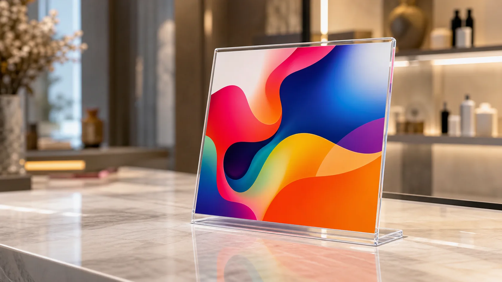
The right method depends on what the shopper sees, how close they see it, and how many identical units the programme needs. A direct print that works on a flat back panel may be the wrong choice for a transparent shelf, a bent sign holder, or a surface exposed to repeated handling. I would not approve a method until the graphic faces, protected areas, and assembly order are visible on the drawing.
| Option | Best starting use | Buyer decision to confirm | Main watchpoint |
|---|---|---|---|
| Direct UV printing | Detailed colour graphics, short runs, design variants | Viewing side, white layer, gloss/matte expectation | Adhesion and scratch exposure on the actual sheet |
| Screen printing | Repeat spot colours, logos, solid graphic areas | Colour standard, repeat quantity, screen setup | Setup value depends on stable artwork and volume |
| Engraving with paint fill or contrast backing | Marks, logos, line art, premium tactile detail | Depth, contrast treatment, viewing distance | Fine detail and readability after finishing |
| Applied graphics or printed insert | Replaceable promotions, protected graphics, layered effects | Edge treatment, adhesion, serviceability | Film/insert edges and the visual depth of clear acrylic |
When direct UV printing is the practical choice
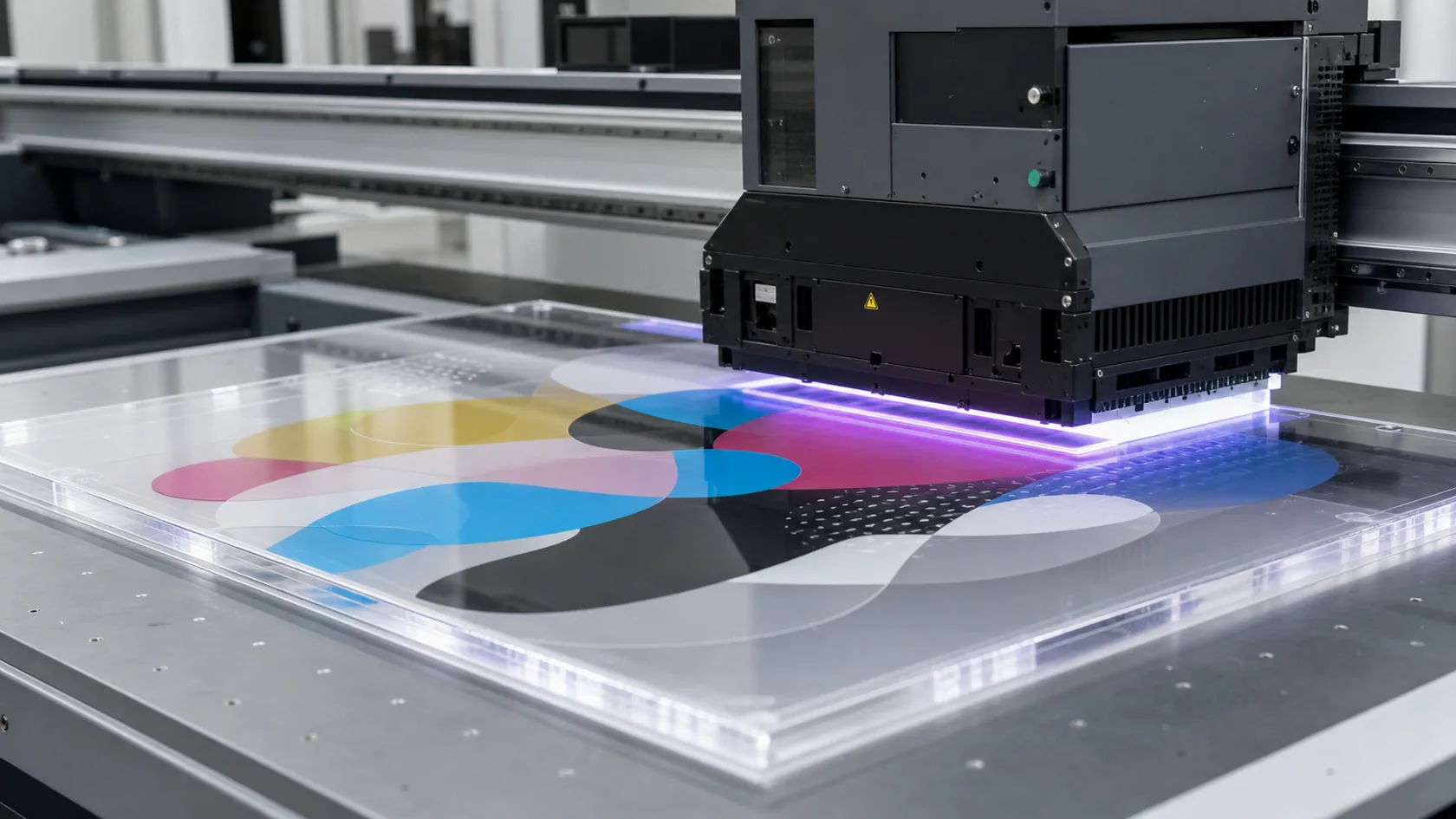
Direct UV printing is normally the first option I would review for photographic artwork, gradients, multi-colour retail graphics, prototypes, or programmes with several artwork versions. It can place colour, white, and clear effects in layers, which is especially helpful when a graphic must read on transparent acrylic rather than on a white paper proof.
The critical decision is whether the image is first-surface or reverse-printed. Reverse printing behind a clear face can protect the graphic from normal front-side contact and create visual depth, but it changes file orientation and requires the right white or backing layers. First-surface printing keeps the texture and finish visible but puts the graphic in the handling zone. Printing United Alliance’s UV adhesion guidance reinforces the practical rule: the actual substrate and ink system need testing rather than assumption.
Use screen printing for repeat colour control
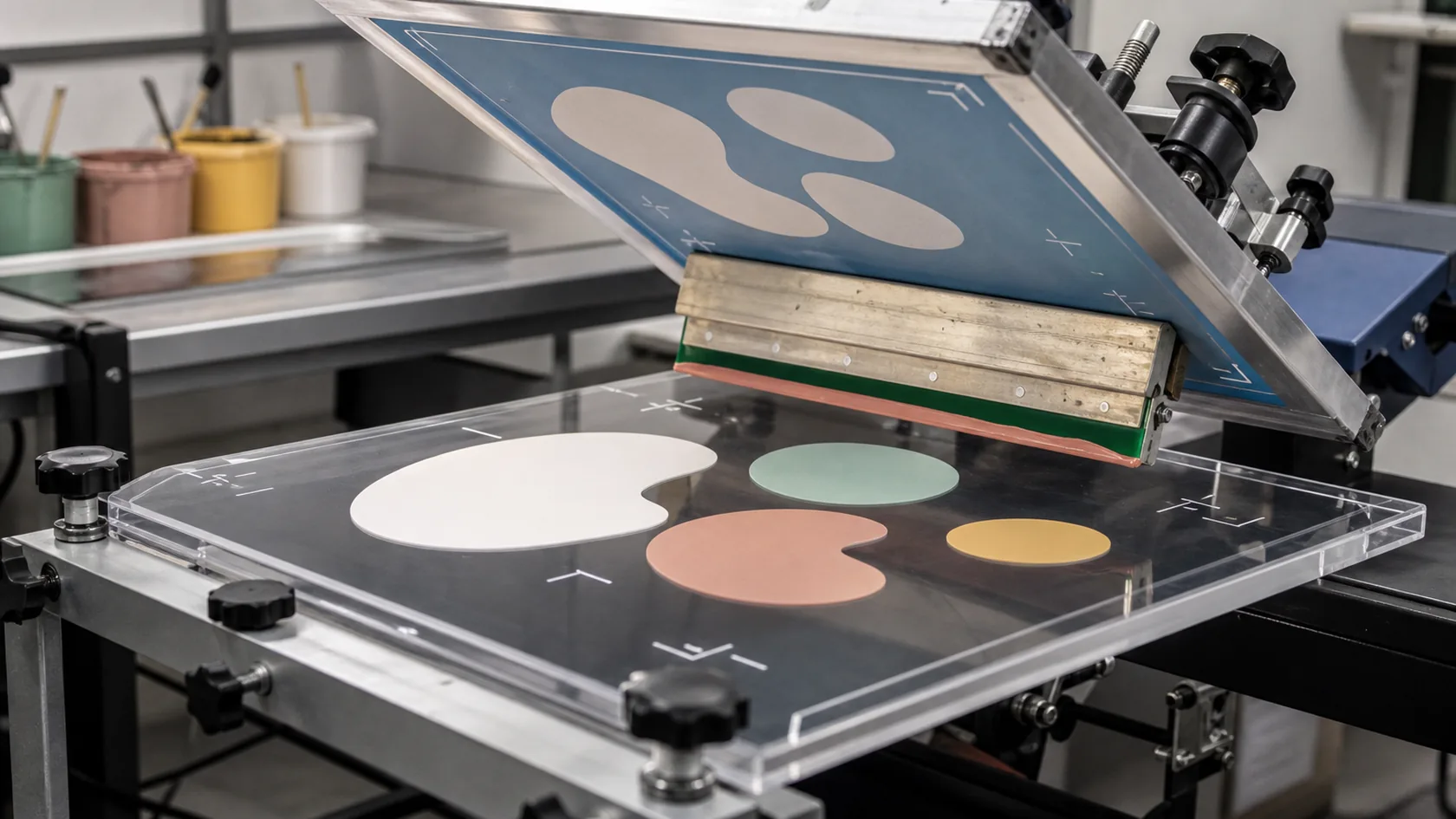
Screen printing deserves consideration when a display repeats the same logo, solid colour blocks, or limited spot-colour artwork across a stable production run. The process can be a disciplined choice when artwork, colour reference, and print location are locked, rather than a lower-cost substitute for every job.
Before quoting, we would confirm the number of colours, opacity on clear or dark acrylic, registration tolerance relative to holes and edges, and the approved colour reference. A late logo revision can erase the value of a prepared screen setup, so I recommend treating artwork release as a manufacturing approval—not just a marketing email. The technical details of ink, surface condition, and screen process also matter; ACRYLITE’s printing guidance notes that ink selection is a material part of adhesion and appearance.
Decide how a clear panel should show colour
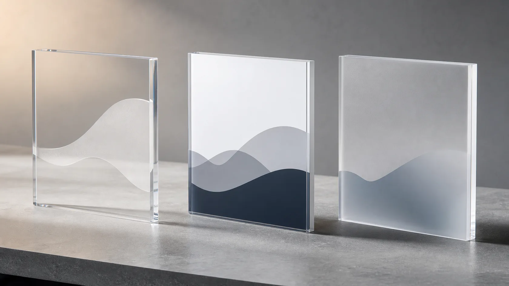
Transparent acrylic changes the colour conversation. A graphic may look washed out without a white underlayer, while a full white backer can intentionally make the same artwork more opaque. Frosted, coloured, mirrored, or textured sheet changes the result again. A mock-up on a monitor is useful for layout, but it cannot prove the appearance of ink on the selected acrylic.
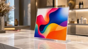
For a branded clear counter display, I would request a print proof that shows the intended viewing side, lighting condition, and any white layer behind the colour. If the display sits in front of a changing retail background, the team should decide whether transparency is a design feature or a readability risk. That decision controls the print layer plan before production artwork is released.
Coordinate printing with cutting, bending, and bonding
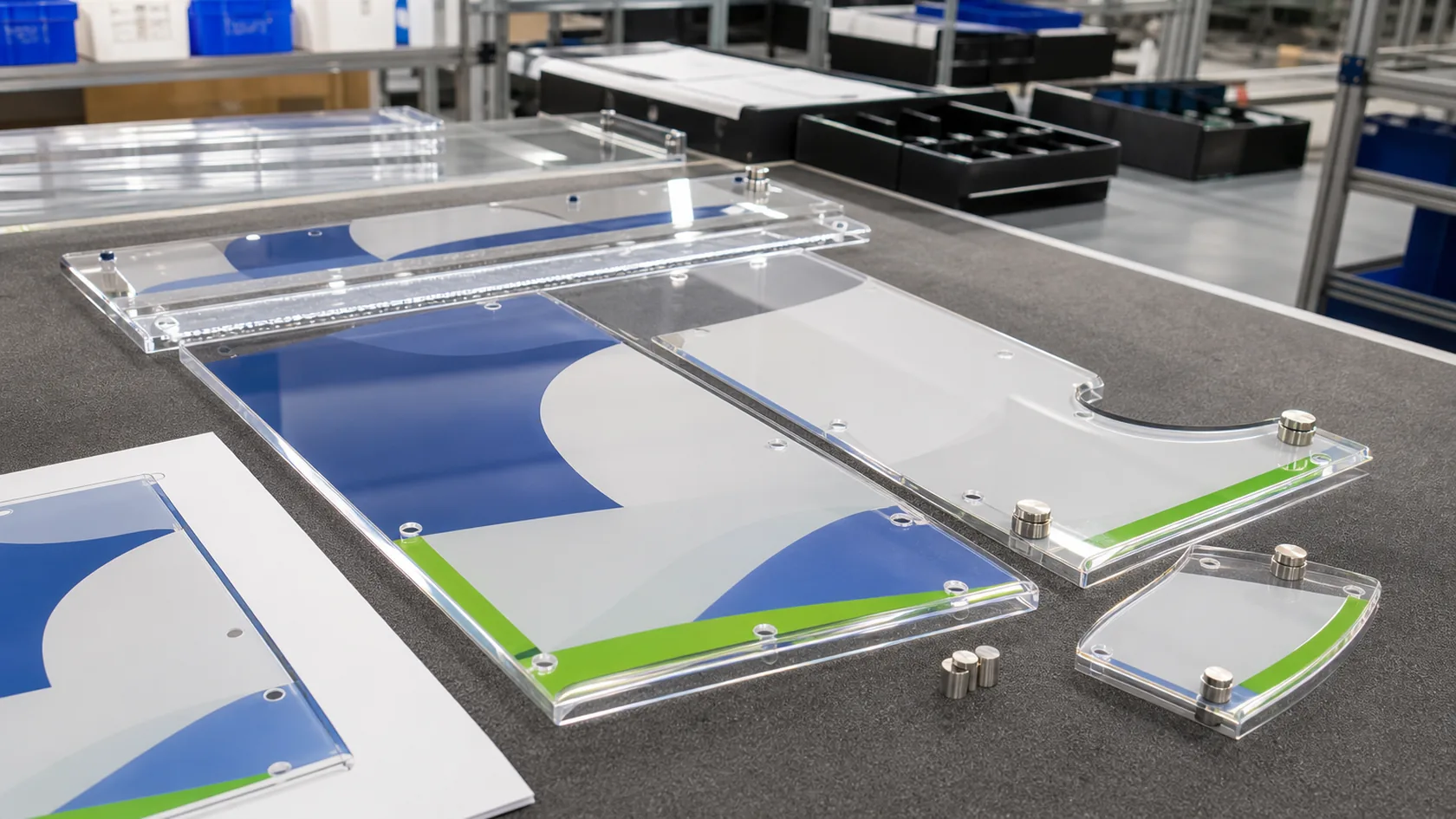
Print work cannot be separated from fabrication. Cutouts, drilled holes, polished edges, bends, bonded seams, protective film, and hardware all define where a graphic can safely go. A printed panel that looks correct before fabrication can be compromised if the artwork crosses a bend line, enters a glue area, or registers from an unfinished edge rather than a controlled datum.
We normally review print placement against the finished part, including the direction each piece faces after assembly. For a multi-part display, I would lock registration references and graphic exclusions before the first sample. The small amount of coordination at this stage prevents mirrored text, obstructed labels, exposed print, or a logo split by a joint.
Treat adhesion and handling as part of the specification
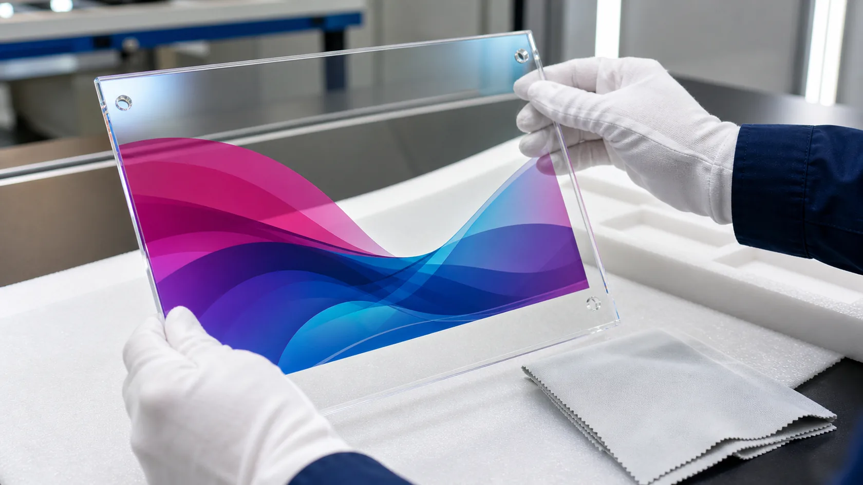
For a display that will be touched, cleaned, replenished, or moved, ink adhesion and abrasion exposure are not secondary details. Acrylic grade, surface finish, surface preparation, ink system, cure conditions, print location, and cleaning method can all change the result. We do not make a universal durability claim because a protected reverse print and a frequently handled front graphic are different use cases.
I recommend defining the real contact conditions before the sample: retail handling, alcohol or other cleaning agents, moisture, sunlight, packing rub, or a surface that slides against merchandise. Then test the chosen sheet and intended print structure in a representative build. It is usually safer to move a graphic to a protected face than to discover after launch that the display’s most visible message is also its most exposed surface.
Specify the artwork package before the quote is final
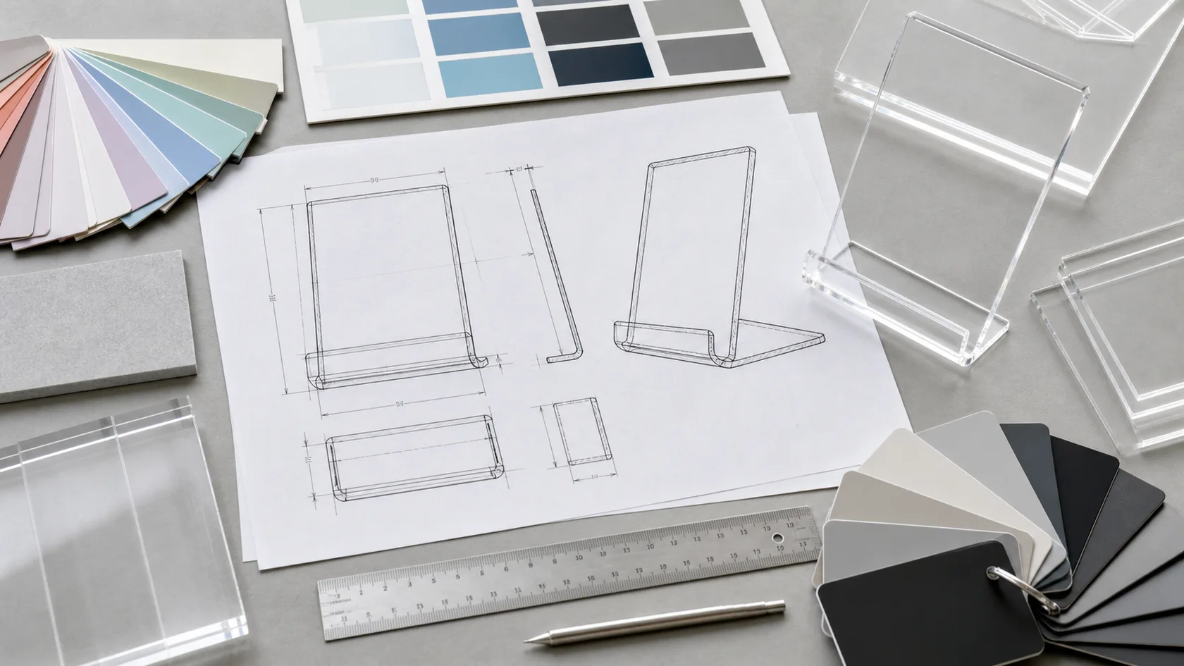
A quote can be more accurate when the buyer supplies a usable artwork package early. We need the editable/vector source where available, final dimensions, print faces, orientation, colours or colour references, white-layer instructions, variable-data needs, and a note on whether any legal or retail copy must remain readable at a defined distance.
| RFQ item | Why it affects the print plan |
|---|---|
| Drawing or reference image | Maps graphics to bends, holes, joints, and visible faces |
| Artwork files and revision ID | Prevents preparing from an obsolete version |
| Colour and opacity intent | Determines spot colour, CMYK, white layer, or transparent treatment |
| Quantity and artwork variants | Helps compare UV flexibility with screen-setup logic |
| Use and cleaning conditions | Identifies whether protection or a sample test is needed |
| Packaging and shipping state | Prevents print-to-print or print-to-hardware abrasion in transit |
For a custom display with complex graphics, I would ask the buyer to name one artwork approver and return one consolidated proof. That keeps colour, layout, and legal feedback from creating parallel “final” files after the physical build is already underway.
Build a sample around the visual risk, not only the shape
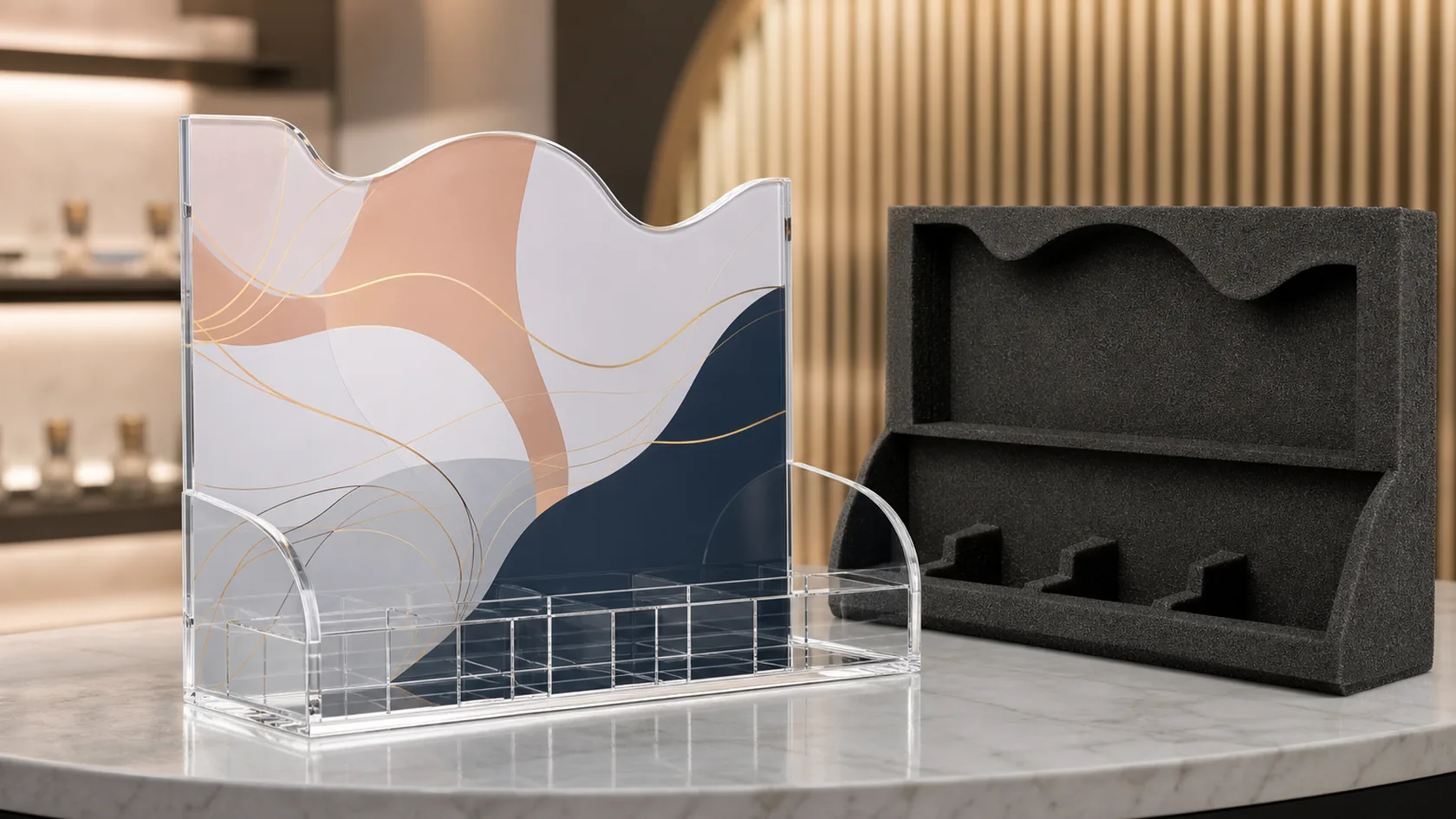
Not every project needs the same sample. A simple repeat logo may only need a colour and placement proof, while a premium cosmetic display may need the full customer-facing panel, lighting condition, white-layer effect, edge finish, and assembly sequence reviewed together. The sample should answer the risk that would be expensive to change later.
For a new branded programme, our practical approach is to review the proof beside the actual acrylic and finished construction—not as artwork in isolation. If the sample is simplified, the approval note should state what it proves and what remains open. That distinction protects both the buyer and production team from treating a partial visual check as blanket approval.
Send a print-ready display brief
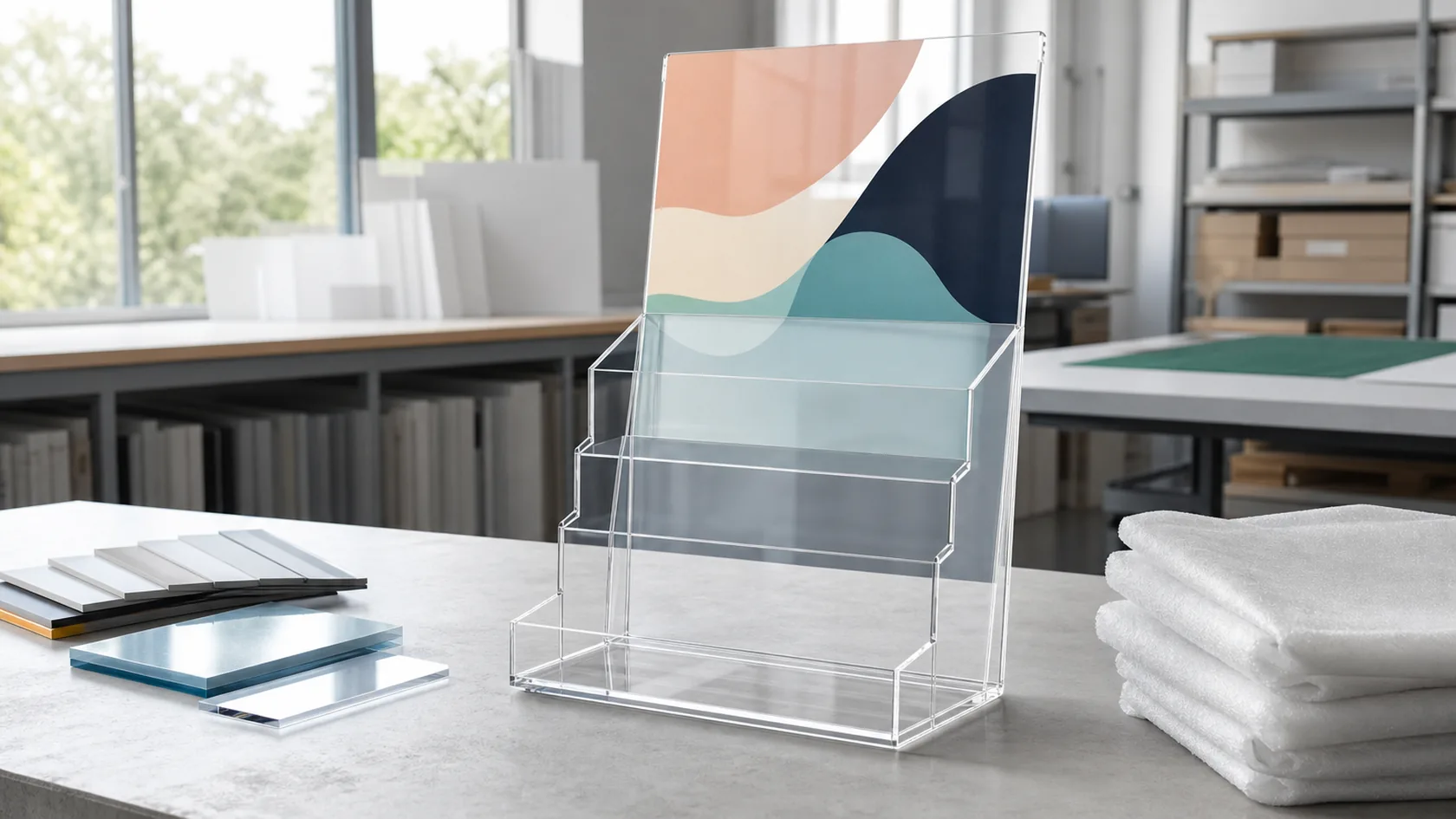
The best printing option is the one that supports the display’s final viewing condition, repeat quantity, fabrication path, and handling exposure. UV printing, screen printing, engraving, and layered graphics can all be valid; the wrong choice usually comes from approving artwork before the product and its use have been defined.
Send us your drawing or reference image, finished dimensions, quantity, acrylic finish, artwork files, print faces, colour/white-layer intent, hardware, and packing requirements. We can review the print route alongside the physical build and help you specify a repeatable custom acrylic display solution before sampling.