Skip to content
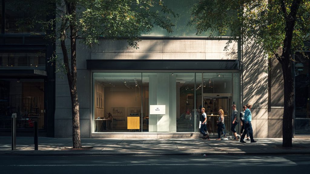
I notice the same pattern every time a new retail buyer sends me a signage request.
The design file looks clean. The brand colors are correct. The words are “nice.”
And the budget is not small.
Then one line appears in the email that tells me everything:
“Can you help us make this sign more effective?”
That word—effective—is where most signage plans fall apart.
Many retail brands invest in signage, but they get little return because the sign does not work in real life. It looks good in a PDF. It looks fine in a render. But on the shop floor, people walk right past it like it is air.
What makes this painful is the waste is not obvious. It is not “bad printing.”
It is small decisions that quietly drain budget: placement, contrast, message length, wrong materials, and the “trend copy-paste” habit.
This article is written for people like Jacky. You already know materials. You already know suppliers. You already know what a revision cycle costs in time and mood. You want fewer mistakes, less risk, and more return from the same budget.
One more thing before we start: I am not against beautiful signs. I work with acrylic signs and display parts every day. I love good design.
But beauty without function is an expensive hobby.
And that brings us to the first mistake I see in almost every “signage overhaul” project.
Mistake 1: Treating Signage as Decoration, Not a Sales Tool
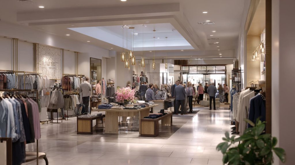
A lot of signage is made like wall art. It is designed to “match the space.”
That sounds reasonable. But it is often the fastest way to waste money.
A sign in retail is not a poster. It is a tool. It should do at least one of these jobs:
- Pull people in from a distance
- Help them choose faster
- Reduce confusion
- Increase trust
- Push them to take one small action
The sign does not need to shout. It needs to move behavior.
Here’s my real-world test: if you remove the sign, does anything change?
If nothing changes, it was decoration.
Signage designed to “look nice” instead of driving action
I once saw a boutique spend serious money on a layered acrylic logo wall.
It looked premium. It also did nothing for customers.
People walked in, looked around, and asked the staff the same questions:
- “Where is the new collection?”
- “Which items are on promotion?”
- “What is your best seller?”
The signage looked like branding, but it did not help shopping.
What surprised the owner was this: they still needed staff to explain everything.
That means the sign failed as a retail tool.
A decorative sign can still be useful, but only if it supports a real goal: confidence, direction, or clarity.
Missing a clear goal: attract, guide, explain, or convert
Most signage projects start with: “We need a sign.”
I always push for: “What should the sign do?”
Here is a simple goal map I use:
| Goal | Where the sign lives | What it should cause |
|---|---|---|
| Attract | storefront / window | stop, look, enter |
| Guide | aisles / zones | walk to the right place |
| Explain | shelf / product area | understand fast |
| Convert | checkout / promo area | decide now |
If the goal is unclear, design becomes guesswork. Guesswork becomes revisions. Revisions become waste.
One practical judgment I make in real projects is this: if the buyer cannot describe the sign’s job in one sentence, the sign will end up doing no job at all.
How unclear purpose leads to wasted materials and redesigns
When purpose is unclear, these things happen:
- the copy gets too long
- the design becomes too “balanced” and safe
- the material becomes “premium” just for comfort
- the sign ends up in the wrong place
Then the store blames the sign. The factory blames the file.
And the buyer is stuck in the middle.
If you want signage that pays back, start with the job, not the look.
Next, let’s talk about the silent killer that ruins even good signage: placement.
Mistake 2: Poor Placement That Kills Visibility
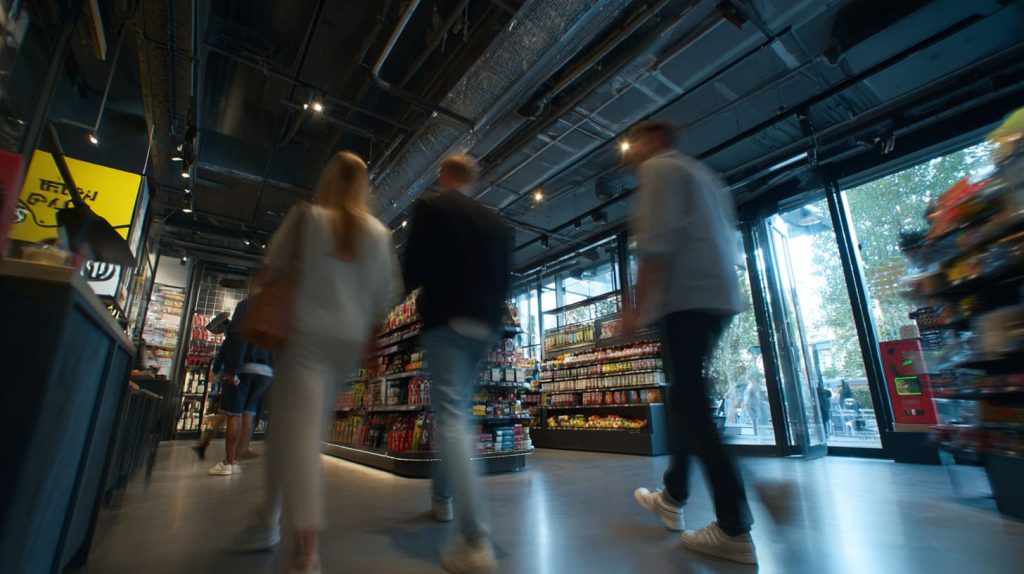
Placement is boring. It is also everything.
I have seen average signage perform well because it sat in the right place.
And I have seen beautiful signage fail because it was placed like a decoration.
The hard truth is shoppers do not “scan” a store like designers do.
They move with habits. They look where they expect answers.
Signs placed too high, too low, or outside natural sightlines
Two common placement mistakes:
- too high: the sign becomes background
- too low: the sign gets blocked by products, people, carts
Retail sightlines are messy. People carry bags. They walk in groups.
Kids run. Shelves block. Staff stands near displays.
That is why I like to think in simple “eye windows”:
- distance view (outside / entrance)
- walking view (mid-store)
- decision view (at shelf)
Ignoring customer walking paths and stopping points
If you want a sign to be read, put it where people naturally slow down.
This is where I see good stores win:
- right at the entrance turn
- at the endcap
- near fitting rooms
- at the first “choice point” between two product zones
- at checkout line waiting spots
I once visited a store where the main promo sign was placed behind a display rack.
It looked perfect on the plan. In reality, it was invisible.
A personal view I rely on is: if I cannot notice the sign in my first three steps, I assume most customers will never notice it at all.
Why good design fails when placement is wrong
A sign is not only “read.” It is also “felt.”
If it is in the wrong place:
- customers miss it
- staff repeats the same explanations
- promo items do not move
- the store feels confusing
Then the brand thinks, “We need more signs.”
But the real issue was not quantity. It was placement logic.
Now, even if placement is perfect, the next mistake can still kill results: saying too much.
Mistake 3: Overloading Signs With Too Much Information

A sign is a glance tool.
It is not a brochure.
People read signs the way they read road signs: quick, selective, emotional.
But many retail signs are written like internal presentations.
Trying to say everything in one sign
When I see a sign with:
- a headline
- a paragraph
- five bullets
- and a QR code
…I already know it will fail.
Not because the content is wrong.
Because the format asks too much.
Customers are not there to study. They are there to decide.
Small text, long sentences, and visual fatigue
There are two kinds of “too much”:
- too many words
- too many visual elements
And both create fatigue.
Here is a quick check table I use with buyers:
| Sign type | Best reading time | What to keep |
|---|---|---|
| Window sign | 1–2 seconds | brand + simple promise |
| Aisle sign | 2–3 seconds | category name + direction |
| Shelf sign | 3–5 seconds | key benefit + price cue |
| Promo sign | 2–4 seconds | offer + urgency cue |
If the sign needs 10 seconds, it is not signage anymore.
What I often decide in real work is: I would rather cut 60% of the copy and keep 100% clarity than keep every detail and lose the reader.
How shoppers actually read signs in real retail environments
Most shoppers do this:
- notice shape or light
- read the first 2–5 words
- decide if it matters
- move on
So the first words must carry weight.
A clean sign with fewer words often performs better than a crowded sign with “more information.”
It feels bold. It feels confident. It feels easier.
Next, let’s talk about a mistake that costs money twice: wrong materials.
Mistake 4: Choosing the Wrong Material for the Environment
I work with acrylic every day, so I say this carefully: acrylic is amazing, but it is not magic.
Many signage budgets get wasted because the material choice is made by “look,” not by use environment.
Acrylic used where impact, heat, or UV exposure is ignored
Acrylic can look premium and clear.
But acrylic can also crack if impact risk is high.
And acrylic can age if UV exposure is long-term and not planned correctly.
These are common mismatch cases:
- door area signs that get bumped by bags
- narrow aisle areas with carts
- near heat sources (some lighting setups, sun-exposed windows)
- semi-outdoor storefront zones
Indoor materials forced into semi-outdoor or high-traffic use
Many brands treat “near the door” as indoor.
But it behaves like outdoor.
It has:
- stronger sun
- temperature changes
- more traffic hits
- more cleaning
Here is a simple environment-to-material logic I use:
| Environment | Risk | Material direction |
|---|---|---|
| Calm indoor wall | low | acrylic is great |
| Busy aisle | medium | thicker acrylic / rounded edges / protected mounting |
| Entrance near door | high | stronger structure + impact planning |
| Window sun exposure | medium-high | UV planning + finish choices |
| Semi-outdoor | high | material + fastener + weather design |
A judgment I often make is: if the sign sits where people’s hands, bags, or carts can touch it, I treat it like a “product,” not a “graphic.”
How material mismatch causes early damage and replacement
Wrong material choices lead to:
- scratches that look ugly fast
- cracks around mounting holes
- warped panels
- yellowing or cloudy surfaces (depending on conditions and cleaning)
Then the brand re-orders. The budget doubles.
And everyone feels annoyed because “it looked fine at first.”
Next, we go into a mistake that feels small but destroys readability: lighting and contrast.
Mistake 5: Ignoring Lighting and Contrast
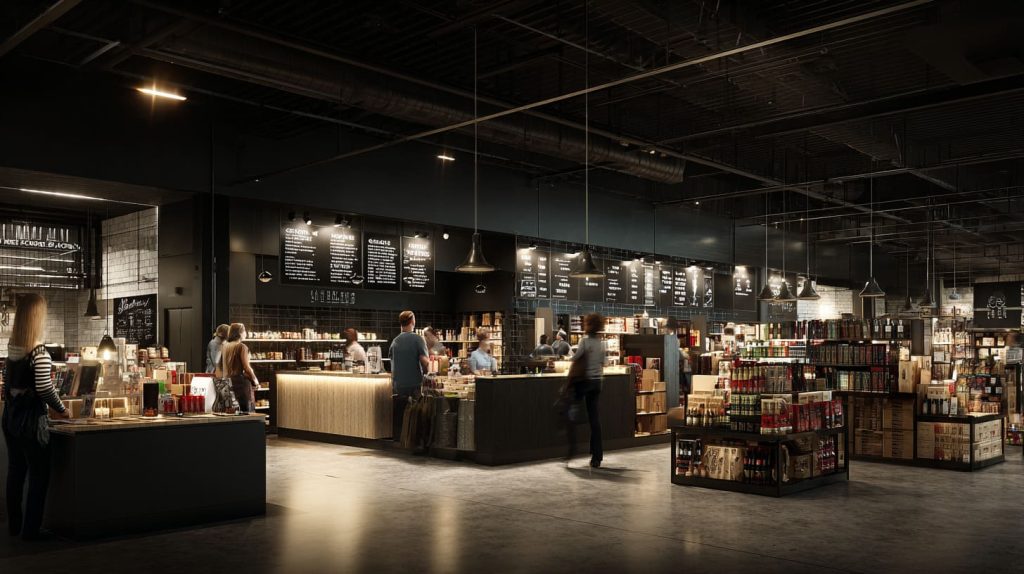
I can ruin a sign with one bad decision: low contrast.
Even the best typography becomes invisible if lighting and contrast are ignored.
Dark text on dark backgrounds
This is common in “premium” stores:
- dark wood walls
- black metal frames
- dim lighting
Designers choose dark-on-dark because it looks calm.
But calm can become unreadable.
In real shopping, unreadable equals wasted.
Clear acrylic without enough visual contrast
Clear acrylic looks clean.
But clear acrylic can disappear.
This happens when:
- the background is bright
- the sign is placed in front of glass
- the edges are not catching light
- the copy color is too weak
Sometimes the fix is simple:
- add frosted backing
- use thicker material for edge visibility
- choose higher-contrast print colors
- use lighting in the right angle
Here is a quick contrast check table:
| Background | Safe text approach | Risky approach |
|---|---|---|
| bright window | bold dark / high contrast | light gray / thin fonts |
| dark wall | bright white / strong color | dark gray / low contrast |
| busy shelf | simple blocks / clear shapes | thin outlines / detailed art |
One personal way I judge this is: I take a photo from five meters away; if the phone camera cannot read it, customers will not read it either.
Why unreadable signs are the most expensive kind
Unreadable signs cost more than “bad-looking signs” because they fail silently.
No one complains. They just ignore them.
Then the brand says:
- “Traffic is okay, but conversion is weak.”
- “Customers still ask too many questions.”
And the fix is often not more signs.
It is better contrast.
Next, let’s talk about branding inconsistency, the slow leak that weakens memory.
Mistake 6: Inconsistent Branding Across Different Signs

This mistake does not show up in one store photo.
It shows up after a month, when the brand feels “less real.”
Mixing fonts, colors, and finishes across stores or zones
When signage is purchased in pieces, over time, you get:
- different fonts
- slightly different logo sizes
- different white tones
- different acrylic thicknesses
- mixed glossy and matte finishes
Each difference feels small.
Together, they make the store feel unplanned.
How inconsistency weakens brand memory
Brand memory works like this:
- repeated signals
- same feel
- same tone
- same “voice” in the space
If signage changes style every corner, the brand becomes fuzzy.
Customers may still buy, but the store becomes forgettable.
A practical viewpointI make is: if a shopper cannot guess a sign belongs to your brand without seeing the logo, your signage system is not doing its job.
Why small variations add up to big brand confusion
Small variations create:
- internal arguments (“Which one is correct?”)
- slower approvals
- more supplier mistakes
- harder re-orders
This is where a simple brand signage guide saves real money:
- standard font
- standard sizes for key sign types
- standard material and finishes
- standard mounting approach
Next, we hit a mistake that is trendy, tempting, and often expensive: copying trends.
Mistake 7: Copying Trends Without Considering Brand Fit
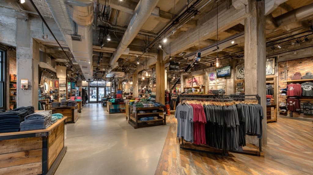
Trends are fun.
Trends also expire fast.
I see brands copy “luxury minimal” signage and wonder why sales do not move.
The store looks like a gallery. The customers feel nervous.
Blindly following “Instagram-style” or luxury signage trends
Two common copied trends:
- ultra-minimal text with huge whitespace
- shiny mirrored surfaces and neon-style lighting
These can work.
But only when your product price, audience, and store mood match.
When trendy designs clash with product price or target customer
If you sell everyday products and your signage looks like a luxury jewelry store, customers may think:
- “Is this expensive?”
- “Am I the right person here?”
- “Will staff judge me?”
That emotional friction can kill conversion.
Here is a quick fit check:
| Trend style | Works best when | Risk when |
|---|---|---|
| luxury minimal | premium products, calm traffic | mid-price mass retail |
| neon / loud | youth brands, nightlife vibe | family stores, calm brands |
| mirrored acrylic | strong lighting control | messy lighting, fingerprints |
| handwritten style | artisan / handmade tone | technical / precise products |
my opinion: if the signage style makes your core buyer feel “out of place,” it is not a good trend for you, even if it looks cool online.
How trends increase cost but reduce trust
Trends often add cost because:
- special finishes
- complex lighting
- fragile surfaces
- harder maintenance
And when they fade, the brand must update again.
Next, we move into a mistake that causes real factory pain: designing without manufacturing reality.
Mistake 8: Designing Without Manufacturing Reality in Mind

This is where buyers lose money without noticing it.
A design can look simple on screen and still be expensive to make.
Designs that look good but are hard or expensive to produce
Some “small” design choices change everything:
- hidden fasteners
- perfect edge alignment across layers
- super thin parts
- tight gaps between letters
- fragile mounting tabs
When these are not planned early, the factory must slow down.
Slow down means cost.
Sharp corners, tight tolerances, and fragile structures
Sharp corners are stress points.
Tight tolerances are risk points.
Acrylic can be precise, but it still needs realistic tolerance thinking.
Here is a practical DFM-style table I often share:
| Design detail | Looks good | Risk in production | Better approach |
|---|---|---|---|
| sharp inside corners | crisp | cracking / stress | add small radius |
| ultra-thin letters | elegant | break in handling | thicker strokes |
| tight layer fit | clean | misalignment | allow small margin |
| hidden mounts | premium | complex assembly | simple mounting plan |
I think: if the design needs “perfect alignment” to look good, I assume it will look bad after real installation and daily cleaning.
How poor design-for-manufacturing inflates tooling and scrap cost
Poor DFM leads to:
- higher scrap rate
- longer production time
- more rework
- more shipping damage
- higher after-sales complaints
It also leads to the worst situation: “We need to remake it, but we already installed the first version.”
Next, let’s talk about the step that feels like a delay but actually saves money: prototyping.
Mistake 9: Skipping Prototyping and Real-World Testing
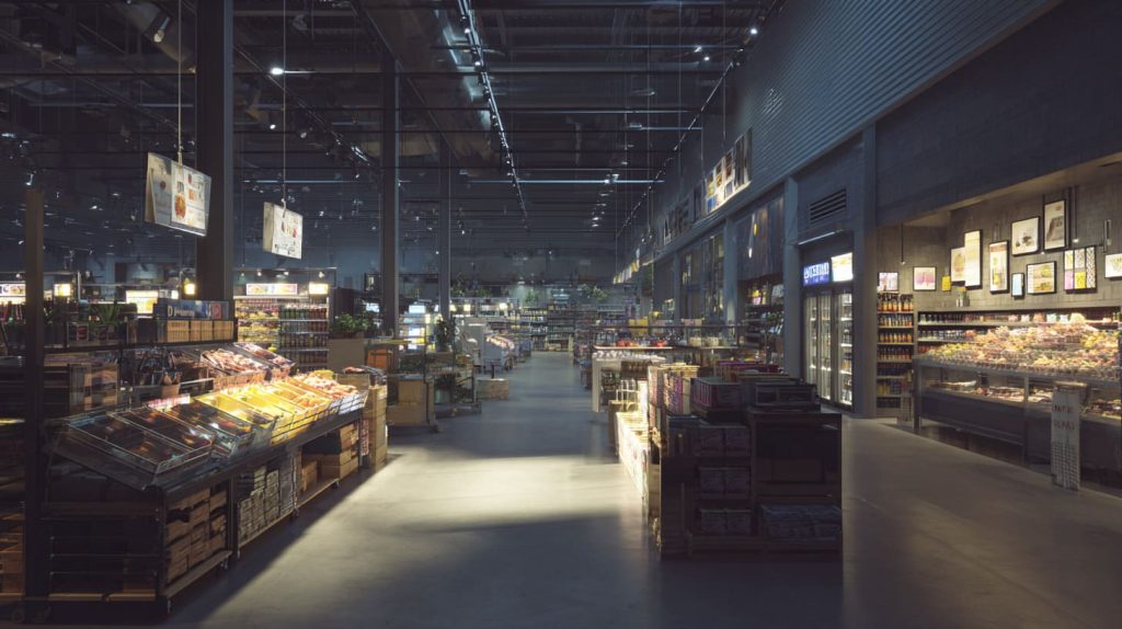
Some buyers avoid prototypes because they want to “save time.”
Then they lose weeks later.
Approving signage based only on renders or drawings
Renders lie in a polite way.
They do not show:
- glare
- fingerprints
- real lighting
- viewing angles
- how it looks next to products
- how mounting affects alignment
A drawing is a plan.
A sign is a physical object in a messy store.
What only shows up after installation
These are common “after install surprises”:
- the sign blocks a camera or sensor
- reflection makes it unreadable
- color looks different under store lighting
- size feels smaller than expected
- mounting points crack after tightening
A simple sample can reveal most of this.
if the sign is new style, new material, or new placement, I will always push for a sample, because surprises are more expensive than shipping.
Why small samples save big budgets
Prototyping helps you:
- confirm contrast and readability
- test mounting strength
- check edge finish quality
- validate thickness and feel
- catch design issues early
Even a small mock-up can save a full remake.
Now, the final mistake is about mindset. Many brands treat signage as “done forever.” That is rarely true.
Mistake 10: Treating Signage as a One-Time Expense

Retail changes fast.
Promos change. Products change. Seasons change.
Signage must change too.
No plan for updates, seasonal changes, or expansion
When signage has no update plan:
- seasonal promos become messy stickers
- new product zones have no guidance
- old signs stay and confuse people
Then the space looks tired.
Signs that age badly or cannot be reused
Some signage ages badly because:
- surfaces scratch easily
- colors fade
- adhesives fail
- mounts loosen
Some signage cannot be reused because it is too specific:
- fixed dates
- too many details
- too narrow messages
Here is a simple “reuse mindset” table:
| Sign type | Should be reusable? | How to design for it |
|---|---|---|
| brand logo | yes | durable materials + stable style |
| category signs | yes | modular sizes + consistent system |
| promo signs | partly | changeable inserts / frames |
| seasonal campaigns | yes | removable / easy storage |
if a sign cannot survive one year of cleaning and small changes, it is not an asset, it is a recurring cost.
How modular and scalable signage reduces long-term cost
Modular signage wins because it:
- reduces remake cycles
- speeds up store updates
- keeps branding consistent
- makes expansion easier
It is the difference between “signage as an event” and “signage as a system.”
Now let me wrap this up in the only way that feels honest: why I think this matters, and how I decide in real work.
Conclusion
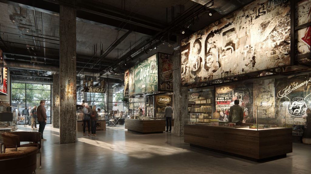
Most signage budget waste is not caused by the factory price. It is caused by decisions that feel small at the start: unclear purpose, bad placement, too much copy, wrong material, weak contrast, inconsistent branding, trend copying, poor DFM, no prototyping, and no update plan.
I think this way because I have watched the same cycle repeat:
- a brand buys signs for “looks”
- results stay flat
- they blame the supplier or the material
- they remake and spend again
My experience keeps pulling me to one conclusion: signage is not a one-time design task. It is a retail behavior tool.
That is why I judge signage with real-world questions, not with mood boards:
- Can a customer understand it in a few seconds?
- Can it survive daily cleaning and traffic?
- Does it match the brand and the buyer’s comfort?
- Can the store update it without pain?
If you are planning a signage project and you want fewer revisions, lower risk, and better ROI, tell me what you are trying to make customers do. Then I can help you pick the right structure, thickness, finish, and production path.
If you want to move fast, send these four details:
- where the sign will be used (window, aisle, shelf, checkout)
- size or photo of the installation area
- your preferred style references
- target quantity and timeline
I will reply with a practical suggestion, not a pretty theory. And if acrylic is not the best choice for your situation, I will tell you that too.