Skip to content


On most photo projects, people talk first about cameras, lenses, and editing presets. Only later, when we start chasing a certain mood or reflection, someone looks at a simple clear board on the table and asks, “What is this material?” Very often, it is acrylic.
When I talk about “shaping light” in photography, I do not mean just making things brighter or darker. I mean changing how light moves, how it wraps around edges, how it reflects, and how it feels. Light can feel sharp, soft, clean, dreamy, cold, or warm. Acrylic sheets give me a very direct way to control that feeling without touching the camera settings.
Acrylic plays with light in three basic ways:
- It lets light pass through (transmission)
- It bends light as it passes (refraction)
- It throws light back to the camera (reflection)
By changing thickness, surface finish, and color, I can push these three behaviors in different directions. This is why you see acrylic under perfume bottles, behind headphones, or under a watch in a product shot. It is not just a “plate.” It is a quiet light tool.
When I work with product designers and buyers like Jacky, who already understand materials, this is usually the turning point: once they see acrylic as a light-shaping tool, not just a storage material, they start to design displays and sets in a very different way.
Now let me break down how this material really talks to light, step by step.
How Acrylic Interacts with Light

When I handle acrylic in the factory or in a photo setup, I always think of it as “controlled glass with options.” It gives me clarity like glass, but with more control over thickness, color, and surface finish. That control is exactly what shapes the light.
Optical Properties of Acrylic Sheet
Acrylic is known for high light transmission, often around 92% for clear, good-quality material. That sounds like a lab number, but in real life it simply means this: if I put a white product on a clear acrylic board, I still see it clearly, and the board itself does not turn muddy or yellow.
I look at three basic things when I judge a sheet for photography:
- Clarity – Do I see any haze or milkiness?
- Color cast – Does white look slightly green, blue, or warm?
- Surface consistency – Are there waves, scratches, or distortions?
Here is a simple way I think about these properties in a photo context:
| Property | What I Look For in Photos | Risk If It’s Poor |
|---|---|---|
| Clarity | Clean edges, sharp product silhouette | Image looks dull or slightly “foggy” |
| Color cast | Neutral whites, natural skin tones | Strange tint in highlights and shadows |
| Surface quality | Smooth, even reflections or refractions | Warped lines, distracting artifacts |
Diffusion vs. Direct Transmission
Clear acrylic sends light through in a fairly direct way. Frosted or matte acrylic scatters light, so the beam spreads out and becomes softer. I think of it like this:
- Clear acrylic = like a clean window
- Frosted acrylic = like a bathroom window that lets in light but hides detail
When we sand or chemically treat the surface, we create micro-roughness. These tiny surface changes are what break up the beam and give us that soft, creamy glow instead of a hard highlight line.
Light Transmission and Refraction
When light passes from air into acrylic, it bends. That is refraction. In photos, you see this as:
- Bent lines when you look through the sheet
- Slight magnification of edges
- Light “concentrating” in certain zones
Thicker sheets bend more light, and sharp edges catch more highlights. This matters a lot when we place jewelry, watches, or tech devices on top.
A simple way to think about it:
| Factor | Effect on Refraction in Photos |
|---|---|
| Thickness | More bending, more visible edge glow |
| Edge finish | Polished edge = sharp, bright highlight line |
| Surface finish | Glossy = clear bending, Matte = softer edges |
When I design acrylic displays for photography, I try to match the refractive behavior with the product’s character. A high-end watch can live with strong polished edges. A soft skincare brand often looks better with gentler diffusion.
Reflection and Specular Effects
A glossy acrylic sheet behaves like a mirror at certain angles. It gives you:
- Clear reflections when the angle is shallow
- Soft, long highlights when light skims along the surface
- Strong specular hotspots if the light is too direct
By changing the camera angle and light angle, I can move that reflection line where I want it. Sometimes, I want a clean “mirror reflection” under a product. Sometimes, I only want a hint of glow near the edge.
Here is a quick comparison I keep in mind:
| Setup | Visual Result |
|---|---|
| Light low + glossy acrylic | Long, dramatic highlight strip |
| Light high + glossy acrylic | Small, sharp hotspot |
| Light through frosted acrylic | Broad, soft, even highlight |
One thing that often separates a good shot from a “cheap” one is how we handle those specular lines. When a reflection cuts through a logo or a key detail, the product suddenly looks lower-end, even if it is expensive.
I often tell clients this: the first place things go wrong is not the camera, it is uncontrolled reflection on the acrylic.
Once we understand these basic behaviors, we can start using acrylic not only as a surface, but as a simple diffuser.
Acrylic as a Light Diffuser

For many photographers, acrylic starts to feel “magic” when it becomes a diffuser. A plain sheet suddenly turns a harsh LED into a soft, clean light that wraps around the subject.
Softening Harsh Light
LED panels and bare strobes are often too hard on skin and on glossy products. When I place frosted or matte acrylic between the light and the subject, I see three clear changes:
- Shadows soften
- Skin texture looks more gentle
- Glossy surfaces show smoother reflections
In a portrait or beauty setup, I like to compare different diffusion options:
| Diffuser Type | Softness Level | Notes in Real Use |
|---|---|---|
| Thin fabric | Soft | Natural look, but can wrinkle |
| Frosted acrylic (2–3mm) | Medium–Soft | Clean edges, consistent panel |
| Thick frosted acrylic | Very soft | Great for product, may lower contrast |
When I shoot cosmetics on an acrylic board, I often mix two roles in one: the sheet under the product reflects light, and a frosted sheet above acts as a softbox panel.
Shadow Control and Even Illumination
Shadows tell you a lot about the material in the light path. With acrylic, I can “design” the shadow edge.
- Clear acrylic: harder, sharper shadows
- Frosted acrylic: softer, feathered edges
- Double-layer diffusion: very soft, almost invisible shadow transitions
For product photography, especially for online catalogs, even illumination is critical. Buyers like Jacky want to see the true form, but they do not want dirty, busy shadows.
A simple comparison:
| Setup | Shadow Behavior |
|---|---|
| Bare light, no acrylic | Hard, strong edge |
| Light through one frosted sheet | Soft edge, still visible form |
| Light through two diffusing layers | Very soft edge, “floating” effect |
Many photographers try to fix harsh shadows in editing. It is much easier and more natural to soften them with the right acrylic sheet in front of the light.
Types of Acrylic Diffusers
When I choose acrylic as a diffuser, I do not treat all sheets as the same. The surface finish matters a lot.
Clear vs. Frosted vs. Matte
Clear acrylic
- Good when I want structure and reflections
- Not ideal as the main diffuser in front of the light
Frosted acrylic
- Good balance between transmission and scatter
- Ideal in front of LEDs and strip lights
Matte acrylic
- Kills strong glare and gives soft, calm light
- Good for moody product shots or darker scenes
A quick summary table:
| Finish Type | Light Behavior | Best Use Case |
|---|---|---|
| Clear | Direct, sharp, high contrast | Reflections, glass-like surfaces |
| Frosted | Soft, even, still fairly bright | Beauty, skincare, tech products |
| Matte | Very soft, low glare, lower contrast | Moody shots, dark packaging, metals |
When I need a gentle, reliable base for many product types, I normally start with frosted acrylic around 2–4 mm. It gives me enough diffusion without making everything look flat.
After we see how acrylic works as a diffuser, the next question is simple: how do we place it in a real photo setup?
Using Acrylic to Shape Light in Practical Photography

In real photo projects, acrylic is rarely just “on the table.” It becomes part of the lighting system. The way I position the sheet can completely change the mood of the same product, even with the same light.
Positioning and Light Source Interaction
I like to think in triangles: light – acrylic – subject.
Changing any side of this triangle changes the result.
Some simple patterns I use:
- Acrylic close to the light, far from the subject → soft overall wash
- Acrylic close to the subject, light further away → more controlled, local softness
- Acrylic at an angle → directional glow or gradient
Here is a simple positioning map:
| Positioning Style | Visual Effect |
|---|---|
| Flat above subject | Classic top softbox look |
| Vertical between light/subj | Side glow, controlled spill |
| Angled panel beside subject | Gradient light across product surface |
What often saves me time is this: when I am unsure, I move the acrylic slowly between light and subject and watch the edges of the shadows on the viewfinder. That edge tells me more than any spec sheet.
Creating Floating or Invisible Support Effects
Clear acrylic can hold a product but almost disappear in the final image. This “invisible support” is powerful for items that look better when they are not obviously sitting on a big block.
Common uses:
- Small stands under watches or jewelry
- Hidden risers under cosmetic bottles
- Transparent shelves in lifestyle product shots
To make the support really disappear, I pay attention to:
- Edge polish (too shiny and it may flash)
- Angle toward the main light
- Background brightness (dark backgrounds reveal edges more)
Common mistakes I see:
- Using acrylic that is too thick for the shot
- Placing the stand where it catches a bright highlight
- Forgetting to clean fingerprints and dust before shooting
A quick checklist:
| Step | Why It Matters |
|---|---|
| Match thickness to load | Enough support, but not visually heavy |
| Control edge exposure | Avoids random highlight bars |
| Clean the surface | Saves retouching time |
When I help clients set up these invisible supports, I often remind them that the camera is very unforgiving at certain angles. A stand that looks “invisible” to the naked eye can jump out on a high-resolution photo.
Color and Special Effects with Acrylic
Colored or fluorescent acrylic opens a different game. Instead of just softening or supporting light, it adds a color story.
I use it in two main ways:
- As a background that lights up when a soft source hits it
- As a side panel that adds a colored edge or reflection to the product
Examples:
- Soft blue acrylic behind a silver device to give a cool, tech feel
- Warm amber acrylic under a drink shot to hint at warmth and comfort
- Fluorescent edge-lit acrylic to create a modern, graphic look
Table of effects:
| Acrylic Color | Mood in Photos | Good For |
|---|---|---|
| Clear | Neutral, clean | General product, minimal brands |
| Soft blue | Cool, modern, precise | Tech, tools, industrial items |
| Warm amber | Cozy, rich, inviting | Food, drinks, lifestyle products |
| Fluorescent | Bold, graphic, “designer” feeling | Fashion, youth brands, ads |
Sometimes, one colored sheet can do more for brand feeling than a change in lens or camera body.
When we talk about acrylic as material, though, we also need to look at the different sheet types that photographers tend to use again and again.
Types of Acrylic Sheets Commonly Used in Photography

Over the years, both in the factory and in actual photo sets, I have seen a pattern: photographers and designers keep returning to a few specific types of acrylic. They form a small “toolbox” that covers most lighting needs.
Clear Acrylic Sheets
Clear acrylic is often the first contact point. It is simple, looks like glass, and feels neutral.
Key traits:
- High transparency
- Minimal distortion if quality is good
- Glossy surface that reflects light clearly
Typical use cases:
- Mirror-style reflections for high-end products
- Invisible stands and risers
- Clean, modern backgrounds with strong highlights
A basic overview:
| Feature | What It Helps With |
|---|---|
| High clarity | Sharp product outlines |
| Smooth surface | Clean, controlled specular highlights |
| Edge polish | Luxury “glass-like” appearance |
Frosted and Translucent Acrylic
Frosted and translucent sheets are the workhorses when it comes to soft, even light.
Properties:
- Breaks up harsh light
- Hides surface imperfections and cables behind it
- Keeps a fairly bright transmission
Best use cases:
- Soft light panels for product sets
- Backgrounds where you want shape but less detail behind
- Beauty and skincare layouts where everything should look gentle
I like to keep a small range of frosted sheets with different thicknesses, because they give me different strengths of diffusion without changing the basic setup.
Matte Acrylic Sheets
Matte acrylic pushes even further towards softness and low glare. It is strong when you want calm, controlled visuals.
Properties:
- Anti-glare surface
- Very soft reflections
- Lower contrast look
Best use cases:
- Dark packaging where strong reflections would distract
- Metals that easily show ugly hotspots
- Moody, muted brand aesthetics
Comparison table:
| Type | Reflection Look | Best For |
|---|---|---|
| Glossy clear | Sharp, mirror-like | Luxury reflection shots |
| Frosted | Soft, smooth bands | Clean commercial product photos |
| Matte | Dampened, subtle glow | Moody or minimal, low-glare campaigns |
Colored and Specialty Sheets
Colored and specialty acrylic sheets let you bring in brand color and more playful effects without adding more screens or gels.
Options include:
- Solid tinted sheets
- Fluorescent edge-lit sheets
- Mirror acrylic (for stronger mirror effect, but lighter than glass)
These are helpful when:
- A brand has strong key colors and wants them visible in the set
- You need a futuristic or graphic feel
- You want layered backgrounds with color separation but simple physical construction
When I work with designers like Jacky’s team, I often suggest building a small library of 5–8 sheet types: clear, frosted, matte, and a few brand-related colors. This is enough to cover most photo styles without turning the studio into a plastic warehouse.
Once we know what we can choose from, the next question is how to use these sheets well, not only in theory, but in daily work.
Tips for Using Acrylic Effectively in Photography
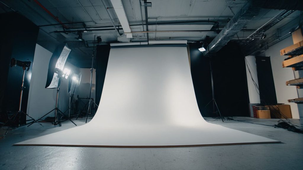
Acrylic is forgiving in some ways, but very unforgiving in others. Small mistakes show up fast in high-resolution photos. Over time, I built a few habits that save both shooting time and retouching time.
Preparing the Sheet
Dust, fingerprints, and small scratches can ruin an otherwise perfect shot. They might look small to the eye, but on a macro beauty product they become huge.
My basic routine before shooting:
- Clean with a proper plastic cleaner or mild soap solution
- Use a microfiber cloth, not paper towels
- Peel protective film only when the set is almost ready
I also match thickness to the job:
| Thickness | Typical Use in Photos |
|---|---|
| 2–3 mm | Background panels, small diffusers |
| 4–6 mm | Table surfaces, larger product supports |
| 8–10 mm | Heavy stands, strong “block” aesthetics |
If the sheet is too thin for a big object, it can flex and cause weird reflections or subtle bends. If it is too thick for a light product, the acrylic itself starts to grab too much attention.
Combining with Other Light Modifiers
Acrylic works very well together with classic photo tools. I rarely use it alone.
Some combinations I like:
- Softbox + frosted acrylic: even softer light, especially for shiny packaging
- Reflector + clear acrylic base: clean reflection under the product plus gentle fill
- Grid + acrylic side panel: focused beam but with a smoother edge
You can think of acrylic as a “hard, shaped diffuser” that you can cut, bend, and polish into very exact forms. This is different from fabrics and softboxes, which are more flexible but less precise in shape.
A simple mix-and-match table:
| Acrylic Role | Partner Tool | Result in the Image |
|---|---|---|
| Diffuser panel | LED panel | Soft, even, rectangular light source |
| Glossy base | Overhead softbox | Clear product reflection, soft top light |
| Colored background | Bare strobe | Strong, bright color wash |
Avoiding Common Problems
Most problems with acrylic in photography come from the same few points:
- Glare hotspots – Light hitting at a bad angle on glossy sheets
- Double reflections – Two surfaces reflecting the same light source
- Edge highlights – Bright lines on edges that cut through the product form
To reduce these, I do a few simple things:
- Change the light angle slightly instead of turning everything off
- Flag the light with black cards to block unwanted spill
- Rotate the sheet until key reflections sit in safe areas (not on logos, not on faces)
I have seen many teams blame the camera or the retoucher when the real problem was uncontrolled acrylic reflections. Small adjustments with flags, angles, and sheet choice usually fix the issue faster than any software trick.
When you start to view acrylic not just as “transparent plastic,” but as a very flexible light tool, your whole approach to product and display photography becomes more intentional.
Conclusion
After years of working with acrylic both as a manufacturer and as a support partner for photographers and product designers, I reached a simple belief: acrylic is not only a display material, it is a quiet light engineer.
I think this way because I have watched many sets change completely by adding or removing just one sheet. A harsh tech product suddenly looks premium with a clean reflection. A simple skincare bottle feels soft and calming once we pass light through frosted acrylic. A complex display design becomes much easier to shoot when clear supports lift the product without visual noise.
My judgment now usually starts from this question: “What should the light feel like for this brand and this object?”
Once I answer that, I choose the acrylic type, thickness, and finish to match that feeling, not the other way around. That is why I trust acrylic as a core tool, not an afterthought.
From the Feilong Acrylic side, this also shapes how we work with clients. We do not just cut random plates. We help choose surface finishes, thickness, and edge treatments that will behave well under real studio lights. That way, Jacky and people like him do not need to fight reflections and strange shadows later when they shoot.
If you are planning a new display, product line, or photography setup and you want acrylic that behaves predictably under light, you can always reach out through flacrylic.com. Share your product type, lighting style, and a few reference photos. I am happy to suggest sheet types, surface finishes, and even small structural changes that will make both your designers and your photographers a lot more relaxed on shoot day.