Skip to content

A few months ago, I wandered into a weekend craft market in Vancouver. Between tables piled with candles and leather wallets, one small booth caught my eye. Not because of what they sold—but because of how they displayed it. A simple, clear box with a tiny light inside turned an ordinary soap bar into something magical. I ended up buying three. That day reminded me: a custom display box doesn’t just hold a product—it sells it.
Why custom display boxes matter in modern retail
- Snap attention, spark action. A bright lid, a clear window, or a playful angle pulls the eye. Shoppers decide in seconds, and our box is often the quiet voice that says Pick me up.
- Guard the goods, tell the tale. I need a box strong enough for shipping yet elegant enough for shelves. It protects and quietly repeats the brand’s story with every glance.
Purpose and structure of this guide
I wrote this guide for designers and buyers who juggle specs, budgets, and brand dreams. I boiled down two dozen high-ranking articles into quick lessons, then added my own factory-floor scars and wins.
Ready? Let’s unpack what makes a display box truly work before the next shopper strolls by.
Know Your Product & Audience

I once misjudged a perfume bottle’s weight. The box bowed on the shelf, and the merchandiser never called back. Since then, I start every project with questions, not sketches.
Map product attributes before design
| Attribute | Why It Matters | Quick Check |
|---|---|---|
| Size & Shape | Dictates footprint, die-line, and shelf fit | Measure longest edge + clearance |
| Weight | Impacts board strength & inserts | Drop mock-ups from waist height |
| Fragility | Guides padding, window choice | Shake test with actual product |
| Shelf-Life | Influences barriers, coatings | Note UV, moisture exposure |
Decode buyer psychology and demographics
Talk to people, not averages. I run short surveys and study sales reports. For example, teen gamers loved neon patterns while eco-minded shoppers wanted plain kraft. Align graphics, structure, and copy to the real person, not the persona.
Bridging thought: Knowing who and what sets the stage; let’s now explore how we build the box itself.
Materials & Structural Engineering
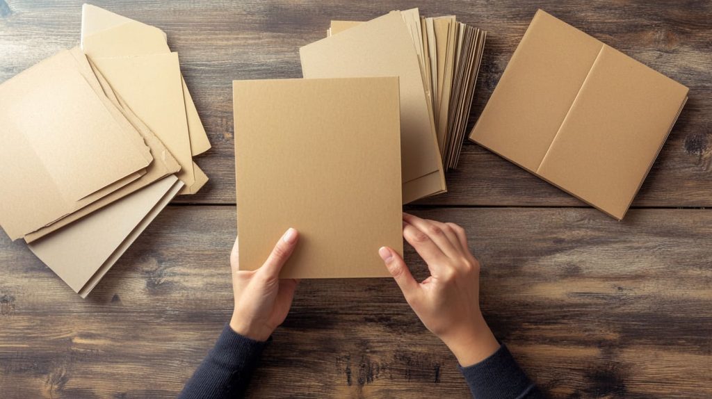
Three months ago a client squeezed costs by switching from acrylic to thin paperboard. It saved pennies but their luxury candles looked cheap overnight. Lesson learned: material whispers value.
Choose the right substrate
| Material | Perceived Value | Unit Cost | Best For |
|---|---|---|---|
| Paperboard | Moderate | Low | Lightweight cosmetics |
| Corrugated | Rugged | Mid | Bulk snacks, mailers |
| Acrylic | Premium | High | High-end tech, jewelry |
Precision structural design
I lean on CNC grooves and laser scores. A tight fold means faster assembly and fewer returns. Stay inside retailer height limits; no buyer wants an end-cap they must trim.
Durability & protection benchmarks
I run drop tests from chest height and humidity checks at 80% RH. If the print rubs off or corners crush, I iterate.
Bridging thought: Once the skeleton stands, color and story breathe life into it.
Visual Branding & Graphics

On a Shenzhen press floor, I watched a red logo turn burgundy under the wrong lamp. Color is mood; mishandle it and you lose the room.
Color psychology, typography, and imagery
A calm pastel tells a different tale than a hot magenta. Choose fonts anyone can read at arm’s length. Test mock-ups under store lighting.
Logo placement and hierarchy
Keep the logo in the visual “hot zone” (center-upper third). Foil or spot UV can add flair but use them sparingly—shine should guide, not blind.
Storytelling panels & QR integrations
Side panels are mini-billboards. A short origin tale or a scannable code linking to shopper psychology videos deepens engagement.
| Panel | Purpose | Checkpoint |
|---|---|---|
| Front | Wow factor, product peek | Three-second rule test |
| Sides | Brand backstory, usage tips | QR scan works on mid-tier phones |
| Back | Ingredients, specs, barcodes | Complies with target market laws |
Bridging thought: Gorgeous art means little if the box can’t survive aisle chaos. Let’s place it smartly.
Retail Environment Fit

I saw an oversized display shoved behind a pillar because it blocked the aisle. Placement nightmares start at the drawing board.
Placement strategy
Design for end-caps, checkout lanes, or peg hooks. Each zone has its own height, angle, and security quirks.
Space & footprint optimization
Use planogram data. Trim wasted air; every centimeter costs rent. I often create a scale mock-up and test it on an actual shelf.
Compliance with retailer guidelines
Big chains hand me thick manuals—UPC size, safety flaps, no sharp edges. I highlight each rule in the CAD file to dodge rejections.
Bridging thought: Standing still is fine, but can our box dance with the shopper? Let’s add a little magic.
Shopper Engagement Mechanics
I once embedded a tiny scented sticker in a soap box. Sales jumped 18%. Small surprises pay big dividends.
Clean, uncluttered fronts
Follow the three-second rule: one hero image, one benefit line, one logo. Clutter kills clarity.
Interactive and sensory add-ons
- Windows reveal color.
- Soft-touch varnish invites hands.
- Light motion tabs catch peripheral vision.
Clear calls-to-action & benefits
Use bold icons for “eco”, “limited”, or “new”. Price flashes near the corner prompt quick grabs.
| Add-On | Cost Impact | Engagement Lift* |
|---|---|---|
| Die-cut window | +5% | 12% |
| Texture varnish | +8% | 15% |
| Scent sticker | +3% | 18% |
*Ballpark from client A/B trials
Bridging thought: Speaking of eco icons, let’s make sure our promises stand up to scrutiny.
Sustainability & Eco Credentials

Two years back, a buyer asked if our acrylic scraps could re-enter the loop. That question nudged me toward closed-loop thinking.
Material choices and end-of-life pathways
I weigh recycled PET against virgin board. Sometimes a hybrid—corrugated shell with an acrylic window—balances strength and recycling ease.
Communicating eco value on-pack
Icons, FSC badges, and a quick note on recycled cardboard reassure conscious shoppers. Less ink means less landfill trouble.
Bridging thought: Green costs must stay in check. Let’s balance wallet and wow.
Cost-to-Value Optimization

A CFO once laughed, “If it costs more than the product, we’re out.” Fair point.
I present three tiers—bronze, silver, gold. Each shows material, finish, and unit cost. Buyers pick based on margin targets.
Production efficiency & lead times
Die-cutting multiple layouts on one sheet saves waste. Gang runs shrink print cost. Early proofs cut the panic later.
| Tier | Material | Finish | MOQ | Unit Cost* |
|---|---|---|---|---|
| Bronze | Kraft board | 1-color | 5k | $0.12 |
| Silver | SBS board | 4-color + matte | 3k | $0.22 |
| Gold | Acrylic | UV + foil | 1k | $0.95 |
*Indicative values from past runs
Bridging thought: Math is solid, but proof beats promises. Let’s measure, tweak, repeat.
Measurement, Testing & Iteration
I treat every launch as a live experiment.
Prototype, test, refine
I print 50 units, ship to two stores, and watch weekly sell-through. Tweak graphics, change window size, retest.
Metrics that matter
- Unit Lift – extra pieces sold after new box.
- Dwell Time – how long shoppers hold the box.
- ROI – margin gain minus packaging spend.
I track results on a shared dashboard so everyone—from design to finance—sees what moves the needle.
Bridging thought: Data shapes wisdom; wisdom shapes the next brief. Time to land this plane.
Conclusion

Custom display boxes work when five pillars stand strong:
- Know the product & the person.
- Pick the right material and build it tight.
- Brand with clear, honest visuals.
- Fit the retail stage.
- Measure, learn, and refine.
Next steps
- Draft a brief with the tables above.
- Run a quick prototype.
- Schedule shelf tests before mass order.
When the box sings, the product dances off the shelf. I’m rooting for your next hit.