Skip to content
To hang frames in a gallery wall style, first choose a location with adequate light and space.
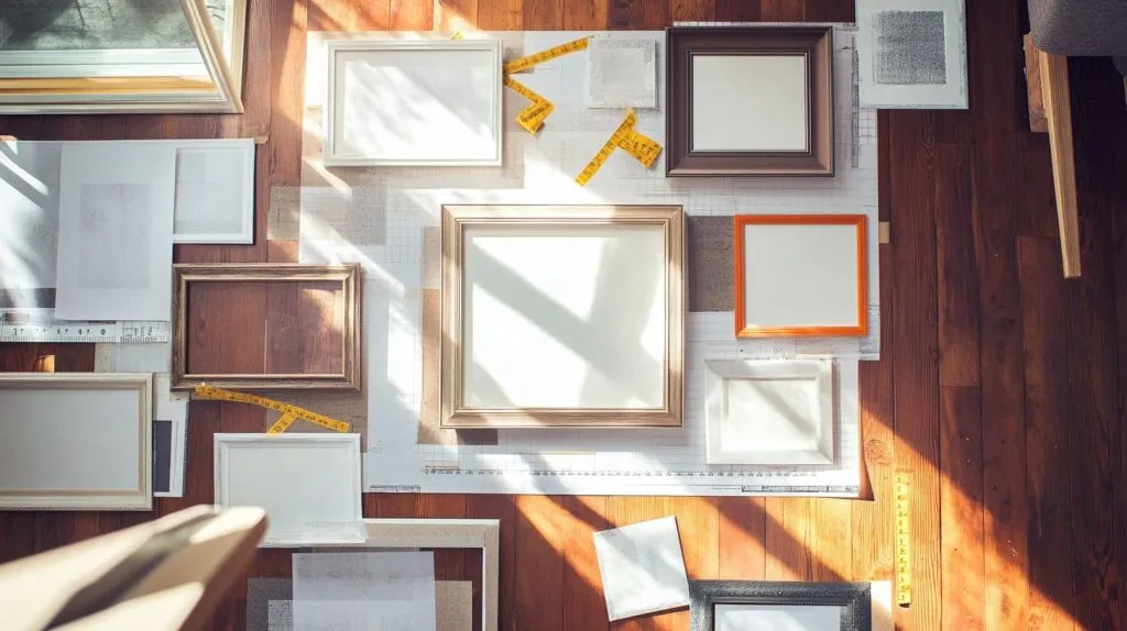
Plan the arrangement on the floor first, and use painter’s tape or paper to outline where the pieces will go on the wall.
In general, picture frames should be hung at eye level, or 57 to 60 inches from the floor.
If you want a gallery look, leave two to three inches of space between frames.
With the level, you’ll be able to ensure that lines are straight and even.
Prep Your Picture Perfect Wall
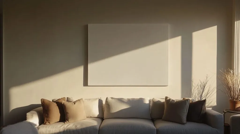
Preparing your wall is the first actual step in creating a gallery that looks like it belongs there. The wall you choose to decorate should be very noticeable, such as above your living room couch or around the dining room area. Be certain it works within your environment and best displays your images, as opposed to mess or other diversions.
Go with walls that highlight your personality and coordinate with the other hues in your home. Make sure that the wall is wide and tall enough to handle all your future frames. This ensures that the space has an airy, welcoming feel rather than a cramped.
Choose the Ideal Wall Space
Ideally, select a location that serves as a natural point of interest. A wall space above the couch or fireplace is ideal. Make sure that the wall has plenty of indirect natural light without too much direct sunlight, as that can cause prints to fade.
Avoid high-traffic corridors or areas where frames can be bumped. Any wall you choose should be dry and in good shape.
Curate Your Photo Selection First
Whether it’s a handwritten note or a simple story behind each piece, it will help that wall feel personal. Maybe 2 or 3 at the most because more than that can be visually confusing. Using a variety of sizes and layouts creates a dynamic energy for your display.
If you’re looking for something more unique and affordable, consider digital prints from local artists.
Select Frames That Speak Volumes
Choose frames that complement your space and artwork. You can choose different frame types for a playful appearance, or make them all the same type for a more traditional look. Frame colors should coordinate with your wall and decor.
Better materials hold up longer and help to safeguard your art.
Gather Your Essential Hanging Tools
Keep a level, tape measure, pencil, and hammer on hand. Adhesive hooks are a great way to prevent holes from forming. Pre-mark your hole locations prior to hanging.
A sturdy step stool will help you safely access height.
Master Popular Frame Layouts
Hanging portrait or landscape image frames on the wall requires an artistic touch combined with some forethought. A carefully considered gallery wall layout goes a long way toward achieving a feeling of balance, drawing attention to beloved works and lending unique charm to any space. Creating a photo wall can enhance the overall aesthetic of your home décor.
There are many different ways to hang frames – grids, salon hangs, lines in the center, etc. Knowing what each layout brings—or doesn’t bring—to a space is key in maximizing your design. Mastering popular frame layouts, such as the gallery wall formula, can help you find what works best to your artistic advantage.
Plan around your wall space and the feeling you’d like to evoke. To ensure the layout is comfortable, consider balance and flow. Many participants enjoy spreading out all the frames on the floor first. Some like to use painter’s tape on the wall to mark out the lines as a guide, which can also inspire creative photo wall layout ideas.
These approaches allow for more design changes before any drilling is done. Below, you’ll find a breakdown of several popular frame layouts, each with its own strengths and practical tips for achieving a polished look.
1. Create a Classic Grid Gallery
The classic grid layout really just needs no introduction. This method looks great in contemporary spaces or for those who just like things balanced. Select all the same-sized frames so your grid layout is uniform.
Alternatively, use a combination of sizes to introduce energy but still uphold a sense of structure. Align the frames in simple rows and columns. Give yourself an even spacing of 2-3 inches between each frame. This usually looks great on any size wall.
It’s easier to get everything straight when you use a measuring tape. This layout usually looks most appropriate over couches, beds, or long-vaulted hallway walls where you prefer a clean, polished look. Others loosely mix up frame sizes within a two-column or staggered grid layout.
This technique relaxes the rigid aesthetic without losing the balance.
2. Embrace the Eclectic Salon Hang
Eclectic salon hang is embraced by many contemporary artists, and this aesthetic is born from art’s long and winding European history. This layout is super chic and creative, perfect for displaying an array of unique keepsakes, family portraits, or fine art photographs.
Begin with your central frame—usually your largest, most impactful work—and branch out with your smaller frames. Allow the installation to develop in a free form, organic manner, occupying space as you work.
Pairing contemporary metal frames with more traditional wood frames creates surface contrast, and a group of squares and rectangles creates even more dimension. To create more visual interest, introduce planter boxes or hanging display space between your frames.
This principle works wonders in artistic communities and lobbies. It supplements the content on a TV, transforming the wall it’s mounted on into its own engaging, artfully organized narrative.
3. Arrange Along a Central Line
Arranging frames along a central horizontal or vertical axis introduces an expected stability. This is especially vital in environments with high visual stimulation. This approach relies on one line—usually as high as eye level or the height of a doorframe—to ground the composition.
Choose one primary frame to lay out first, and then orient the others so their centers or sides align with the guideline. This prevents the view from becoming cluttered, even when working with a variety of frame sizes.
The central line is particularly effective in corridors, on stairways, or above pieces of art or furniture. It helps you avoid craning your neck or leaning over the table. It offers a straightforward approach to linking various segments.
Painter’s tape makes a great little guide, making sure your line remains straight from beginning to end.
4. Build Around One Large Piece
Choosing one strong piece to be the anchor of your wall adds immediate eye-catching impact and grounding. Position this large frame or artwork at the focal point of your layout. Next, place smaller frames around it, using the larger piece’s colors or themes to select artwork that will best match.
This technique helps achieve visual equilibrium while directing the viewer’s gaze with purpose. Anchor that big piece properly, because it really does dictate the mood for the entire gallery. This layout is especially stunning over fireplaces and beds.
Its elevation makes for enchanting dining rooms, as its height creates one central visual drawing the eye to its stately elegance. Almost everyone begins with the biggest piece in the center and moves outwards. This creates a natural way to keep everything looking cohesive.
5. Design an Asymmetrical Balance
In spaces where a more casual, contemporary vibe is desirable, asymmetrical arrangements bring a great deal of movement and purpose. This method mixes different frame widths and heights. It puts them in a pleasing composition, though not necessarily an exact symmetrical one.
Ground one end with a big element. Next, counter it by grouping together more diminutive frames on the opposite end. The trick is to balance visual weight so that no portion of the composition seems top-heavy or bottom-heavy.
Other folks prefer to cluster works on the wall, creating groupings that are essentially mini-collections, but still within the wall. When creating a composition, using a multitude of shapes—including squares and rectangles—can really liven up the layout and add depth.
6. Use Furniture as Your Anchor
Hanging artwork over furniture—such as couches, sideboards or beds—connects the wall art to the overall space, as well. The overall width of the framing should be around two-thirds the width of the piece of furniture underneath for a pleasing, balanced look.
Place the frames so that their lowest points are between 6 and 12 inches above the tops of the furniture. Keep the artwork in line with eye level for optimum viewing. Align the frame styles with your art table.
Pair contemporary metal frames with an industrial-style leather couch or raw wood frames with a cozy farmhouse table to establish cohesion within the room. This approach is extremely practical for living rooms, bedrooms, and dining rooms.
7. Think Vertically for Tall Walls
Vertical frame layouts work wonders on tall, narrow walls, especially when considering a modern photo wall layout. Install taller frames or larger artwork to draw the eye upward, creating the illusion of higher ceilings. Staggering frame layouts along the vertical axis, while incorporating both horizontal and vertical frames, enhances the visual appeal of your photo wall.
Avoid crowding text and maintain consistent spacing, as this tactic proves effective in doorways or next to bookcases where vertical real estate tends to be wasted. This careful spacing contributes to a successful gallery wall, making it a focal point in your home décor.
By intentionally coordinating frame hues, you can create bold color block moments, particularly with family photos or large pieces of art. This approach not only enhances the overall aesthetic but also showcases your creativity in assembling a personal gallery wall.
8. Go Horizontal Above Wide Furniture
If you have wide furniture, such as a big couch or a long console, to the side of your frame wall, create a horizontal line to go with the scale. Consider using larger frames to take up more real estate and maintain an even spacing between them for a polished aesthetic.
Ensure the overall length of the layout accommodates a few inches of wiggle room on either side of the furniture. This layout is equally at home in contemporary or traditional environments, and it’s perfect for open-plan living areas.
9. Integrate Ledges or Shelves
Ledges and shelves provide an adaptable solution for creating a photo wall that showcases framed artwork and photography. By placing one or more ledges at eye level, you can stack frames of various heights and depths, allowing for a creative photo wall layout. This way, you can easily swap out artwork as needed without making a bunch of new holes in the wall.
These ledges are especially perfect for renters or individuals who enjoy frequently changing their displays. Just ensure that the ledge is deep and strong enough to support the frames you choose, enhancing the overall visual appeal of your home décor.
Adding plantings along the frames or small objects that hang around the edges can make your display even more dynamic, contributing to a successful gallery wall.
Define Your Gallery Wall Style
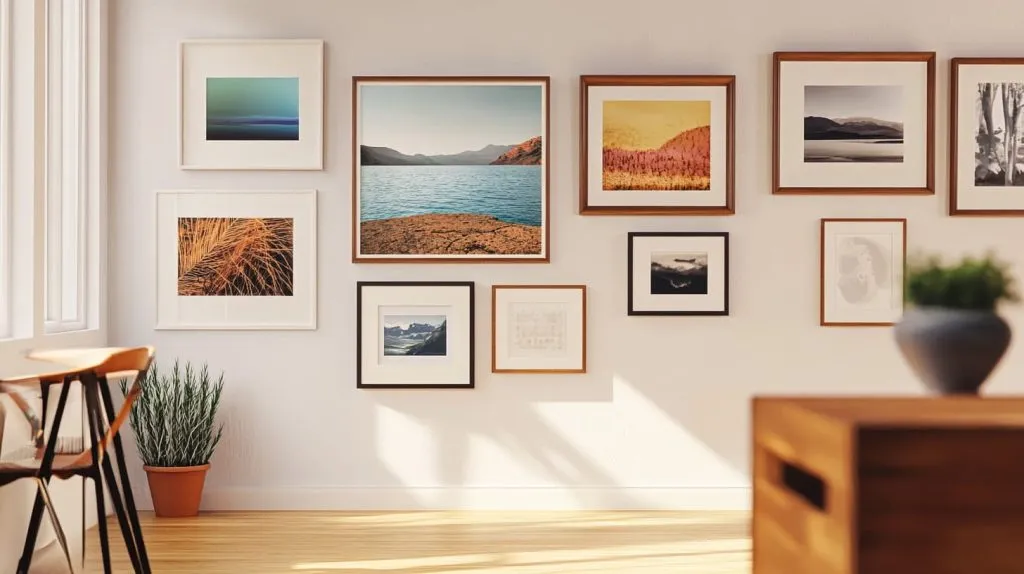
A gallery wall can give any room an air of vibrancy, showcasing a collection that combines your personal aesthetic with pieces that evoke your history and creative vision. Choosing a gallery wall style involves considering what best represents your personality and suits the aesthetic of your home.
Graphic shapes, pristine edges, and composed aesthetics are all the rage in city dwellings from New York to London. There’s definitely space for the more modern, or even vintage, look—anything that falls in between.
Find Your Unifying Theme
This unifying theme will make the display feel cohesive and engaging. Many people opt for travel photography, family portraits, or even images of landscapes. Some choose to use one specific color or mood in every piece, creating a feeling of unity through the same story told in each work.
Continue reading to learn how you can add quotes or short texts to achieve greater depth of meaning. Each piece should contribute to the overall mood. For instance, mix vintage travel passes with images from the same trip or match nature drawings with emerald colors.
Mix Photos, Art, and Objects
Your gallery wall should mix and match pieces, especially if your style leans contemporary or eclectic. Add photos, flat artworks, and even 3D objects into the mix. For instance, mix a wood-framed photograph, a metal sculpture, and a canvas print.
This adds depth to your wall and helps to maintain visual interest. The key is to ensure every piece adheres to the overall concept, meaning the wall will feel planned, rather than haphazard.
Play with Cohesive Color Schemes
Choose a cohesive color scheme that works with the space. Either matching frame colors or keeping everything in the same color family with the art creates a cohesive gallery wall.
Even when combining different styles, a unifying color allows for some creative freedom while maintaining harmony.
Consider Frame Materials Wisely
Select frame material based on what looks and feels best to you. Whether you choose wood, metal, or acrylic, the material of your frames can make a big impact.
Combining materials creates visual interest, but limit yourself to three or four to prevent a cluttered appearance.
Add Personal Mementos
Include items with history for your photo wall, such as a postcard from a memorable vacation or a family heirloom, and rotate these everyday prints to keep the gallery wall fresh.
Hang Frames Like a Pro
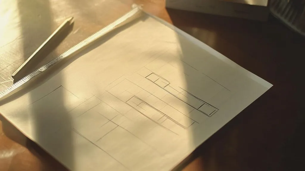
Hang picture frames like a pro. Hanging picture frames on a wall requires more thought than simply choosing locations haphazardly. Gallery walls re-create the magic of the museum in homes and offices throughout North America and Europe. They bring a space to life, they tell stories, they ignite conversations, they reflect your style.
As with any successful endeavor, the dynamic trio of smart planning, thoughtful measurement, and the right tools leads to success. It’s important to remember that every step in the process counts. The sections below outline techniques and tricks that go a long way toward achieving a professional, well-composed wall installation.
Plan Your Layout on Paper First
Planning your layout on paper first will save you plenty of time and stress. Before breaking out the hammer, take some simple, plain, or graph paper and draw your wall to scale, then doodle different frame shapes. This step lets you move things around, test ideas, and see the full layout without making holes in the wall.
Graph paper comes in handy for ensuring your measurements stay nice and snug and your spacing consistent. Experiment with layout, alternate between horizontal rows and grids, or organic clusters. Circle your desired configuration and center point. This center mark will be your guide during the hanging process, ensuring that your display is hung accurately according to your vision.
For those design-minded folks who value symmetry, take advantage of the grid’s boxes to maintain even spacing throughout the design. Alternatively, if you desire a more freeform appearance, plan the larger focal pieces first and then weave in smaller frames. Mark the center point on your sketch. This will ensure you’re getting the whole setup lined up at eye level when you go to actually hang it.
Measure for Perfect Placement
A tape measure is second only to a level as your best friend in the art hanging business. Begin by figuring out your available wall space in conjunction with the frames’ heights and widths. Identify your central focal point on your wall with a pencil.
To make the most impact, hang the center of the display at average eye level. In the U.S. and Europe, experts often suggest 57 to 60 inches from the floor to the center of the artwork. 62.5 inches is a decent rule of thumb starting point for many homes. To determine the height, start by taking half of the frame height.
From this, subtract the distance from the top of your frame to the hanging hardware, and then add that figure back to whatever eye-level mark you desire. This formula goes a long way toward keeping your art looking in balance from room to room regardless of varying ceiling heights. To hang art over any furniture, measure 6 to 12 inches above the top.
This maintains a visual flow of the pieces and establishes a polished appearance. For grid or series layouts, measure carefully to ensure consistent spacing between pieces so they all line up cleanly and evenly.
Use the Right Hanging Hardware
Using the proper hardware is key for any gallery wall layout, regardless of the frames' weight, size, or shape. For small, lightweight frames, adhesive hooks or simple nails work well, while heavier frames require wall anchors or screws for security. Always consider the weight of the frame and pair it with the appropriate hardware.
To enhance your photo wall, utilizing two hangers per frame can prevent swinging or tilting, ensuring a tight display even after long-term hanging. When attaching D-rings, place them one-third of the way down from the top of the frame to distribute weight evenly and keep the frame flush against the wall.
Never assume that hardware is securely fastened to the wall and frame; improper installation can lead to a dangerous fall, compromising the visual appeal of your gallery wall.
Get Spacing and Alignment Right
Even spacing goes a long way in making a gallery wall look polished and purposeful. Now is the time to pull out the ruler or tape measure. Use the same spacing between the frames, generally 2 to 4 inches for most grouping displays.
For larger frames or a more open layout, wider spacings can be more visually pleasing. To check alignment, run a level across the top of each frame. If you don’t have a level on hand, many smartphones come equipped with built-in level tools.
As you hang, periodically step back and take a look at the overall wall and make any adjustments. This concurrent verification nips minor mistakes in the bud before they blossom into major issues. For mixed-size arrangements, allow the largest frame to create the layout anchor, then build out from there, spacing sizes to create visual balance.
Leverage Negative Space Effectively
Negative space—the blank spaces between and around frames—add a sense of calm and concentration. Use it to draw attention to important pieces and give the viewer’s eye a place to relax. When you crowd too many frames, you can end up with a wall that looks noisy or frenetic.
Choose a couple of standout pieces to be your showstoppers and create negative space around them on purpose. This method is a perfect fit for contemporary or traditional spaces. For gallery walls and walls that will be covered with art, leverage negative space to your advantage.
Using visual hierarchy, this approach builds visual trails that lead viewers from one work to the next.
Try AR Apps for Visualization
Technology has opened up new opportunities to preview art like never before. Several augmented reality (AR) apps allow you to visualize your potential frames on your actual walls before you commit to hanging anything.
These AR apps help you visualize multiple design options in your space. With the tap of your finger, you can upgrade or downgrade with ease. This makes it especially helpful for renters or anyone looking for a no-commitment preview.
Once you’ve added a frame, most apps allow you to reposition it, adjust the size and dimensions, and even simulate different lighting scenarios. Use the app’s suggestions to adjust your final artwork design until you’re satisfied.
When you get it perfectly arranged, stick to your game plan with boldness!
Elevate Your Frame Arrangement
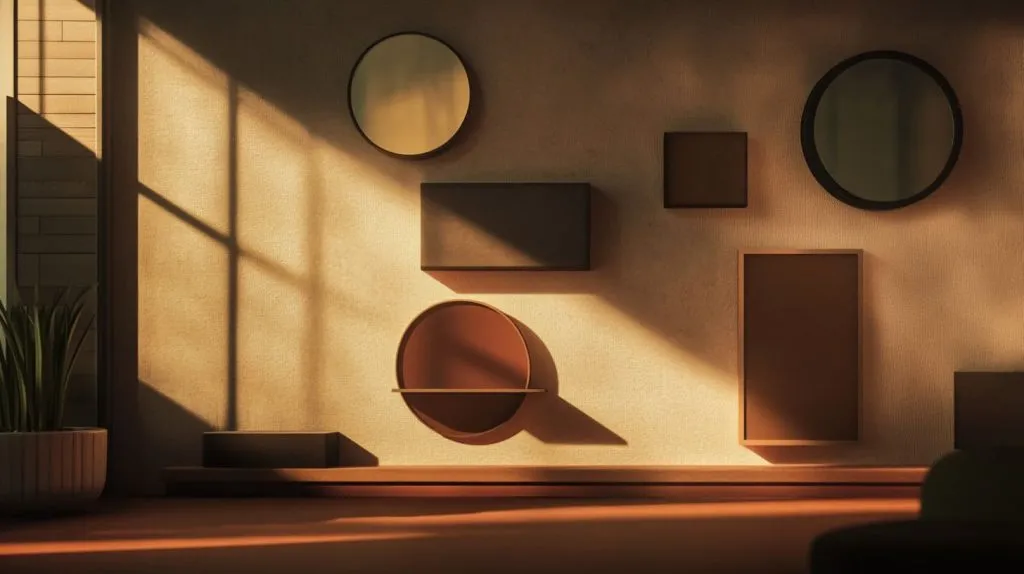
Hanging photo frames on a wall isn’t just about covering empty wall space. It’s a chance to stitch narrative and aesthetic into your domestic sphere. Here, both design and function come into play no matter if you’re in a compact urban apartment or a spacious suburban house.
Combining different frame shapes, light sources, and intentional angles allows you to create the illusion of expansive, vibrant spaces even in small areas.
Experiment with Unique Frame Shapes
Adding different-shaped frames, whether they be round, oval, or other unique shapes, brings new life to a wall. A combination of circles, squares, and rectangles can soften harsh edges, giving your presentation a more dynamic look.
For instance, positioning one small round frame above a row of rectangular frames maintains the viewer’s upward glance. See how well you can pair these shapes to the vibe of your space!
Mix vintage wood ovals with sharp black rectangles for a look that’s equal parts cozy and modern. Layering frames adds dimensionality to your image. It’s that easy. Set one frame a little higher than the two adjacent frames and incorporate three frames of different shapes and sizes for an easy, yet dynamic, arrangement.
Consider Modern Floating Mounts
Floating mounts are ideal for showcasing Polaroids, ticket stubs, and even keys. These devices let you create the wondrous magic of art floating in free air. Hang with strong hardware—two D-rings across the back from each other make for a more level hang.
Floating styles bring more dimension to your room. When frames are hung at varying heights, they give a beautiful stacked gallery print look from top to bottom.
Use Lighting to Enhance Display
Spotlights or wall sconces can be used to highlight important pieces. In spaces with ample natural daylight, UV-safe art lighting is perfect to reflect color and texture in your art.
With adjustable lights, you can set the mood in an instant. Regardless of bulb type, keep your bulbs at an appropriate angle and distance to prevent glare and fading.
Think Beyond the Living Room
Gallery walls are versatile designs, making them suitable for any space—hallways, bedrooms, or home offices. In cramped spaces, consider a tight grouping or combination of art styles.
Match your wall’s aesthetic to the room’s purpose, and orient artwork or displays between focal points to create visual symmetry.
Make Sustainable Framing Choices
Select recycled or upcycled frames for a one-of-a-kind, eco-conscious flair. Honor local artists, or show digital artwork if you want to reduce your material use.
Every decision makes the work more meaningful to them personally and better for the planet.
Avoid These Common Pitfalls
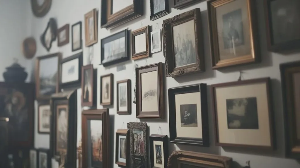
Hanging photo frames on a wall requires more than just aesthetic instinct. Frequently overlooked mistakes can really detract from the overall appearance and aesthetic of your gallery wall. Most of us are trial-and-error learners. A handful of caveats can steer you clear of design missteps and keep your rig tidy yet customized.
The most important of all is the planning and measuring. No matter the material you choose, a well-planned wall will be a reflection of your taste and lifestyle, as well as a lasting addition to your landscape.
Hanging Frames Too High
Few things annoy viewers more than when art is hung too high, which can destroy the experience of enjoying the piece. To provide the best experience, place the middle of the frame at the viewer’s eye level. This usually involves hanging it no higher than 57 to 60 inches off the ground.
Residentially, in living rooms, you can look at the height of a sofa or a console, and you want to stay grounded. When you are in set-up, make sure to periodically step back and see if the height works for you.
Ignoring the Scale of Your Wall
A tight group of frames on a large wall may look swallowed up. Ignoring the scale of your wall frames must be compatible with the wall’s scale. The width of the primary artwork should be two-thirds the width of the furniture underneath it.
Think of your gallery as a single work to achieve a more harmonious balance.
Creating Visual Overload
Crowding too many frames together can create a chaotic photo wall. Providing 2 to 6 inches of clearance between frames allows for a successful gallery wall, as white space helps each piece of art pop individually.
Using Inconsistent Spacing
Using inconsistent spacing or uneven gaps between frames can really break up the flow. Consistency and precision using a ruler or level to ensure spacing is uniform, compensating for the size of the frame, provides crisp, sharp lines.
Don’t forget to proofread your lines along the way.
Forgetting Long-Term Maintenance
Pictures just sit in frames collecting dust. Art is affected by the surrounding environment over time, such as sunlight and humidity. Change art periodically.
Clean frames regularly, inspect for damage, and replace artwork from time to time.
Conclusion
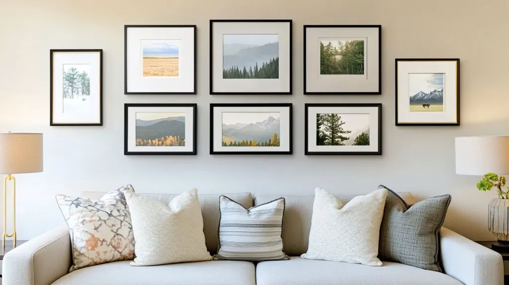
Arranging picture frames on your wall can create different vibes in any space. Strategic planning, a discerning sense of visual balance, and a gentle touch make all the difference in keeping frames crisp and clean. Use a grid layout if you want a clean, modern feel, or a salon-style, eclectic approach for more of an artsy flair. For example, you can use painter’s tape to test out spots before committing with nails. Allow a little space between each frame. Two inches is generally a good rule of thumb for gallery walls. Don’t hang picture frames too high or too close together. Step 4 – Follow your intuition and avoid overthinking it. Your wall should reflect your life, not the instruction manual. Do you have a preferred frame style or gallery arrangement? Bounce your plans off each other, trade experiences, or seek guidance from people who just like to customize their surroundings.