Skip to content
Acrylic sheet names look clean on paper.
OP3.
P95.
P99.
Three short names. Three simple lines on a quotation sheet. They look like a buyer can choose one in a few seconds and move on to price, lead time, and packaging.
But in real custom acrylic work, I have learned to slow down when I see these names.
Acrylic is not only a material. It is also part of the visual experience. It changes how light moves. It changes how a product looks. It changes how a customer feels when he stands in front of a display, frame, sign, or acrylic cover.
That is why choosing acrylic only by sheet name can become expensive.
I have seen buyers ask for P99 because they want “less glare.” That sounds reasonable. But later, they may feel the image looks softer than expected. I have seen buyers ask for OP3 because it sounds like a higher-grade sheet. That also sounds reasonable. But if the real problem is reflection under store lighting, OP3 may not solve the problem at all.
The material is not always wrong.
The context is wrong.
That small difference matters a lot.
A product and mold designer like Jacky from Canada may already know acrylic very well. He may have visited factories in China. He may understand CNC cutting, bonding, polishing, packing, and quality control. But even experienced buyers can still fall into this small trap: they choose the sheet name before they define the application.
This is where things often get messy in real work, because the name on the material sheet feels safe, but the final display is judged by eyes, light, distance, and customer feeling.
In this article, I want to talk about OP3, P95, and P99 in a practical way. Not like a classroom. More like a factory table discussion.
Because the real question is not:
“Which sheet is better?”
The better question is:
“What do you need this acrylic sheet to do?”
And that question can save a project.
What Do OP3, P95, and P99 Actually Mean?
Before I talk about cost, mistakes, or selection, I need to make one thing clear.
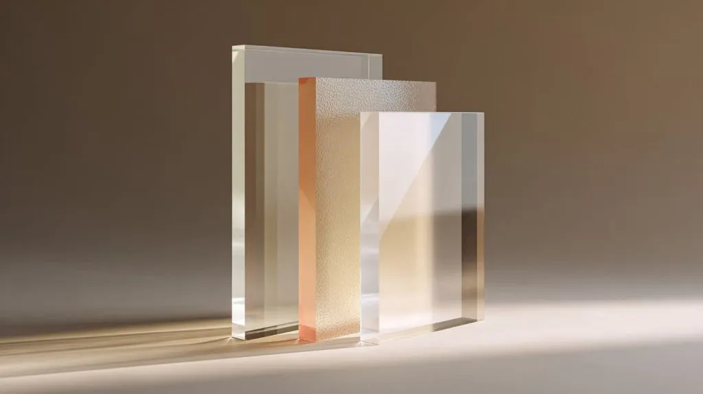
OP3, P95, and P99 are not three levels of the same product.
They are not like small, medium, and large.
They are more like three different tools in the same toolbox.
A screwdriver is useful. A wrench is useful. A knife is useful. But if I use a knife as a screwdriver, the problem is not the knife. The problem is my choice.
The same idea applies here.
The first thing I check is not whether the customer asks for OP3, P95, or P99, but whether the customer can explain the visual problem he wants to solve.
If he cannot explain that clearly, I know we need to talk more before making samples.
OP3: UV-Filtering Acrylic
OP3 acrylic is usually used when UV protection matters.
Its main job is to help protect artwork, photos, printed graphics, retail samples, or sensitive products from ultraviolet light. In many display or framing jobs, this can be very useful.
The important point is simple:
OP3 protects against UV light, but it does not automatically solve glare.
That is where many people get confused.
OP3 can still look clear. It can still have good transparency. It can still show the product well. For high-end displays, museum-style covers, photo frames, and retail cases, this clarity is valuable.
I often think of OP3 as the “quiet protector.” It does not try to change the look too much. It tries to protect what is behind it.
| Feature | OP3 Acrylic |
|---|---|
| Main purpose | UV protection |
| Visual style | Clear and clean |
| Common use | Artwork, photos, retail displays |
| Main strength | Protects sensitive items |
| Main limitation | Does not remove strong reflection |
OP3 can be a very good choice when a buyer wants both protection and clarity.
For example, if a store wants to display a signed sports photo, UV protection can be important. If a museum-style retail display holds a limited-edition product package, OP3 may also make sense.
But if the display sits under strong ceiling lights and the customer complains about reflection, OP3 alone may not fix that issue.
That is the small detail many buyers miss.
P95: Matte / Light Diffusion Acrylic
P95 acrylic usually has a matte finish on one side.
It can reduce glare. It can soften light. It can give the surface a gentle, smooth feeling. It is often used in lighting panels, backlit signs, decorative panels, and some display designs where a soft look is more important than sharp details.
I like to think of P95 as a “softener.”
It takes hard light and makes it calmer.
But that softness has a price.
When acrylic diffuses light, it may also reduce sharpness. If a buyer places detailed artwork, fine text, or high-resolution graphics behind P95, the result may not look as crisp as clear acrylic.
| Feature | P95 Acrylic |
|---|---|
| Main purpose | Matte effect and light diffusion |
| Visual style | Soft, smooth, gentle |
| Common use | LED panels, backlit signage, decorative covers |
| Main strength | Reduces harsh reflection and spreads light |
| Main limitation | Can reduce image sharpness |
P95 is not bad because it softens the image.
That softness is sometimes exactly what the design needs.
For a light box, harsh LED points can look cheap. P95 can help hide them. For a decorative panel, sharp clarity may not be the goal. A soft glow may look much better.
But for a premium product display where the customer wants every edge, color, and detail to look sharp, P95 may not be the best first choice.
P99: Non-Glare Viewing Acrylic
P99 acrylic is usually used when glare reduction is the main goal.
It has a stronger non-glare effect than P95 in many viewing situations. It diffuses reflected light and makes the surface easier to view under difficult lighting.
This sounds great.
And sometimes it is.
But here is the trade-off: strong glare reduction can also mean more visible image diffusion.
In simple words, P99 may reduce reflection, but it can also make the image behind it look less sharp.
| Feature | P99 Acrylic |
|---|---|
| Main purpose | Non-glare viewing |
| Visual style | Reduced reflection, softer image |
| Common use | Picture frames, display covers, areas with strong light |
| Main strength | Reduces distracting glare |
| Main limitation | Can reduce sharpness and depth |
P99 can be very useful for framing. If a framed photo or poster faces strong light, P99 can make viewing easier.
But I do not treat P99 as a magic sheet.
If the artwork has tiny text, deep black areas, or very detailed lines, I want the buyer to see a sample first. The eye may accept less glare, but it may also notice less depth.
That is the balance.
And balance is where real material selection begins.
Acrylic names can explain the feature, but they cannot tell the full story. The next problem is even more dangerous: the same name can create different expectations in different projects.
Why Sheet Names Can Be Misleading in Real Projects

A sheet name feels official.
That is why it can be dangerous.
When a buyer writes “P99 acrylic” on a drawing, everyone may think the requirement is clear. The purchasing team thinks it is clear. The supplier thinks it is clear. The engineer thinks it is clear.
But the final customer does not judge the name.
The final customer looks at the display and says:
“Why does it look cloudy?”
Or:
“Why can I still see the light reflection?”
Or worse:
“Why does this not look like the sample I approved?”
A sheet name can start the conversation, but it should never end the conversation.
The mistake I try to avoid is accepting the material name too fast, because a clear name can hide an unclear requirement.
Names Describe Features, Not Outcomes
OP3, P95, and P99 describe material features.
They do not promise the final visual result in every project.
That difference matters.
For example, OP3 may provide UV protection. But if the product is displayed under strong lighting, the customer may still see reflection.
P99 may reduce glare. But if the viewer stands very close to the acrylic surface, the image behind it may look softer.
P95 may create a nice matte feeling. But if the project needs crystal-clear detail, the matte finish may become a problem.
| Sheet Name | Feature It Suggests | Outcome Buyers May Expect | Possible Reality |
|---|---|---|---|
| OP3 | UV filtering | Better display quality | Clear view, but still reflective |
| P95 | Matte finish | Less glare and premium look | Softer image, less detail |
| P99 | Non-glare | Clear view without reflection | Less reflection, but more diffusion |
This is why I like to separate feature and result.
A feature is what the sheet does.
A result is what the customer sees.
They are related, but they are not the same.
Suppliers Use Names Differently
Another issue is that sheet names are not always used in the same way by every supplier.
One supplier may call a sheet P95 based on surface finish. Another supplier may focus on haze, gloss, or light diffusion. Some buyers may assume all P95 or P99 sheets behave the same.
They may not.
This becomes important in custom manufacturing.
If the buyer approved one sample from one source, and later switches supplier or material batch, the visual result may change. Sometimes the difference is small. Sometimes it is very obvious.
I have seen this kind of problem in custom acrylic projects.
The buyer says, “We used P99 before. Please make the same.”
Then I ask:
“Can you send the previous sample or technical data?”
That question may sound boring. But it can protect the project.
| What Buyers Say | What I Need to Confirm |
|---|---|
| “Use OP3.” | UV level, thickness, clarity, original brand if needed |
| “Use P95.” | Matte side, haze, surface direction, lighting condition |
| “Use P99.” | Non-glare level, viewing distance, image sharpness tolerance |
The material name is not enough when the visual requirement is strict.
Buyers Often Skip Optical Behavior
Many buyers focus on the sheet name because it feels practical.
They need to send an inquiry. They need to compare prices. They need to move the project forward.
I understand that.
But acrylic sheets are optical materials in many display projects. Light does not care about our schedule. Light does not care about our quotation sheet. Light hits the surface, reflects, scatters, passes through, or gets softened.
Then the customer judges the result.
For example, a buyer may choose P99 for a retail product display because he wants to remove glare. But if the product behind the sheet is a luxury watch, strong diffusion may reduce the sharp metallic details that make the watch look expensive.
Less glare.
Less shine.
Less premium feeling.
That is not always a win.
| Optical Factor | Why It Matters |
|---|---|
| Viewing distance | Close viewing makes blur easier to notice |
| Light direction | Direct light creates stronger reflection |
| Product detail | Fine details need clearer acrylic |
| Background color | Dark colors show reflection more clearly |
| Customer expectation | Premium products need visual depth |
This is why I always want to know the application before I agree with the sheet name.
A buyer may think he is choosing a material. But he is really choosing how the final product will be seen.
And once we understand that, we can compare the sheets in a more honest way.
How OP3, P95, and P99 Perform in Real Applications
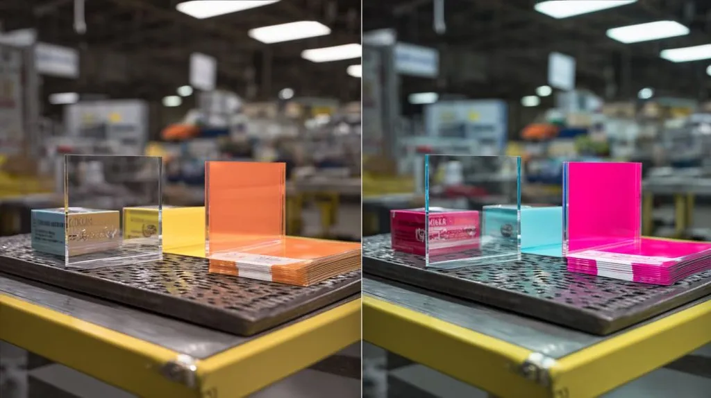
Acrylic sheets behave differently when they leave the sample rack and enter real life.
A small sample on a desk may look fine.
Then the same sheet goes into a retail store, under ceiling lights, beside a glass wall, in front of dark packaging, and suddenly the result changes.
That is not strange. That is normal.
Materials do not work alone. They work with light, distance, color, angle, and human eyes.
I do not judge these sheets only by how they look in my hand; I judge them by how they behave when the buyer’s customer will actually use the product.
Visual Clarity Comparison
Visual clarity is usually the first thing buyers notice.
OP3 is usually the strongest choice when the buyer needs clarity and UV protection at the same time. It keeps the image or product behind the sheet looking sharp.
P95 gives a softer look. It may be fine for lighting or decorative effects. But it may not be ideal when fine details matter.
P99 reduces glare more strongly, but it may create more visible diffusion. The image may look less sharp, especially if there is space between the acrylic and the printed surface.
That last point is important.
The distance between acrylic and image can change the result a lot.
If the acrylic touches the artwork directly, the image may look clearer. If there is a gap, diffusion becomes more noticeable.
| Sheet | Clarity Level | Best Viewing Situation | Risk |
|---|---|---|---|
| OP3 | High | Detailed products, artwork, clear display covers | Reflection may remain |
| P95 | Medium | Soft lighting, frosted effects, decorative panels | Fine details may blur |
| P99 | Medium to low depending on setup | Glare-heavy framing or viewing areas | Sharpness may drop |
Acrylic is a little like a window.
A clean clear window shows the view well, but it may reflect light.
A frosted window hides glare, but it also hides detail.
The buyer needs to decide which problem is more serious.
Light Reflection Behavior
Reflection is where many acrylic projects become emotional.
A buyer may look at a finished display and feel disappointed, even if the size, edge polish, bonding, and packing are all correct.
Why?
Because the light reflection makes the product hard to see.
OP3 behaves more like standard clear acrylic in terms of reflection. It can protect against UV, but it does not remove strong reflection by itself.
P95 reduces harsh reflection. It gives a softer surface feeling. It can work well when the design does not need perfect clarity.
P99 is more focused on non-glare viewing. It can reduce strong reflected light better, but again, it may make the image softer.
| Lighting Problem | OP3 | P95 | P99 |
|---|---|---|---|
| UV exposure | Strong solution | Not the main purpose | Not the main purpose |
| Harsh surface glare | Limited help | Medium help | Strong help |
| LED hot spots | Limited help | Good help | Not always ideal |
| Clear product viewing | Good | Medium | Depends on distance |
| Fine image detail | Good | Medium | Can be weaker |
For store displays, this becomes tricky.
Retail lighting is often designed to make products look attractive. But strong light can also create reflection on acrylic covers. A buyer may want anti-glare acrylic. That makes sense.
But if the product inside needs shine, depth, and color power, too much diffusion can reduce the emotional value.
A jewelry display is a good example.
The customer does not only want to see the jewelry.
He wants to feel it.
Reflection is bad when it blocks the view. But some sparkle and depth can help the product feel premium. This is why the answer is rarely simple.
Color and Depth Impact
Color is another detail that buyers may not think about early enough.
Acrylic does not only cover the product. It can change how the product feels.
OP3 usually preserves color well because it stays clear. If the item behind it needs strong color accuracy, OP3 is often safer.
P95 can mute contrast a little. It can make the look calmer, softer, and less sharp.
P99 can flatten visual depth if the non-glare effect is strong. Dark colors may look less deep. Fine shadows may become softer.
| Visual Need | Better Choice | Reason |
|---|---|---|
| Strong color accuracy | OP3 | Clearer viewing |
| Soft brand feeling | P95 | Gentle surface and light diffusion |
| Less glare under strong lights | P99 | Better reflection control |
| Deep black contrast | OP3 or sample test | Diffusion may flatten black areas |
| Premium product detail | OP3 or controlled P99 test | Sharpness matters |
This is where I sometimes ask buyers a simple question:
“Do you want the viewer to see more clearly, or do you want the viewer to see with less reflection?”
That sounds like the same thing.
But it is not.
More clarity and less reflection can fight each other.
This is the real reason sample testing matters. A sheet may look good in theory, but the customer only cares about what his eyes see.
And if the wrong sheet is chosen, the cost does not stop at the material price.
The Hidden Cost of Choosing the Wrong Sheet
The wrong acrylic sheet does not always look wrong during production.
The cutting may be accurate.
The edges may be polished.
The packaging may be strong.
The carton may arrive safely.
Then the buyer opens the box, puts the acrylic into the real display, turns on the lights, and feels that quiet pain in the stomach.
Something is not right.
The painful part is that the product may be technically correct but commercially weak.
The hidden cost often appears after production, because the sheet choice affects customer feeling more than factory process.
Customer Experience Issues
Acrylic displays are often made to improve product presentation.
That sounds obvious.
But if the sheet choice reduces visibility, the display works against its own purpose.
A customer may complain about:
- Blurry images
- Weak product detail
- Too much reflection
- Flat-looking colors
- A “cheap” visual feeling
- Poor viewing under store lights
These complaints are hard to solve after the goods arrive.
If the acrylic is already cut, printed, bonded, packed, and shipped, the buyer cannot easily change the sheet.
| Wrong Choice | Customer Complaint |
|---|---|
| OP3 used when glare is the real issue | “I still see too much reflection.” |
| P95 used for detailed graphics | “The image looks soft.” |
| P99 used for premium product display | “The product lost depth.” |
| Any sheet chosen without testing | “It does not look like what we expected.” |
This is why I always treat the final viewing condition as part of the product design.
Acrylic is not judged in the factory alone. It is judged in the shop, the office, the gallery, the exhibition booth, or the customer’s home.
Rework and Replacement Costs
Rework is where a small material mistake becomes expensive.
The sheet price difference may not look huge at the beginning. But after the wrong material is used, the real cost can include much more.
There may be new material cost.
There may be CNC cutting again.
There may be laser cutting again.
There may be polishing, printing, bonding, assembly, inspection, and packing again.
And then shipping.
Shipping is often the part that hurts most.
Acrylic products can be bulky. They need protection. International freight is not friendly to mistakes.
| Cost Area | What Happens After Wrong Sheet Choice |
|---|---|
| Material | New sheet must be purchased |
| Production | Cutting and finishing must be repeated |
| Labor | Workers spend time correcting an avoidable issue |
| Lead time | Delivery schedule gets pushed back |
| Freight | Replacement parts may need urgent shipping |
| Trust | Buyer must explain the issue to his customer |
This is why I do not like “just produce first” thinking.
It can feel fast at the beginning. But it can become slow and expensive at the end.
A sample test may take extra time. But it is still cheaper than a container of products that look wrong.
Brand Perception Damage
Brand perception is harder to calculate, but it is very real.
If a retail display makes a premium product look average, the display has failed.
If a photo frame makes the image look flat, the frame has failed.
If a cosmetic organizer makes the product inside look less clean, the organizer has failed.
The acrylic may be strong. The size may be correct. The production may be neat.
But the viewer does not think like a factory inspector.
The viewer thinks:
“Does this look good?”
That is the dangerous part.
| Product Type | Visual Risk from Wrong Sheet |
|---|---|
| Cosmetic display | Product color may look less vivid |
| Photo frame | Image may look soft or cloudy |
| Museum cover | UV need may not be met |
| Retail product case | Reflection may block the product |
| Backlit sign | Light may look uneven or harsh |
For B2B buyers, this matters because their customer often judges them by the final product feeling.
Not by the material code.
Not by the supplier invoice.
Not by the technical word on the drawing.
The customer sees the result.
That is why I care so much about context. And that is why each sheet should be used where it really makes sense.
Let us start with OP3.
When OP3 Is the Right (or Wrong) Choice
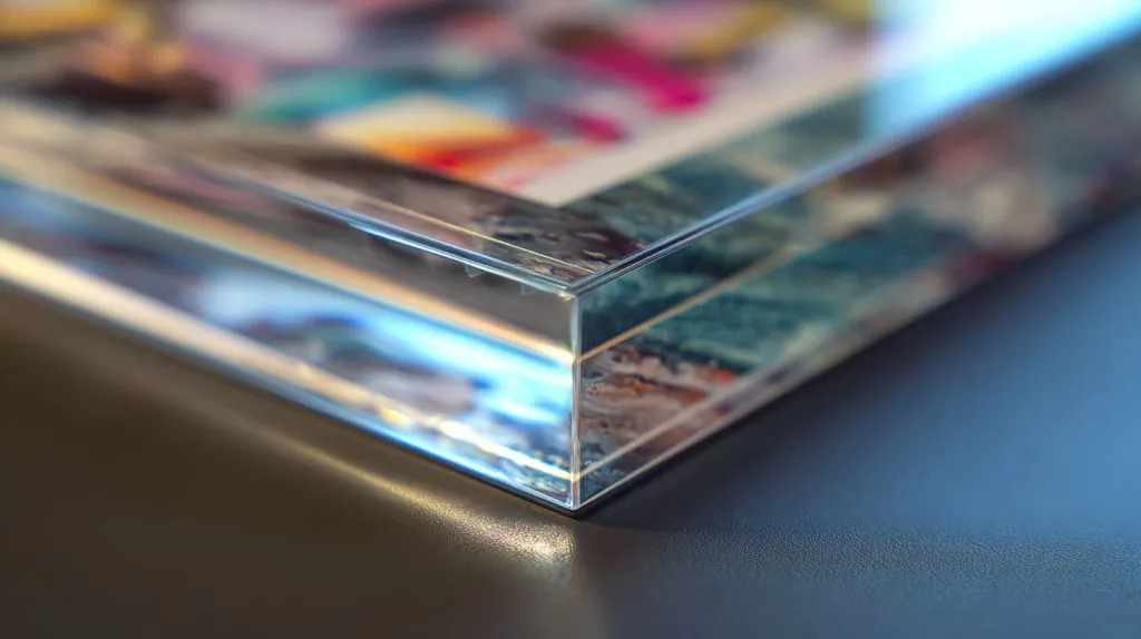
OP3 is easy to misunderstand because it sounds premium.
UV-filtering acrylic feels like an upgrade. It sounds safer. It sounds more professional.
And in many cases, it is a smart choice.
But I do not use OP3 just because the project sounds high-end. I use it when UV protection is truly part of the problem.
The real decision for me is simple: if the main risk is fading or UV damage, OP3 moves up the list; if the main risk is glare, I keep looking.
Best Use Cases for OP3
OP3 makes sense when the item behind the acrylic needs protection from ultraviolet light.
This can include:
- Artwork
- Photographs
- Posters
- Signed documents
- Retail packaging
- Museum-style displays
- UV-sensitive product samples
For these applications, clarity is also important. Nobody wants protection that makes the item look dull.
That is why OP3 can be useful. It can protect while still keeping a clear look.
| Application | Why OP3 Can Work Well |
|---|---|
| Art frame | Helps protect artwork from UV exposure |
| Photo display | Keeps image clear while adding protection |
| Retail product case | Protects packaging or product surface |
| Museum-style cover | Supports long-term display needs |
| Collectible display | Helps protect value and appearance |
I have worked with buyers who cared a lot about long-term presentation.
They did not only ask, “How does it look today?”
They asked, “How will it look after months under light?”
That is the right question for OP3.
When OP3 Fails
OP3 can fail when the buyer expects it to solve the wrong problem.
If the real issue is strong reflection, OP3 may not be enough.
For example, imagine a clear acrylic cover over a dark poster. The poster is displayed under bright lights. The buyer chooses OP3 because he wants a better sheet.
But the final result still reflects the ceiling lights.
The buyer may feel disappointed.
But OP3 did what it was meant to do. It was just not chosen for the right reason.
| Real Problem | Is OP3 Enough? | Better Thinking |
|---|---|---|
| UV damage risk | Yes, often suitable | Confirm UV needs |
| Strong glare | Not usually | Consider P99 or test options |
| Soft light diffusion | No | Consider P95 |
| Premium clear display | Maybe | Confirm lighting and reflection |
| Long-term artwork protection | Yes | OP3 may be a strong option |
This is why I never describe OP3 as “better acrylic” in a general way.
Better for what?
That question keeps the project honest.
If the buyer needs UV protection and clear viewing, OP3 can be very useful. If the buyer needs glare control, OP3 may only solve half the story.
And some projects do not need UV protection first. They need softer light. That is where P95 enters the conversation.
When P95 Makes Sense in Design
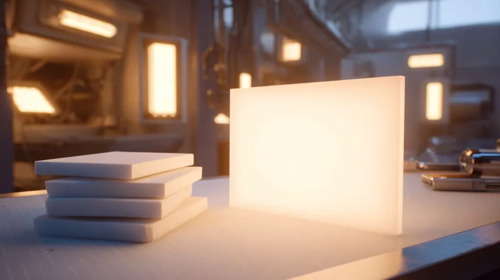
P95 has a quiet charm.
It does not shout like a shiny clear sheet. It does not try to show every detail with sharp edges. It softens the surface. It softens light. It makes the product feel calmer.
For some designs, that is exactly the point.
I become careful with P95 when the buyer talks about “premium matte look,” because matte can look premium in one project and make another project look unclear.
Ideal Applications
P95 is often a good choice when the project needs diffusion.
This is common in lighting-related designs.
For example:
- LED light panels
- Backlit signs
- Decorative lighting covers
- Soft display panels
- Interior design acrylic parts
- Acrylic panels where a gentle surface is desired
In these projects, perfect sharpness is not always the main goal.
The goal may be to hide LED points. It may be to create even light. It may be to reduce harsh reflection. It may be to create a soft brand feeling.
| Application | Why P95 Makes Sense |
|---|---|
| LED panel | Helps spread light more evenly |
| Backlit sign | Reduces harsh bright spots |
| Decorative cover | Creates a soft matte look |
| Retail background panel | Gives a calmer surface |
| Display divider | Reduces reflection and feels gentle |
I often compare P95 to soft lighting in photography.
A hard light shows every line and shadow. A soft light makes the scene smoother. Neither is always better. It depends on the mood you want.
P95 can do that for acrylic design.
Limitations to Watch
The main limitation of P95 is reduced sharpness.
If the buyer puts detailed graphics behind it, the result may not look crisp.
If the project has small text, QR codes, fine patterns, or detailed product images, I become careful. The matte surface can make details less clear.
This does not mean P95 is poor quality.
It means the sheet is doing its job.
It is softening light and reducing harsh reflection.
That softness may become a problem if the project needs a sharp view.
| Project Need | P95 Risk |
|---|---|
| Small text readability | Text may look less sharp |
| Fine printed graphics | Detail may soften |
| Clear product viewing | Product edges may look less crisp |
| Premium photo display | Image depth may reduce |
| Close viewing | Surface texture may be more noticeable |
Another detail is the matte side direction.
For some projects, the matte side should face outward. For others, it may need to face inward. The final effect can change depending on the design.
This is a small detail, but small details are often where custom acrylic projects win or lose.
| Detail to Confirm | Why It Matters |
|---|---|
| Matte side direction | Changes surface feel and visual effect |
| Thickness | Affects strength and optical look |
| Distance from light source | Changes diffusion result |
| LED spacing | Impacts whether light spots show |
| Viewing distance | Affects how much blur is noticed |
P95 is a good design sheet.
But I do not choose it only because “matte looks better.”
I choose it when the project needs softness more than sharpness.
If the buyer needs stronger glare control for viewing, especially in framing or bright areas, then P99 may be a better discussion.
When P99 Is the Better Option
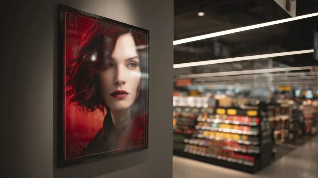
P99 is attractive because it promises something many buyers want.
Less glare.
That sounds simple. And in many environments, glare is a real problem.
A beautiful image can disappear under one ceiling light. A product label can become hard to read. A frame can turn into a mirror. A display can look messy even when the product inside is perfect.
So yes, P99 can be useful.
But I never treat P99 as a free lunch, because every step away from reflection usually asks for something back from sharpness.
Where P99 Performs Well
P99 performs well when glare is the main enemy.
This can happen in:
- Picture frames under strong lighting
- Displays facing windows
- Covers placed under ceiling lights
- Retail signs in bright stores
- Exhibition panels with many light sources
- Public viewing areas where the angle is hard to control
In these conditions, normal clear acrylic may reflect too much light. The viewer may struggle to see what is behind the sheet.
P99 can help by diffusing reflected light.
| Application | Why P99 Can Help |
|---|---|
| Photo frame | Reduces distracting reflection |
| Poster cover | Improves viewing under light |
| Retail display | Helps customers see through glare |
| Exhibition panel | Works better with uncontrolled lighting |
| Office wall display | Reduces mirror-like reflection |
P99 can be especially useful when the viewer cannot choose the best viewing angle.
For example, in a retail store, customers stand in different places. They move quickly. They do not adjust their body like a photographer trying to avoid reflection.
The display needs to work for real people.
That is where non-glare acrylic can help.
Trade-Offs to Accept
The trade-off is image sharpness.
P99 can reduce reflection, but it may also reduce visual depth.
This becomes more obvious when:
- The image has fine details
- The image sits behind a gap
- The background is dark
- The viewer stands close
- The product needs a luxury feeling
| Benefit | Trade-Off |
|---|---|
| Less glare | Softer image |
| Easier viewing under light | Reduced fine detail |
| Better comfort for eyes | Less visual depth |
| Less mirror effect | Possible cloudy feeling |
| Good for bright spaces | Not always best for premium product shine |
This is why I want buyers to test P99 with the real artwork or product, not only a random sample.
A blank sample can mislead people.
A sheet may look good when held in the hand. But put it over a dark luxury product photo with fine text, and the result may feel different.
For P99, sample testing is not just a nice step.
It is protection.
A Practical Example
Let me use a simple example.
A buyer wants an acrylic cover for a framed product story card. The card has a dark background, small text, and a glossy product image. The display will sit under strong store lights.
The buyer asks for P99.
At first, that makes sense. The light is strong.
But then I would ask:
- Is the small text still readable?
- Is the product image still sharp?
- Is the card touching the acrylic or sitting behind a gap?
- Will customers view it close or from far away?
- Does the brand want a soft look or a rich look?
If the answer is “we need the text and product image to look very sharp,” then we may need to test P99 carefully. We may also need to adjust lighting or display angle.
Sometimes the best solution is not only changing material.
Sometimes it is changing the whole viewing setup.
That is why I always come back to the application first. The sheet name comes later.
How to Choose Based on Application, Not Name
If I had to give one simple rule, it would be this:
Do not start with OP3, P95, or P99.
Start with the job the acrylic needs to do.
That sounds simple, but it changes everything.
A buyer who starts with the sheet name asks, “How much is P99?”
A buyer who starts with the application asks, “Can customers see the product clearly under strong lights?”
The second question is much more useful.
My safest way to choose is to describe the failure I want to avoid first, because the right sheet is usually the one that prevents the most expensive failure.
Define the Primary Goal
The first step is to define the main goal.
Usually, the buyer wants one of these:
- UV protection
- Clear product visibility
- Glare reduction
- Soft lighting
- Matte surface effect
- Premium visual feeling
- Long-term display protection
The problem is that buyers often want all of them at once.
That is normal.
But acrylic selection always has trade-offs.
| Primary Goal | Better Starting Point |
|---|---|
| Protect artwork from UV | OP3 |
| Create soft lighting | P95 |
| Reduce strong glare | P99 |
| Keep maximum clarity | Clear acrylic or OP3 |
| Hide LED hot spots | P95 |
| Improve viewing comfort | P99 |
| Keep deep visual contrast | OP3 or clear sample test |
The key word is “primary.”
Not “nice to have.”
Not “maybe.”
Primary.
If the main goal is UV protection, OP3 makes sense.
If the main goal is soft light, P95 makes sense.
If the main goal is glare control, P99 makes sense.
This simple step prevents many mistakes.
Evaluate Environment Conditions
The environment can change everything.
A sheet that looks good in a meeting room may look bad in a retail store.
A sheet that works well under soft office light may fail under spotlights.
So I want to know where the product will be used.
| Environment Factor | Question to Ask |
|---|---|
| Light direction | Is light coming from above, front, side, or back? |
| Light strength | Is the display under strong spotlights? |
| Viewing angle | Will customers view it straight or from the side? |
| Viewing distance | Will people stand close or far away? |
| Background color | Is the object behind acrylic dark or light? |
| Product detail | Are there small words, logos, or fine lines? |
Dark backgrounds often show reflection more clearly.
Small text needs sharpness.
Strong lights create glare.
Large viewing angles can change the surface effect.
These details are not small.
They are the real project.
Test Before Mass Production
Testing may sound slow, but it often saves time.
For custom acrylic projects, I like side-by-side comparison.
Not one sample today and another sample next week.
Side by side.
Same light.
Same product.
Same viewing angle.
Same distance.
That is how the buyer can see the difference honestly.
| Test Method | Why It Helps |
|---|---|
| Side-by-side sheet comparison | Shows real visual difference |
| Real product behind acrylic | Avoids misleading blank samples |
| Real lighting condition | Matches final use |
| Close and far viewing | Checks both detail and comfort |
| Photo and video review | Helps remote teams compare |
| Buyer approval sample | Reduces later arguments |
A good test does not need to be complicated.
Sometimes three small pieces are enough.
One OP3.
One P95.
One P99.
Put them over the real printed image or product. Turn on the real light. Look from the real viewing distance.
That small test can prevent a big headache.
And for B2B buyers, that headache often includes their customer, their boss, their deadline, and their reputation.
Now let me turn this into a more practical selection framework.
Practical Selection Framework for B2B Buyers
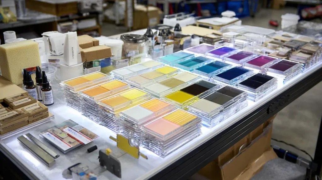
B2B buyers do not have unlimited time.
They need to send drawings. They need to confirm prices. They need samples. They need mass production. They need the goods to arrive without drama.
I understand that.
So the goal is not to make material selection more complicated.
The goal is to make it clearer.
For custom orders, I would rather ask three useful questions early than fix thirty small problems later.
Quick Decision Table
Here is a simple starting table.
It is not a replacement for testing. But it helps the buyer avoid the most common wrong direction.
| Requirement | Recommended Sheet | Why |
|---|---|---|
| UV protection + clarity | OP3 | Protects sensitive items while keeping a clear view |
| Soft lighting effect | P95 | Spreads light and creates a matte surface |
| Anti-glare viewing | P99 | Reduces harsh reflection under strong light |
Here is a slightly more detailed version for real projects.
| Project Situation | First Sheet to Consider | Warning |
|---|---|---|
| Museum-style acrylic cover | OP3 | Check reflection if lighting is strong |
| Photo frame in bright room | P99 | Check image sharpness |
| LED light panel | P95 | Check light uniformity |
| Luxury retail product display | OP3 or test P99 | Avoid losing product depth |
| Backlit sign | P95 | Confirm LED spacing and thickness |
| Dark poster under ceiling lights | P99 | Test for cloudy effect |
| UV-sensitive printed sample | OP3 | Confirm UV requirement and clarity |
| Decorative matte panel | P95 | Confirm surface direction |
Acrylic selection is not only technical. It is visual. It is emotional. It is commercial.
If the display makes the product look better, it helps sales.
If it makes the product look weaker, it hurts the whole project.
Questions Buyers Should Ask Suppliers
A good supplier should not only answer the sheet name.
A good supplier should help confirm the real use.
Here are questions I think buyers should ask before confirming OP3, P95, or P99.
| Question | Why It Matters |
|---|---|
| What is the haze percentage? | Haze affects clarity and diffusion |
| Is the finish single-sided or double-sided? | Surface direction changes the result |
| Can you provide samples? | Real viewing is better than guessing |
| Can we test under similar lighting? | Lighting changes everything |
| What thickness is available? | Thickness affects cost and strength |
| Can the sheet be laser cut or CNC cut cleanly? | Processing affects final quality |
| Will edge polishing change the look? | Edges matter in display products |
| Is the material stable for repeat orders? | Batch consistency matters |
| Can you match the approved sample later? | Repeat quality protects the buyer |
For custom orders, I also want to know:
- Is the acrylic only a cover?
- Is it part of a display structure?
- Will it be bonded?
- Will it be bent?
- Will it be printed?
- Will it face strong light?
- Will customers touch it?
- Will it need cleaning often?
These questions may sound simple.
But they make the quotation more accurate and the final product safer.
A Simple Buyer Workflow
Here is the workflow I like.
| Step | What to Do |
|---|---|
| 1 | Define the main visual goal |
| 2 | Describe the final use environment |
| 3 | Choose 2–3 possible sheets |
| 4 | Make small comparison samples |
| 5 | Test with real product or artwork |
| 6 | Confirm sheet, thickness, and surface direction |
| 7 | Approve sample before mass production |
This process is not slow.
It is controlled.
There is a big difference.
Slow means nobody knows what to do.
Controlled means each step reduces risk.
For B2B custom acrylic work, that control is valuable.
It protects the buyer.
It protects the supplier.
Most importantly, it protects the final product.
Conclusion
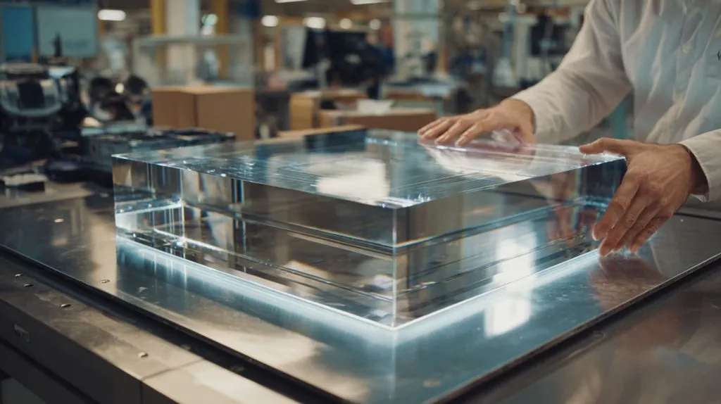
OP3, P95, and P99 are not simple upgrades.
They are tools.
OP3 is useful when UV protection and clarity matter.
P95 is useful when soft light and matte feeling matter.
P99 is useful when glare control matters.
But none of them is automatically the best choice.
The best sheet depends on the real application.
This is the reason I do not like choosing acrylic only by sheet name. I have seen too many projects where the buyer used the “right” name but still got the wrong result. The sheet did what it was designed to do. But it did not solve the project’s real problem.
That is why I care about questions before quotations.
Where will the display be used?
What kind of light will hit it?
How close will people stand?
Does the product need sharp detail?
Does the buyer care more about UV protection, soft lighting, or less glare?
These questions are not extra work. They are the work.
For me, this thinking comes from real factory experience. A custom acrylic product is not judged by the material name on the invoice. It is judged by the final feeling in front of the user. If the acrylic makes the product look clear, protected, and suitable for the environment, the material choice is right. If it creates blur, glare, dull color, or rework, the cheap choice becomes expensive very quickly.
So my advice is simple.
Do not ask only, “Do you have OP3, P95, or P99?”
Ask, “What result do I need this sheet to create?”
That small question can save money, time, and trust.
At Feilong Acrylic, we work with B2B custom acrylic projects every day, from display covers and frames to boxes, stands, racks, organizers, and store display parts. If you have a custom acrylic project and you are not sure whether OP3, P95, P99, or another sheet is the right choice, you can share your drawing, application, lighting condition, and quantity with us.
I would rather help you check the material before production than help you fix a problem after delivery.
Because the real cost is not the sheet.
The real cost is choosing blindly.