Skip to content
Non-glare acrylic sounds like a simple upgrade.
That is how many framing projects start.
A buyer looks at a sample frame under strong light. The clear acrylic reflects the ceiling lamp. The artwork almost disappears for a second. Someone says, “Can we use non-glare acrylic instead?”
The idea feels right.
Less glare should mean a better view, right?
Not always.
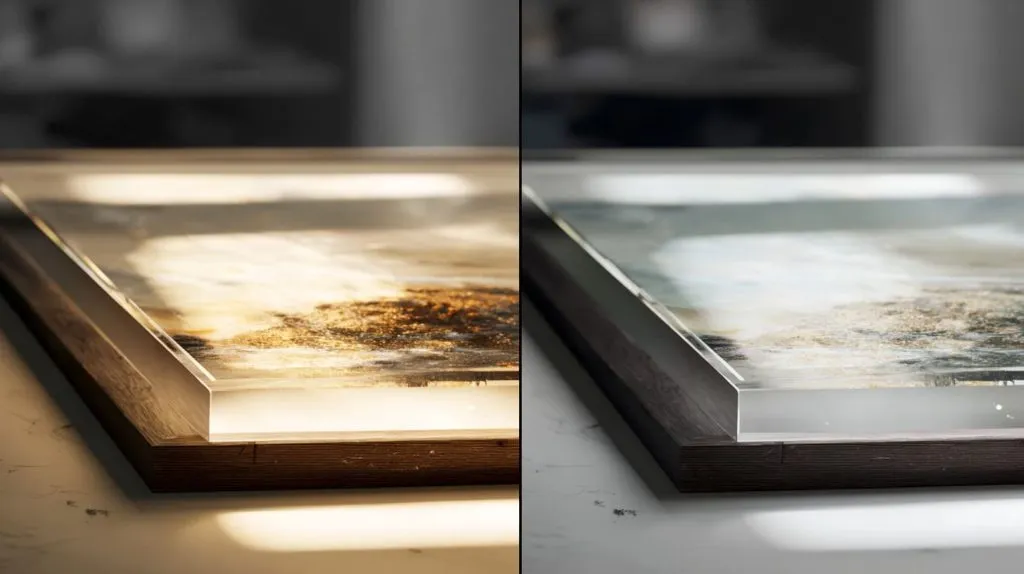
Non-glare acrylic can reduce reflections, but it can also make framed images look softer, flatter, and less vivid. It solves one problem by creating another one.
I have seen this happen in custom acrylic framing and display projects. A buyer wants a clean, premium look. The designer wants the image to be easy to see. The purchasing team wants fewer complaints from end users. So non-glare acrylic looks like the safe choice.
But when the sample arrives, the picture may look a little cloudy. The black areas may lose depth. Fine lines may look less sharp. The customer may ask a painful question:
“Why does the image look worse?”
That is the hidden trade-off.
Acrylic is not only a cover sheet. It becomes part of the viewing experience. It sits between the eye and the image. If that sheet changes how light moves, it changes how the image feels.
For product designers, mold designers, sourcing managers, and buyers like Jacky, this small detail matters. It can affect product value, customer approval, and repeat orders.
When I review a framing project, I do not ask only, “Do we need less glare?” I ask, “What kind of image are we protecting, where will people view it, and how much clarity can we afford to lose?”
That small question can save a project from looking “technically correct” but visually disappointing.
A good material choice should not only look good on a quote sheet. It should look good in the hands of the final user.
What Is Non-Glare Acrylic and How Does It Work?
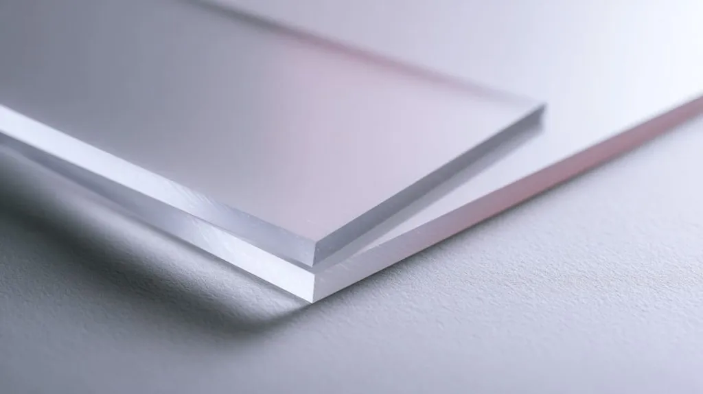
Non-glare acrylic is acrylic sheet made to reduce strong reflections on the surface.
Many people also call it P99 acrylic in framing and display work. The surface is not the same as normal clear acrylic. It has a fine matte or lightly textured finish. This surface spreads light instead of letting it bounce back like a mirror.
That sounds simple.
But this simple surface change is also the reason framed images may look less sharp.
The detail that I watch closely is not only the acrylic name, but the distance between the acrylic sheet and the printed image, because even a small air gap can make the softening effect more visible.
What defines non-glare acrylic?
Non-glare acrylic usually has a light-diffusing surface.
This surface may look smooth from far away. But under close inspection, it is not optically flat like clear acrylic. It has tiny surface texture. That texture changes how light passes through the sheet.
In framing, the common goal is simple:
- Reduce bright reflections
- Make images easier to view under lighting
- Avoid mirror-like glare from lamps or windows
- Give the frame a softer surface look
But the same surface that reduces glare can also reduce image clarity.
| Acrylic Type | Surface Look | Main Purpose | Common Result |
|---|---|---|---|
| Clear acrylic | Glossy and smooth | Maximum image clarity | Strong reflections |
| Non-glare acrylic | Matte or lightly textured | Reduce glare | Softer image |
| Anti-reflective acrylic | Special coated surface | Reduce reflection while keeping clarity | Clear image with lower reflection |
| UV-filtering acrylic | Usually clear or lightly tinted | Protect image from UV light | Better fading protection |
This is why I do not treat “non-glare” as a simple quality level. It is not automatically higher grade. It is a different function.
A hammer is not better than a screwdriver. It is just made for a different job.
How does non-glare acrylic reduce reflections?
Clear acrylic reflects light in a more direct way.
When a lamp shines on it, your eye may see a bright spot. That bright spot is glare. It can block part of the image. It can make the framed picture hard to enjoy.
Non-glare acrylic works differently. Its surface scatters light in many small directions. The reflection becomes softer. The bright lamp reflection becomes less harsh.
But there is a price.
The image light also passes through that same textured surface before reaching your eye. So the image itself can look less crisp.
I like to explain it this way:
Clear acrylic is like looking through a clean window.
Non-glare acrylic is like looking through a very fine mist on that window.
You can still see the picture. But it may not feel as sharp.
Non-glare is not the same as anti-reflective
This is one of the biggest misunderstandings I see.
Many buyers hear “non-glare” and think it means “anti-reflective.” But these two materials are not the same.
Non-glare acrylic reduces reflection by diffusing light. Anti-reflective acrylic reduces reflection through special optical coating. The result can be very different.
| Feature | Non-Glare Acrylic | Anti-Reflective Acrylic |
|---|---|---|
| Main method | Surface diffusion | Optical coating |
| Image sharpness | Can be reduced | Usually stays high |
| Reflection control | Good for softening glare | Better for premium clarity |
| Cost | Usually lower | Usually higher |
| Best for | Posters, signs, public displays | Fine art, photos, premium frames |
If a buyer wants lower reflection and also wants high image quality, I usually do not jump to non-glare acrylic first. I check whether anti-reflective acrylic or clear UV acrylic may be a better match.
That decision can change the whole feeling of the final frame.
A sheet can look almost the same before installation. But after the artwork goes behind it, the truth shows up.
Why Non-Glare Acrylic Reduces Image Sharpness
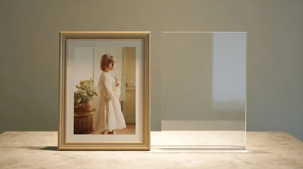
Image sharpness is a quiet thing.
People do not always mention it when it is right. But they notice it fast when it is wrong.
A framed photo can lose its “bite.” A certificate can look slightly fuzzy. A product display image can look less expensive than expected. The material may be correct, but the result feels weak.
I judge this issue by looking at the smallest details first, because fine text, thin lines, and facial features usually reveal the problem before the larger image does.
Surface diffusion and its impact on detail
Non-glare acrylic has a micro-textured surface.
That texture spreads light. When light from the printed image passes through the acrylic, the tiny surface pattern can slightly shift and scatter the image information.
This is why sharp details may become softer.
You may notice it in:
- Small text
- Fine line drawings
- Hair details in portraits
- Product edges in photography
- Black-and-white artwork
- Certificates or awards with thin typography
The effect may be small. But small is not always harmless.
In a retail store, a buyer may not say, “The optical diffusion is too strong.” No one talks like that. They just say, “This sample looks a bit blurry.”
And that sentence can stop an order.
Viewing distance matters
Non-glare acrylic does not always look bad. The viewing distance makes a big difference.
If people view the frame from far away, the softening effect may be hard to see. If people view it from close range, the blur becomes much easier to notice.
| Viewing Distance | Effect of Non-Glare Acrylic | Risk Level |
|---|---|---|
| Under 30 cm | Softness is easy to see | High |
| 30–80 cm | Detail loss may be noticed | Medium |
| 1–2 meters | Usually acceptable for posters | Low to medium |
| Over 2 meters | Often less noticeable | Low |
This is why I ask where the frame will be used.
A wall poster in a hallway is not the same as a framed product certificate on a retail counter. A gallery print is not the same as an office safety notice.
The material may be the same. But the viewer behavior is different.
Real-world example in framing
I once handled a custom acrylic project where the customer wanted non-glare covers for framed promotional prints. The images looked bold on screen. Strong product colors. Clean edges. A premium feel.
Then we tested non-glare acrylic.
The reflection was better. No doubt.
But the product edges looked softer. The black background lost some depth. The print no longer had that “expensive” feeling. It looked safe, but not sharp.
So we compared three options:
| Test Sample | Reflection | Sharpness | Color Depth | Final Feeling |
|---|---|---|---|---|
| Clear acrylic | High | Very good | Strong | Crisp but reflective |
| Non-glare acrylic | Low | Softer | Slightly dull | Easy to view but less premium |
| Anti-reflective acrylic | Low | Very good | Strong | Best visual result |
The buyer did not choose the cheapest option. He chose the option that protected the image quality.
That is a common reality in B2B work. The “best” material is not always the one with the best-sounding feature. It is the one that protects the buyer’s final product value.
And once we understand sharpness, color becomes the next problem hiding behind the sheet.
How Non-Glare Acrylic Affects Color and Contrast
Color is emotional.
A red logo can feel strong or weak. A black background can feel deep or washed out. A photo can feel alive or tired.
Non-glare acrylic can change that feeling.
The change may not look dramatic at first. But once the framed image sits next to a clear acrylic sample, the difference becomes easier to see.
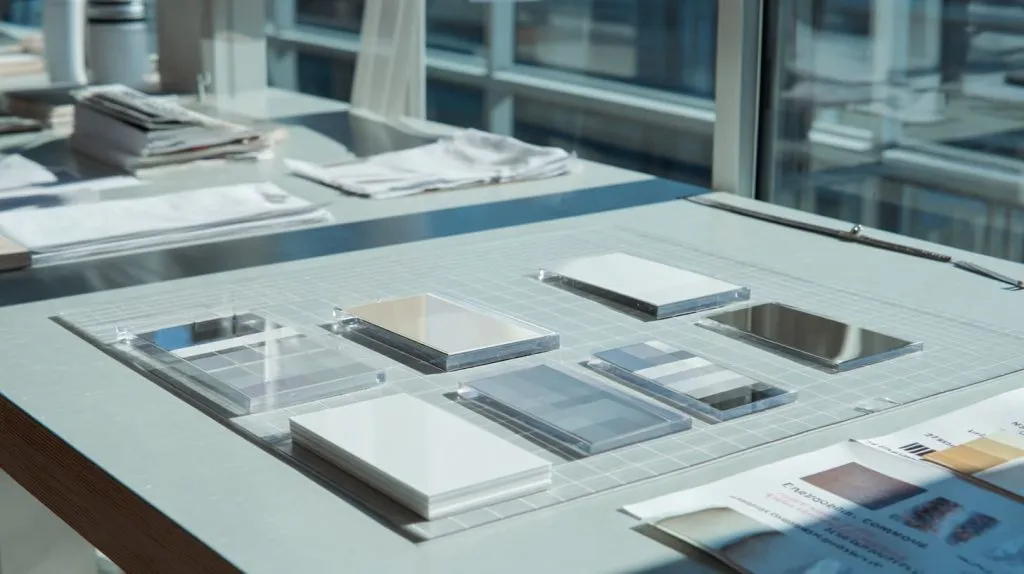
When I compare samples, I do not only look at the glare spot; I put the same print behind different sheets and check whether the black still feels black, because contrast loss often matters more than reflection loss.
Light scattering reduces contrast
Contrast is the difference between light and dark areas.
When non-glare acrylic scatters light, it can reduce this difference. The image may still be visible. But it can feel flatter.
Black areas may look lighter.
White areas may look less clean.
Small shadows may disappear.
This matters a lot for framed images because contrast gives an image its depth. Without enough contrast, the picture can look like it has a thin layer of dust over it.
| Image Type | Contrast Need | Non-Glare Risk |
|---|---|---|
| Black-and-white photography | Very high | Blacks may look gray |
| Fine art print | High | Depth may be reduced |
| Product photo | High | Edges may look less clean |
| Poster graphic | Medium | Often acceptable |
| Informational sign | Low to medium | Usually acceptable |
This is why a non-glare sheet can work well for a public notice but fail badly on a high-end print.
The same material can be right in one project and wrong in another.
Color dulling effect
Non-glare acrylic can also reduce color saturation.
The colors may not disappear. But they may look less lively. Strong red may become softer. Deep blue may lose strength. Rich green may look muted.
For buyers who sell framed artwork, retail display frames, or branded image panels, this can be a serious issue.
A customer may approve a digital proof. Then the final sample looks different. The print shop may blame the material. The material supplier may blame the print. The buyer sits in the middle.
That is never fun.
A simple sample test can prevent this.
I usually suggest comparing:
- One clear acrylic sample
- One non-glare acrylic sample
- One anti-reflective acrylic sample
- The real printed image, not only a color chart
- The real lighting condition, not only office light
The real image tells the truth faster than any specification sheet.
Impact on high-end prints and artwork
High-end prints depend on small visual details.
A buyer may pay more for better paper, better ink, better color control, and better printing. But if the front acrylic reduces depth, the final frame may not show that effort.
This is where non-glare acrylic can become a false saving.
It may reduce surface reflection. But it may also reduce the value that the image was supposed to show.
| Project Goal | Better Material Direction |
|---|---|
| Maximum image clarity | Clear acrylic or AR acrylic |
| Less glare with premium look | Anti-reflective acrylic |
| UV protection with clarity | OP3-style clear UV acrylic |
| Low reflection for basic poster | Non-glare acrylic |
| Low-cost public display | Non-glare or standard acrylic |
I do not like wasting expensive material. But I also do not like saving a small amount and damaging the whole visual result.
That is the kind of trade-off that does not show clearly on a price list.
It shows up when the buyer holds the sample and frowns.
And some projects are simply more likely to show that problem than others.
When Non-Glare Acrylic Makes Framed Images Look Worse
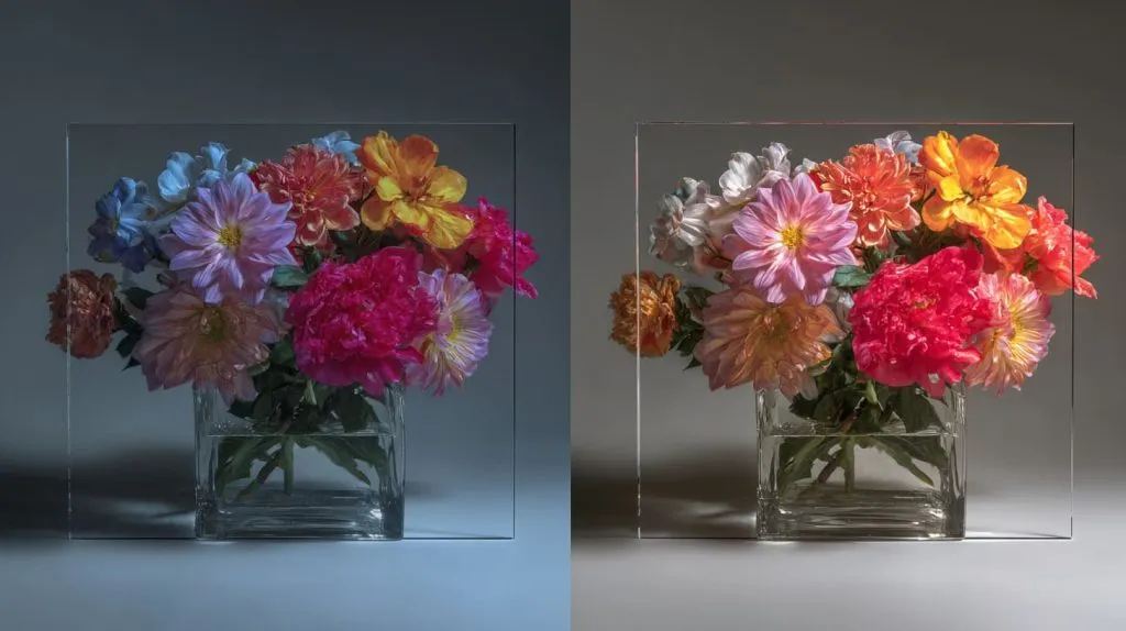
Non-glare acrylic does not ruin every framed image.
But it can make certain images look worse. This is where material choice becomes less about product names and more about use cases.
I have learned to slow down when the artwork has small details, because non-glare acrylic usually punishes detail-heavy images more than simple graphics.
Small or detailed artwork
Small artwork needs clarity.
If the framed piece includes fine lines, small letters, signatures, certificates, or detailed patterns, non-glare acrylic can soften the view.
This can be a problem for:
- Certificates
- Fine art prints
- Technical drawings
- Typography-heavy posters
- Small product labels
- Museum-style display cards
- Detailed illustrations
A certificate is a good example.
Many certificates use small text, thin borders, and official seals. Non-glare acrylic may reduce reflection, but it may also make the certificate look less crisp. That can make the whole frame feel cheaper.
For business buyers, this matters.
A framed certificate in a clinic, school, showroom, or office is not only decoration. It carries trust. If it looks blurry, the message feels weaker.
High-resolution photography
Photography is even more sensitive.
A good photo has details that people feel before they explain. The eye notices skin texture, light edges, shadow depth, and focus. If those details become soft, the image loses energy.
Non-glare acrylic can be risky for:
| Photo Style | Why It Is Sensitive |
|---|---|
| Portraits | Skin, eyes, and hair need clarity |
| Product photos | Edges and reflections show quality |
| Landscape photos | Fine texture creates depth |
| Black-and-white photos | Contrast is very important |
| Luxury brand images | Small visual loss feels expensive |
A product photo behind non-glare acrylic can look less sharp than the original print. That is especially dangerous for retail displays. The framed image may be selling a product, a lifestyle, or a brand feeling.
If the image looks weak, the display loses power.
Close-viewing environments
Close viewing makes the problem bigger.
Many frames are not viewed from across the room. People stand close. They lean in. They read. They compare. They take photos with their phones.
This happens in:
- Retail counters
- Gallery walls
- Hotel lobby displays
- Museum labels
- Trade show booths
- Office reception areas
- Tabletop acrylic frames
In these places, non-glare acrylic may reduce reflection, but it may also create a soft haze. The closer the viewer gets, the more visible that haze becomes.
A customer may not know the material. But the customer knows the feeling.
Something looks off.
Poor lighting conditions
Non-glare acrylic is often chosen because of lighting problems.
But lighting can also make non-glare acrylic look worse.
If the environment has weak light, uneven light, or light from the wrong angle, the diffused surface may create a dull or milky look. The image may look less alive.
| Lighting Condition | Possible Result with Non-Glare Acrylic |
|---|---|
| Strong direct light | Glare is reduced |
| Soft even light | May look acceptable |
| Low light | Image may look dull |
| Side light | Texture may become visible |
| Mixed lighting | Color may look inconsistent |
This is why I never judge non-glare acrylic under one light only.
A sample under factory light may look fine. A sample in the buyer’s store may look different. A sample beside a window may show another result.
Material does not live in a lab. It lives in a real room.
And real rooms are messy.
That is also why many buyers misunderstand this material before they use it.
Common Misunderstandings When Choosing Non-Glare Acrylic

The biggest problems in acrylic selection often start with a good intention.
A buyer wants better quality. A designer wants fewer reflections. A project manager wants fewer complaints. Nobody is trying to make a bad choice.
But the wrong assumption can quietly push the project in the wrong direction.
The mistake I often see is treating one feature as the whole answer, because “non-glare” sounds like a benefit but does not explain what we lose to get that benefit.
This is a common idea.
Non-glare sounds special. It sounds more advanced than clear acrylic. So some buyers assume it must be better.
But premium is not a fixed material name.
Premium means the material matches the job.
A non-glare acrylic sheet may be premium for a large wall poster in a bright office. The same sheet may be a poor choice for a small fine art print viewed from 30 cm away.
| Buyer Assumption | Better Question |
|---|---|
| Non-glare is better | Better for what use? |
| Matte surface looks premium | Does it keep the image clear? |
| Less reflection means better viewing | Does the viewer need sharp detail? |
| Higher material spec means safer choice | Does the spec match the real environment? |
I like this simple rule:
Acrylic quality is not only about what the sheet can do. It is also about what the final viewer needs to see.
That rule sounds basic. But it prevents many expensive mistakes.
Confusing non-glare with anti-reflective
Many buyers mix up non-glare and anti-reflective acrylic.
I understand why.
Both reduce reflection. Both are used in framing. Both sound like they solve the same problem.
But they do not behave the same way.
Non-glare acrylic uses surface texture. It spreads light. That can reduce clarity.
Anti-reflective acrylic uses coating technology. It reduces reflection while keeping better clarity. It is usually more expensive, but it can keep the image looking sharper.
| Requirement | Non-Glare Acrylic | Anti-Reflective Acrylic |
|---|---|---|
| Lower reflection | Yes | Yes |
| High image sharpness | Not always | Usually yes |
| Better for fine art | Risky | Better |
| Lower cost | Usually yes | Usually no |
| Premium framing | Sometimes | Often |
If the project is a high-end frame, I always ask the buyer to compare both samples before making a bulk decision.
A small sample cost is cheap.
A wrong production run is not.
Over-specifying material without use-case match
Sometimes a buyer sends a drawing and already writes “non-glare acrylic” in the material note.
That can be fine.
But I still ask questions.
Where will the frame be used?
How close will people view it?
Is the image a poster, a photo, or a certificate?
Will there be strong lighting?
Is UV protection needed?
Will the buyer accept slight softness?
This is not being difficult. This is protecting the project.
Acrylic selection is not only a purchasing line. It is a design decision.
| Project Detail | Why It Matters |
|---|---|
| Image size | Small images show blur faster |
| Print detail | Fine lines need clarity |
| Viewing distance | Close viewing increases risk |
| Lighting angle | Reflections and haze change |
| Brand level | Premium products need better optics |
| Budget | Material choice must stay realistic |
The wrong acrylic can turn a good frame into an average frame.
And the worst part?
The frame may pass every basic inspection but still fail the customer’s eyes.
That is why we also need to be fair. Non-glare acrylic is not the enemy. It just needs the right job.
When Non-Glare Acrylic Is Actually the Right Choice
I do not want to make non-glare acrylic sound bad.
It is useful. Very useful, in the right place.
The problem is not the material. The problem is using it as a default answer.
My personal rule is simple: I choose non-glare acrylic when reflection control matters more than fine detail, and when people will not judge the image from very close distance.
Large wall displays and posters
Non-glare acrylic can work well for large wall displays.
Large posters are often viewed from a distance. People do not inspect every tiny detail. They read the main message. They see the image shape. They notice the overall design.
For these uses, non-glare acrylic can make sense:
- Office posters
- School displays
- Public notice boards
- Large retail graphics
- Exhibition wall panels
- Event signage
A large poster under bright lights can suffer from strong reflections. Clear acrylic may show lamps, windows, or ceiling panels. Non-glare acrylic can make the display easier to view.
The slight loss of sharpness may not matter much.
This is a good trade-off.
Bright environments with strong reflections
Some environments are difficult for clear acrylic.
A frame may sit near windows. It may face overhead lights. It may be used in a shopping mall, office corridor, or exhibition hall. In these places, glare can be a real problem.
If the viewer cannot see the image because of reflection, sharpness does not help.
That is when non-glare acrylic can be practical.
| Environment | Why Non-Glare May Help |
|---|---|
| Office corridor | Strong ceiling lights |
| Retail store | Mixed lighting and windows |
| Exhibition hall | Bright overhead lighting |
| School wall | Many viewing angles |
| Public building | Function matters more than fine art clarity |
The key is expectation.
If the buyer expects museum-level clarity, non-glare acrylic may disappoint. If the buyer needs readable information in bright light, it may be the right choice.
Functional signage over visual perfection
Some frames are not made to show art.
They are made to share information.
For example:
- Wayfinding signs
- Safety instructions
- Menu boards
- Public notices
- Direction signs
- Office information boards
In these cases, the main goal is readability. The viewer needs to see the message without being blocked by glare.
The image does not need deep blacks or perfect color saturation.
A small softness may be acceptable.
| Framed Item | Best Priority |
|---|---|
| Fine art print | Clarity and color |
| Product photography | Sharpness and contrast |
| Certificate | Text clarity |
| Public notice | Readability |
| Direction sign | Low glare and fast reading |
| Large poster | Balanced visibility |
This is where non-glare acrylic earns its place.
It is not always beautiful. But it can be useful.
And in real manufacturing, useful often matters.
But when the project needs better visual quality, I start looking at other material options.
Better Alternatives for High-Quality Framing
When a buyer says, “I want less glare, but I do not want the image to look worse,” I know we need to slow down.
That sentence means the buyer is not only buying acrylic. The buyer is protecting visual value.
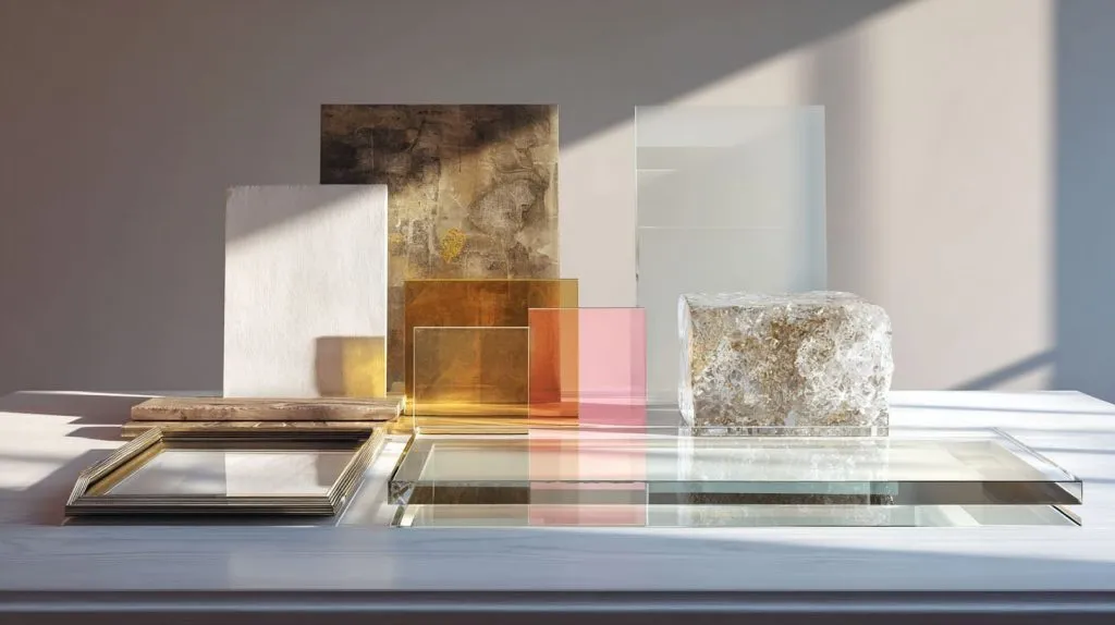
The material I recommend depends on which problem is more dangerous: reflection, fading, breakage, weight, cost, or customer disappointment.
Anti-reflective acrylic
Anti-reflective acrylic is often a better choice for high-quality framing.
It reduces reflection while keeping better image clarity than normal non-glare acrylic. It is usually more expensive, but it can protect the sharpness and color of the artwork better.
This can be useful for:
- Fine art frames
- Premium photography
- Gallery displays
- High-end retail displays
- Museum-style presentation
- Luxury brand image panels
| Factor | Anti-Reflective Acrylic |
|---|---|
| Reflection control | Strong |
| Image clarity | High |
| Cost | Higher |
| Best use | Premium framing |
| Main risk | Budget pressure |
I do not recommend it for every project. That would be lazy.
But when the image is expensive, detailed, or brand-sensitive, AR acrylic can be worth discussing.
A cheap cover can make an expensive print look cheap.
That is a bad trade.
UV-protective clear acrylic
Sometimes the main concern is not glare. It is fading.
For artwork, photos, documents, and special prints, UV light can slowly damage colors. In that case, UV-protective acrylic may be a better choice.
OP3-style acrylic is often used when buyers want UV filtering while keeping a clear view.
It does not solve reflection as strongly as non-glare or AR acrylic. But it can protect the image without the same level of softness.
| Requirement | Suitable Option |
|---|---|
| Reduce fading | UV-protective acrylic |
| Keep sharpness | Clear UV acrylic |
| Reduce strong glare | Non-glare or AR acrylic |
| Premium low reflection | AR acrylic |
A buyer once asked me if UV acrylic and non-glare acrylic were the same. They are not.
One protects against UV.
One reduces glare.
One project may need both. Another may need only one.
This is why material names should never replace project thinking.
Standard clear acrylic with lighting control
Sometimes the best solution is not changing the acrylic.
Sometimes it is changing the lighting.
Clear acrylic gives strong image clarity. The problem is reflection. If the lighting can be controlled, clear acrylic may still be the best choice.
This can work when:
- The frame is installed away from windows
- Lights can be angled differently
- The display position can be adjusted
- The buyer wants high sharpness
- Budget does not allow AR acrylic
| Method | Benefit |
|---|---|
| Move frame angle | Reduces direct reflection |
| Change light direction | Controls glare source |
| Use softer lighting | Reduces harsh reflection |
| Avoid window-facing placement | Prevents bright glare |
| Use clear acrylic | Keeps best sharpness |
This is a small but important point.
Material is not the only tool.
Lighting, distance, image type, and frame position all work together.
Acrylic alone cannot save a bad viewing setup.
Glass vs acrylic comparison
Some buyers also compare acrylic with glass.
Glass can offer good clarity and scratch resistance. But it is heavier and easier to break. Acrylic is lighter and safer, but it can scratch more easily.
For shipping, retail, and custom display work, acrylic often has practical advantages.
| Feature | Glass | Acrylic |
|---|---|---|
| Weight | Heavy | Light |
| Breakage risk | Higher | Lower |
| Clarity | Good | Good |
| Scratch resistance | Better | Lower |
| Shipping safety | More risk | Safer |
| Custom cutting | Possible but less flexible | Very flexible |
| Large size handling | Harder | Easier |
For B2B buyers, the final choice is rarely based on one feature.
It is a balance.
Acrylic can reduce shipping damage. Glass can resist scratches. AR acrylic can improve visual quality. Non-glare acrylic can reduce glare at a lower cost.
The right answer depends on the frame’s job.
So how do we choose without guessing?
I like to turn the decision into a simple checking process.
How to Choose the Right Acrylic for Your Framing Project
Choosing acrylic for framing should not feel like gambling.
But it can feel that way if the buyer only looks at material names.
Clear. Non-glare. Anti-reflective. UV. P99. OP3.
The names can pile up fast.
Before I suggest a material, I try to imagine the final user standing in front of the frame, because that person will not care about the material code if the image looks wrong.
Key decision factors
I usually start with four simple questions.
1. How close will people view the image?
Close viewing needs better clarity.
If people will stand very close, non-glare acrylic can be risky. The softening effect becomes easier to see.
| Viewing Distance | Safer Choice |
|---|---|
| Very close | Clear, UV clear, or AR acrylic |
| Medium distance | Depends on lighting and image detail |
| Far distance | Non-glare may work well |
2. How strong is the lighting?
Strong lighting can make clear acrylic hard to view.
If the frame faces lights or windows, reflection control becomes more important.
But I still check whether the image can accept some softness.
3. How detailed is the image?
Fine details need clear viewing.
A poster with large text can accept more softness. A fine art print cannot.
| Image Detail Level | Non-Glare Risk |
|---|---|
| Very high detail | High |
| Medium detail | Medium |
| Simple graphic | Low |
| Large text sign | Low |
4. What is the budget?
Budget matters.
I do not like pretending it does not.
AR acrylic may be visually better, but it costs more. Non-glare acrylic may be more affordable, but it may reduce clarity. Clear acrylic may be cost-friendly, but reflection can be a problem.
A good choice respects both the image and the budget.
Quick selection table
This table is not perfect for every project, but it helps buyers start in the right direction.
| Use Case | Recommended Material | Reason |
|---|---|---|
| Fine art / photography | Anti-reflective acrylic | Low reflection with better clarity |
| Posters / large signage | Non-glare acrylic | Reflection control matters more than fine detail |
| General framing | Clear acrylic | Good clarity and practical cost |
| UV-sensitive artwork | OP3-style UV acrylic | Helps protect against fading |
| Certificates | Clear or AR acrylic | Text clarity is important |
| Retail product images | AR acrylic or clear acrylic | Sharpness affects perceived value |
| Public notice boards | Non-glare acrylic | Readability matters most |
| Budget display frames | Clear or non-glare acrylic | Depends on lighting and viewing distance |
A simple buyer checklist
Before bulk order, I suggest checking these points:
- Does the image have small text?
- Does the artwork need strong color depth?
- Will people view it closely?
- Is the lighting harsh?
- Is UV protection needed?
- Is reflection more serious than softness?
- Can the buyer approve a physical sample?
- Will the final user judge it as premium or only functional?
If the project is important, I do not rely on one sample photo. Photos can lie. Lighting can lie. A material name can also mislead.
A real printed sample behind real acrylic tells the truth.
Sample testing method
A simple sample test can be very useful.
| Test Step | What To Check |
|---|---|
| Place same print behind clear acrylic | Check maximum clarity |
| Place same print behind non-glare acrylic | Check softness and haze |
| Place same print behind AR acrylic | Check reflection and sharpness |
| View under strong light | Check glare control |
| View from close distance | Check blur and text clarity |
| View from normal distance | Check real user experience |
| Compare black areas | Check contrast loss |
| Compare brand colors | Check color dulling |
This test does not need to be complicated.
It just needs to be honest.
One mistake I see too often is testing acrylic without the real print. A material sample alone cannot show the full result. The print, the acrylic, the light, and the distance all work together.
That is why the final decision should come from the full viewing condition, not only from the material name.
Conclusion
Non-glare acrylic can be useful, but it is not always the best choice for framed images.
It reduces reflection by spreading light. That can help in bright spaces. It can make large posters, public signs, and functional displays easier to view.
But the same surface can also reduce sharpness, contrast, and color depth.
That is why some framed images look worse behind non-glare acrylic. The reflection improves, but the image loses life.
For fine art, high-resolution photography, certificates, detailed prints, and premium retail displays, I usually check other options first. Anti-reflective acrylic may keep a clearer image. UV-protective clear acrylic may protect the artwork without making it look soft. Standard clear acrylic may still work well if lighting can be controlled.
The real lesson is simple.
Do not choose non-glare acrylic only because it sounds better. Choose it because the project really needs it.
In my own work, I always prefer to test the actual printed image behind the actual acrylic sheet before bulk production. A small sample can prevent a large disappointment.
If you are working on custom acrylic frames, display covers, retail image panels, or special acrylic presentation products, Feilong Acrylic can help you review the application, compare material options, and produce custom acrylic parts based on your real project needs.
The best acrylic sheet is not always the one with the most attractive name.
It is the one that makes the final image look right.