Skip to content
The design files were open, coffee was cooling, and a courier deadline was ticking in the corner of my screen. We had just three hours left to finalize an event brochure—and something about it felt…off. The text was clean. The images were sharp. But it didn’t say anything. Not really. It didn’t connect. And if it didn’t connect with me, it definitely wouldn’t land with the people we were trying to reach.
That day made something click: a brochure isn’t just printed info. It’s a conversation starter. It’s a handshake before the booth. Get it right, and it sets the tone for the entire event experience. Get it wrong, and even your best pitch might not be heard.
In this post, I’ll walk you through the same framework I now use—whether we’re preparing for a trade show, a launch event, or a private showcase. If you’ve ever stared at an empty InDesign file and wondered where to start, this one’s for you.
Let’s begin with the part most people rush past: figuring out who the brochure is really for.
Know Your Audience & Purpose
I begin every project by writing a name at the top of the brief. Sometimes it’s Jacky, our Canadian product designer who visits Dongguan twice a year. Sometimes it’s the “new buyer who has never touched acrylic before.” That name keeps me honest.
Define clear event goals and success metrics
How many inquiries? How many demos? If I can’t answer these, the design waits.
Identify target attendee personas
I map pain points and desired outcomes. For Jacky, speed of custom tooling matters more than price.
Align tone and messaging with brand voice
Our voice is practical, never flashy. Yours might be playful. Decide early and stick to it.
Critical view: A single brochure rarely serves both first-time visitors and seasoned pros equally. Consider separate runs or clear segmentation in layout.
| Persona | Key Concern | Desired Action |
|---|---|---|
| Jacky | Rapid prototyping | Book a consult |
| New Buyer | Proof of quality | Visit booth |
| Investor | Market potential | Schedule call |
Knowing who we serve sets the rails for every design choice. Next comes the content that earns their trust.
Essential Content Elements
I’ve lost count of brochures that forget the event date. Don’t laugh—it happens.
Must-have logistics (who, what, where, when, why)
| Element | Example | Why it matters |
|---|---|---|
| Who | Feilong Acrylic | Credibility |
| What | Live demo of CNC accuracy | Hook |
| Where | Booth A12, Shenzhen Expo | Way-finding |
| When | Sept 3–5, 09:00–17:00 | Planning |
| Why | Cut lead time by 30 % | Benefit |
Event highlights & unique selling points
Bullet them. Keep each to seven words or fewer.
Speaker / performer spotlights and bios
A headshot plus one killer stat beats a wall of text.
Supporting details: sponsors, schedule, FAQs
FAQs calm silent objections before they grow.
Content locked? Great—now we choose how to fold it into something people actually handle.
Choosing the Right Format & Fold
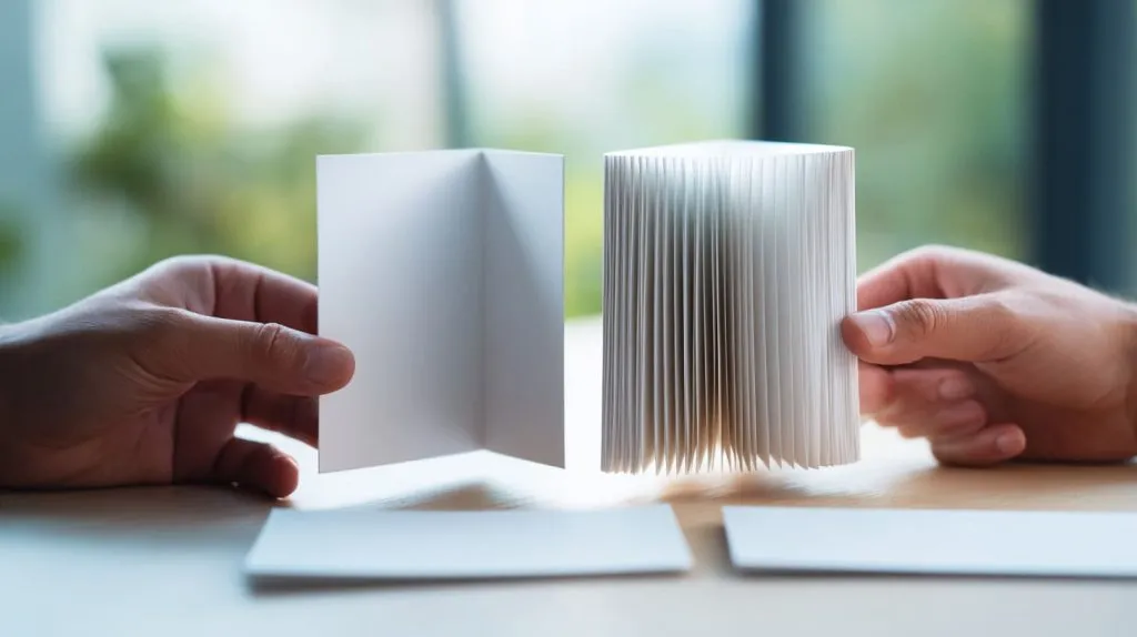
A fold is not decoration; it guides the reader’s hand.
Tri-fold vs. bi-fold vs. accordion: pros & cons
| Format | Pros | Cons |
|---|---|---|
| Tri-fold | Fits standard DL envelopes | Narrow panels restrict art |
| Bi-fold | Magazine feel, roomy visuals | Bulkier to mail |
| Accordion | Storytelling flow, interactive | Harder to stack neatly |
Page count, panel flow, and reading order
Odd numbers create a natural “reveal.” Even numbers feel balanced. Test both.
Sizing for display racks, mailers, and hand-outs
Measure the rack slot before you approve final artwork.
Once the fold is fixed, the layout rules step in to keep eyes moving smoothly.
Visual Design Principles
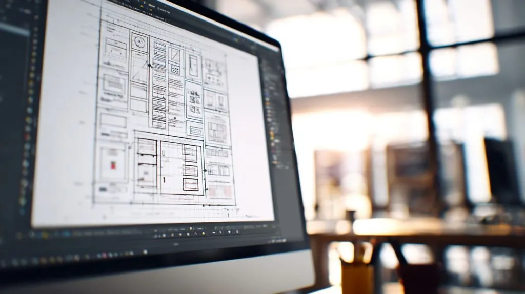
Grid lines are my safety net. They catch me when creative urges push text too close to edges.
Layout grids, white space, and visual hierarchy
More space signals importance. Less space says “skim me.”
Balance imagery with copy for scannability
Aim for a 60 / 40 image-to-text ratio on key panels.
Consistent iconography and way-finding cues
Use the same arrow style for every direction. Consistency builds trust.
Of course, none of this works if it clashes with your brand’s look and feel.
Branding & Consistency
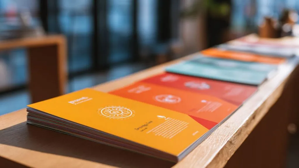
I once tried a neon palette for a partner event. It popped—but looked nothing like our booth. Confusion hurts conversion.
Incorporate logo, colors, and typography guidelines
Keep logo clear space sacred. Never squeeze it to fit.
Extend event theme across all collateral
A brochure shouldn’t surprise anyone who has seen your landing page.
Check hex codes twice. A mis-matched blue is louder than a typo.
Good branding sets the mood. Strong images seal the memory.
Imagery, Graphics & Infographics
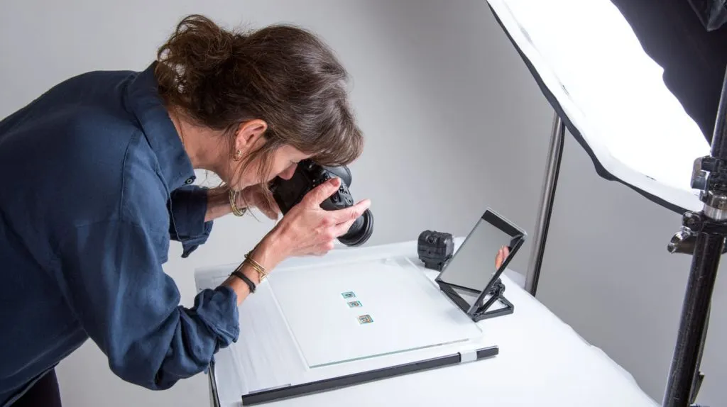
I carry a pocket mirror when scouting photos. If the light flatters acrylic edges in the mirror, it will do so on camera.
Use high-resolution photos that evoke event atmosphere
Show faces, not empty chairs. Energy sells.
Create custom illustrations or pictograms for clarity
Simple line icons beat stock photos for processes.
Apply infographics for schedules, maps, or statistics
A mini heat map helps visitors hit must-see demos in order.
Photos catch the eye; fonts and colors keep it engaged. Let’s choose them carefully.
Typography & Color Strategy
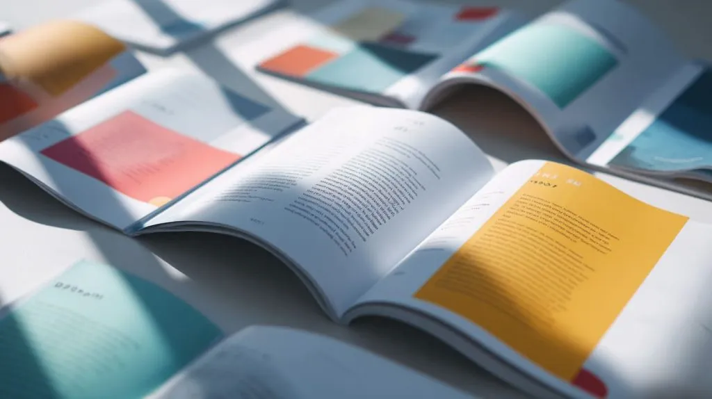
Pair readable fonts with personality fonts
Body: Sans-serif 11 pt. Header: Display font with character.
Use color psychology to drive emotion and focus
| Color | Typical Feel | Where I use it |
|---|---|---|
| Blue | Trust | Process steps |
| Orange | Energy | CTA buttons |
| Grey | Balance | Backgrounds |
Ensure accessibility: contrast ratios & font sizes
Dark text on light background wins nine times out of ten.
A great palette deserves paper that does it justice.
Paper Stock, Finishes & Printing Techniques
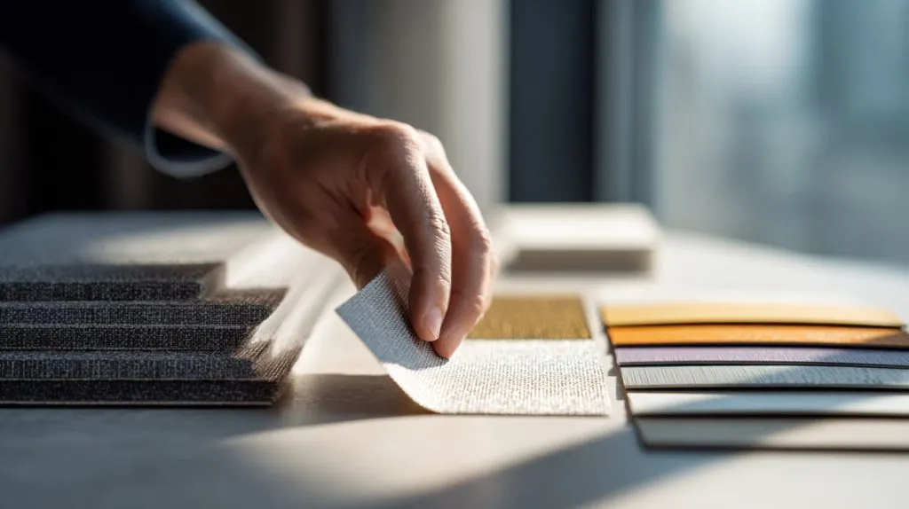
I learned the hard way: matte lamination hides fingerprints at the cost of color depth.
Choose paper weight and texture for perceived value
200 gsm feels solid without spiking postage.
Specialty finishes: matte, gloss, UV spot, foil, emboss
| Finish | Best For | Watch Out For |
|---|---|---|
| Matte | Easy reading | Duller colors |
| Gloss | Vivid photos | Glare |
| UV Spot | Highlight CTAs | Extra cost |
| Foil | Premium feel | Scratches |
Sustainable and budget-friendly print options
Recycled stock paired with soy ink cuts guilt, not impact.
Paper chosen? Great. Let’s add digital layers for readers who live on their phones.
Interactive & Digital Brochure Extensions
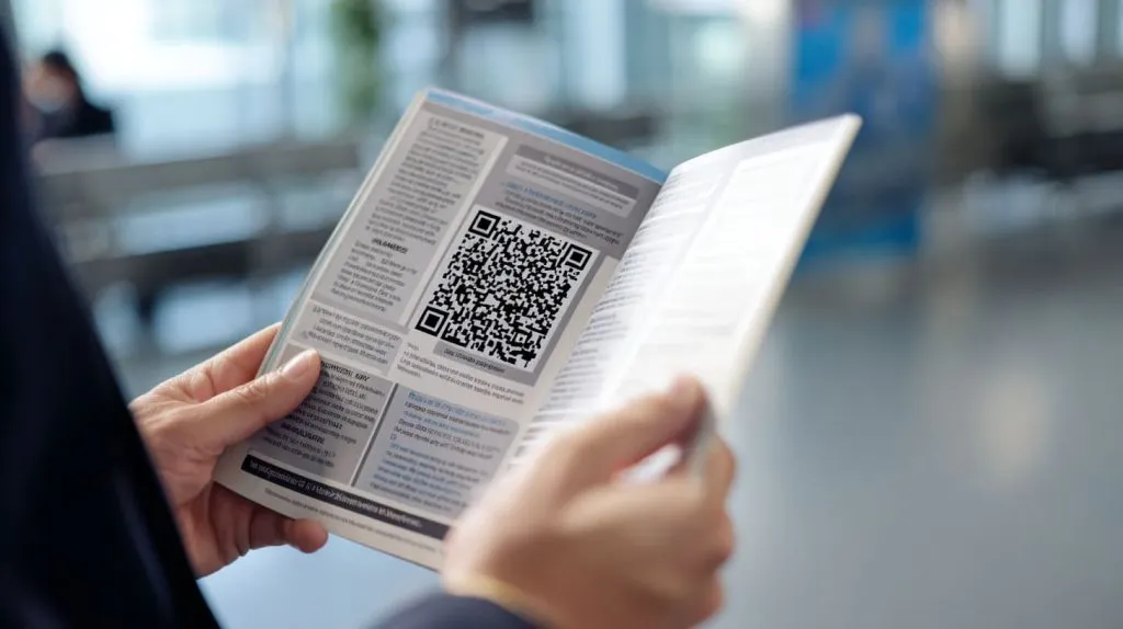
QR codes linking to registration or videos
Place near a thumb corner for quick scan.
Animated or flipbook PDFs for email campaigns
Keep file size under 8 MB to dodge spam filters.
Dynamic updates with online versions
A short URL lets you fix a typo even after print.
Calls-to-action glue all these elements together. Without them, interest slips away.
Calls-to-Action & Contact Information
Craft compelling, action-oriented CTAs
“Book a ten-minute design consult” beats “Learn more.”
Placement and repetition for maximum response
Top, middle, end. Three is magic.
Not everyone loves email. Give choices.
Before we hit print, we need to hunt every error like it owes us money.
Proofing, Testing & Iteration
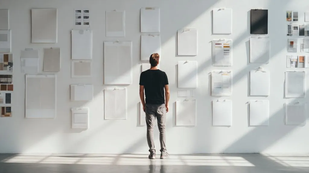
Pre-flight checks: bleeds, margins, color profiles
Adobe Acrobat’s output preview is your friend.
Gather stakeholder feedback and test prints
I tape a draft to the wall and step back two meters. If I can’t read the headline, it’s back to InDesign.
Iterate based on audience response metrics
Track QR scans and sign-ups. Adjust next run.
Now the brochure is battle-ready. Let’s make sure it actually lands in hands, not recycling bins.
Distribution Strategy
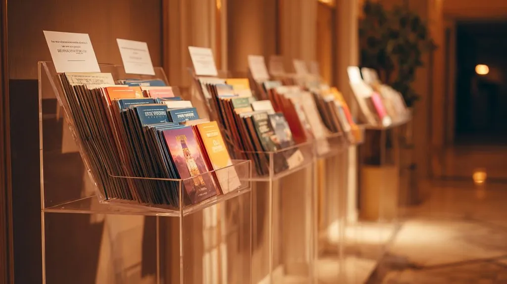
On-site placement: welcome desks, sponsor booths
Refill every two hours. An empty rack signals neglect.
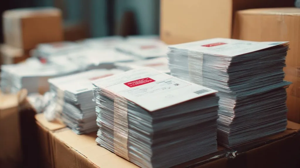
Pre-event mailers and partner inserts
Pair brochures with a personal note. People keep what feels tailored.
A pinned tweet with a glimpse of the cover drives curiosity.
All the pieces fit. Time to wrap up and let you run with it.
Conclusion
Designing a brochure is part science, part gut call. Start with a clear goal, respect your reader’s time, and sweat the small choices—folds, colors, paper. Iterate like your seat count depends on it, because often it does.
Thanks for sharing this coffee-length chat. If you test any of these tips, drop me a line. I’ll be the guy near the press, counting empty boxes with a grin.