Skip to content

An acrylic barrier rarely appears in a design drawing by accident.
When I review counter layouts from buyers, that clear panel usually sits quietly between the cashier and the customer, like a thin line separating two worlds.
At first glance it feels simple. A sheet. A base. Maybe a slot at the bottom.
But once a barrier enters a real workspace, things become more interesting.
People lean forward to talk. Hands slide across the counter. Someone reaches for the payment terminal. A cleaner wipes the panel ten times a day. Suddenly that “simple sheet” begins shaping how the entire counter works.
That is why acrylic barriers became common in many commercial environments. Businesses wanted a way to reduce direct face-to-face exposure while still keeping the counter open and friendly. A solid wall would stop communication. Acrylic keeps visibility while adding a physical boundary.
What many buyers discover later is that barrier design is not only about material or thickness. It is about how the barrier fits the rhythm of the place. A pharmacy counter behaves differently from a hotel reception. A convenience store has a different motion pattern than an office desk.
The moment I review a barrier design, one question always comes to my mind: what will people’s hands do here all day?
If the design ignores that movement, the barrier will create daily friction even if it looks perfect in the drawing.
So in this article I want to slow down and examine acrylic barriers from a practical angle. I will walk through where they are used, why acrylic became the preferred material, and what I personally check before approving a barrier design.
Because the goal is not just to install a panel. The goal is to create protection that quietly works with the real workflow of the space.
What are acrylic barriers and how do they work in service environments?
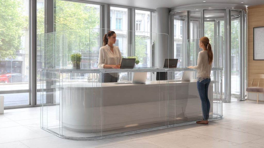
An acrylic barrier is a transparent partition made from acrylic sheet (PMMA). It sits between staff and visitors, most often at a service point. The barrier is simple, but the job is specific: reduce direct droplet travel while keeping the service point usable.
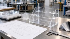
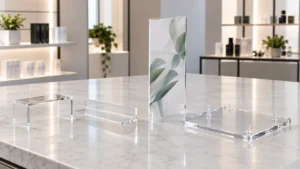
One thing I like about acrylic is how practical it is. It gives good clarity like glass, but it is lighter. It is also easier to fabricate into business-friendly shapes—slots, bends, feet, rounded corners. That is why it became the “default” material for fast deployments.
Here is the part people argue about: “Does it really work?”
My view is more grounded. Acrylic barriers do not create a sterile room. They reduce direct face-to-face exposure at close range. That matters most at counters where people talk, pay, and exchange items.
A small but important detail: barriers help when the airflow and the opening layout do not defeat them. If the pass-through opening is too big, or the barrier sits too low, the protection becomes more psychological than real.
The way I judge it is simple and a bit brutal: if a customer can speak directly into the staff member’s breathing zone through a gap, I treat the barrier as a decoration, not protection.
What an acrylic barrier really is (and is not)
Acrylic barriers are:
- Clear partitions used at close-contact service points
- A physical block for direct droplets and splash
- A way to keep service open without building a wall
Acrylic barriers are not:
- A full-room solution
- A replacement for ventilation and cleaning
- A “one-size-fits-all” panel you copy-paste everywhere
Why acrylic is commonly used for barriers
I see four reasons again and again:
| Reason | Why it matters in real projects |
|---|---|
| Clarity | Customers still want to “see the person” |
| Light weight | Easy shipping, easy installation |
| Impact resistance | Better than glass in busy spaces |
| Easy fabrication | Cutouts, bends, bases, rounded corners |
How barriers reduce direct exposure
Acrylic barriers help mainly by:
- Blocking forward droplets from coughs and sneezes
- Reducing direct splash at close range
- Creating a physical “line” people do not cross
That last point is subtle, but real. People behave differently when there is a clear boundary.
Typical barrier structures you will see
Different environments need different forms:
- Countertop shields (most common)
- Desk partitions (open offices and schools)
- Hanging panels (when counters are narrow)
- Freestanding floor barriers (queues and walkways)
Here’s a quick fit guide I use when talking with buyers:
| Barrier type | Best for | Watch-out |
|---|---|---|
| Countertop | Cashiers, pharmacies | Base wobble, wrong slot location |
| Desk partition | Shared desks | Cable routing, monitor placement |
| Hanging panel | Tight counters | Swinging, ceiling anchor limits |
| Floor barrier | Lines and waiting areas | Trip risk, cleaning around feet |
Before we talk about materials or thickness, I always ask a more human question: Where will hands go all day? Because that is where barriers either help—or annoy people.
And that leads right into the most common use scenarios.
Where are acrylic barriers most commonly used in public spaces?

When people say “acrylic barriers,” most of them imagine a cashier shield. That is true, but it is not the whole story. Barriers show up wherever there is a repeated short interaction: talk, pay, exchange, done.
What I notice is that the “right” barrier depends less on the industry name and more on the interaction style. A pharmacy counter and a bank window look different, but the pattern is the same: high frequency, short distance, and lots of passing objects.
The decision I make in my head is this: I classify the space by interaction type first (talk-only vs talk+exchange), because that decides the opening design more than the location does.
Retail checkout counters
These are classic:
- Supermarkets
- Convenience stores
- Electronics shops
Retail is fast. People move. Bags swing. Kids point. The barrier must stay stable and not block the payment process.
Typical retail needs:
- A clear view of the customer’s hands at payment
- A slot that fits receipts, cash, and small items
- A base that can survive accidental bumps
Reception desks and front offices
These can be calmer, but the counter layout varies a lot:
- Corporate reception
- Hotel front desks
- Office visitor registration
Reception barriers need to feel welcoming. If the barrier looks like a prison window, it can hurt the mood of the space.
Medical and pharmacy counters
Here the barrier has a different emotional weight:
- Hospitals
- Clinics
- Pharmacies
People worry more. They ask more questions. They lean in. That increases close contact. A barrier helps, but only if it does not make communication painful.
Public service environments
- Banks
- Government service windows
- Ticket counters
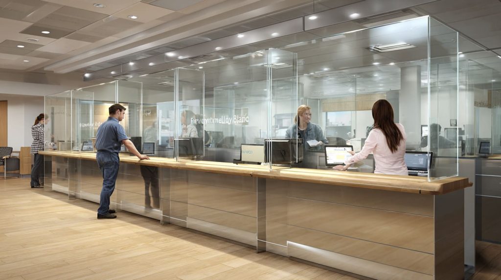
These spaces often need a strong pass-through solution for documents, cards, and sometimes cash.
Educational and workplace settings
- School administration
- Office shared workstations
This is where I see the most “wrong fit” installs. Someone buys a generic panel, then the desk monitor sits behind it, and the glare gets worse, and everyone hates it.
Here is a simple “where it fits best” table I use:
| Space type | Main risk | Barrier goal |
|---|---|---|
| Retail checkout | Fast movement, bumping | Stability + payment access |
| Reception | Image and comfort | Soft look + clear talk |
| Pharmacy/clinic | Close talk + anxiety | Coverage + easy voice |
| Bank/service window | Documents + cards | Slot design + durability |
| Shared office desk | Layout conflicts | Clear space + cable plan |
Once you see these patterns, the next question becomes obvious: why acrylic, not glass or something else?
Why do businesses choose acrylic barriers instead of glass or other materials?
This question shows up a lot in buyer emails. Sometimes it is about cost. Sometimes it is about safety. Sometimes it is about how the barrier “feels” in a clean design.
Glass looks premium. No doubt. But in many real service environments, glass creates a different kind of worry. It is heavy. It can chip. It can break. Shipping is harder. Installation is slower. Replacement feels expensive.
Acrylic is not perfect either. It scratches easier than glass. It can build static. It can look messy if cleaning is wrong. So the choice is not “better material.” It is a trade.
My personal rule is: if the barrier may need to be moved, replaced, or reconfigured later, I lean acrylic, because flexibility beats perfection in living workplaces.
Transparency and communication benefits
Acrylic gives strong visibility. That matters more than people admit. In service work, seeing someone’s face helps reduce tension.
Also, acrylic can be fabricated with smoother edges and friendlier shapes. That changes the vibe of the counter.
Weight and safety advantages
Acrylic is lighter than glass. That impacts:
- Shipping cost
- Installation speed
- Risk during handling
And yes, in many busy spaces, “not shattering” is a real safety comfort.
Cost efficiency (but don’t oversimplify it)
People think cost is only “material price.” In real projects, cost includes:
- Replacement time
- Downtime
- Labor for re-install
- Packaging and freight
Acrylic usually wins because it reduces those hidden costs.
Custom fabrication flexibility
This is where acrylic becomes a work tool, not just a panel:
- Cutouts for payment
- Slots for documents
- Custom curves for counter edges
- Branding options (printing or engraving)
Here is a quick comparison table you can share with a purchasing team:
| Factor | Acrylic (PMMA) | Glass | Polycarbonate (PC) |
|---|---|---|---|
| Clarity | Very high | Very high | High (can haze over time) |
| Weight | Light | Heavy | Light |
| Impact behavior | Good | Can shatter | Very strong |
| Scratch resistance | Medium | High | Medium |
| Fabrication | Easy | Harder | Easy but needs care |
| Cost to replace | Lower | Higher | Medium-high |
I mention polycarbonate because it sometimes enters the conversation for “security.” But for most service barriers, acrylic hits the sweet spot.
Now, none of this matters if the design is wrong. And design is where most projects quietly fail.
What functional designs should be considered before ordering acrylic barriers?
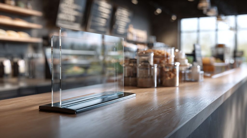
I have seen barriers that “look right” but fail on day two. The staff starts pushing the card reader around. Customers can’t pass receipts smoothly. The base slides. Cleaning becomes a daily fight.
The difference between a barrier that works and one that frustrates people is often just a few centimeters and one missing detail.
Here’s how I think about design: it must support three things at once—
1) protection, 2) stability, and 3) smooth service.
And here is a decision I make almost every time: I design the pass-through opening around the biggest “real object” that must pass, not around what looks neat on the drawing.
Pass-through openings
Openings are where protection and workflow collide.
Common opening needs:
- Slots for documents and receipts
- Gaps for card payment terminals
- Openings for small merchandise transfer
How to size the opening (a practical way)
I ask the buyer:
- What is the biggest item that must pass?
- Is it one hand or two hands?
- Does the customer need to tap, insert, or sign?
A simple sizing guide:
| Use case | Typical opening style | Common mistake |
|---|---|---|
| Receipt + cash | Horizontal slot | Slot too low for hands |
| Card terminal | Side cutout | Terminal blocked by panel |
| Small goods | Wider pass gap | Gap too big, protection lost |
| Documents | Mid-height slot | Papers bend and jam |
Stability and base structure
Acrylic panels are light. That is good for shipping. It is also bad for wobble.
Base options:
- Wide base plates (freestanding)
- Clamp-mounted bases (fixed counters)
- Slot-in feet (quick assembly)
What goes wrong most often:
- Base plate is too narrow
- Counter surface is slick
- Staff pushes the panel daily
A stability table I use:
| Base type | Best for | Risk |
|---|---|---|
| Wide base plate | Temporary setups | Sliding on smooth counters |
| Clamp mount | Permanent counters | Clamp marks, fit limits |
| Slot-in feet | Quick install | Wobble if feet are small |
Size and coverage area
Coverage depends on:
- Counter height
- Standing or seated staff
- Customer distance
- Whether the customer leans in
I don’t chase “maximum height.” I chase “right height.” Too tall can block sight lines and make the space feel cold.
Edge finishing and safety
This is not a small detail. Sharp corners at a public counter are a bad idea.
I prefer:
- Rounded corners
- Polished edges
- Smooth surfaces
Because barriers are touched, cleaned, and bumped. A clean finish reduces complaints.
And once the barrier is installed, something else shows up: how it changes daily work and customer behavior.
How do acrylic barriers affect daily workflow and user experience?
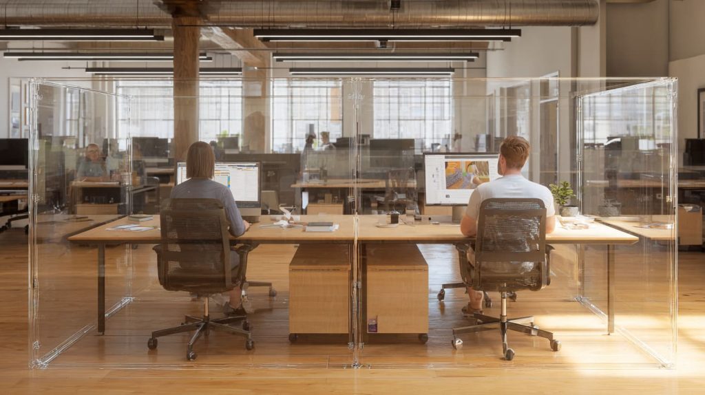
This is the section I wish more buyers cared about. The barrier is not only a safety object. It is a daily interaction object. People lean toward it, talk through it, clean it, and sometimes blame it for everything.
I have had staff tell me, “It’s fine,” while their hands keep bumping the base every two minutes. That is how you know the design is “working” but not working well.
Here’s the judgment I make when I review a real setup: if staff must change their natural motion to avoid the barrier, the barrier will become the enemy, no matter how good it looks.
Staff communication with customers
Acrylic can create a “voice barrier.” Not always, but often.
What helps:
- Proper gap placement
- Not making the barrier too thick and tall
- Avoiding weird angles that reflect sound
If the counter is noisy, a barrier can make it worse. This is why some places add small speaking holes or adjust opening positions.
Payment and transaction efficiency
Payment is the most sensitive point. A barrier that blocks a card reader can slow down the whole line.
Things I check:
- Can the customer reach the terminal comfortably?
- Does the staff still see the customer’s hands?
- Does the terminal cable have space?
A simple checklist table:
| Payment style | Barrier must allow | Common failure |
|---|---|---|
| Tap card/phone | Easy reach + clear view | Terminal behind acrylic |
| Insert chip | Stable hand space | Slot too narrow |
| Cash | Pass-through + tray space | Cash gets stuck under panel |
Cleaning and maintenance routines
Cleaning changes everything. Acrylic shows fingerprints. It also scratches if cleaned wrong.
Common needs:
- Easy wipe surfaces
- Cleaning-friendly spacing around bases
- Material that can handle typical disinfectants (with care)
I always tell buyers: don’t assume the cleaner will be gentle. In many businesses, cleaning is fast and rough.
Customer perception and comfort
Barriers can protect, but they can also feel like a wall if design is harsh.
To keep the space open:
- Use rounded corners
- Keep clear sight lines
- Avoid oversized panels where not needed
The funny thing is: the “best-looking” barrier in a showroom can feel awful when there are 40 customers in line.
Now let’s move to where custom barriers matter most, because not every industry can use a standard design.
What industries require customized acrylic barriers the most?
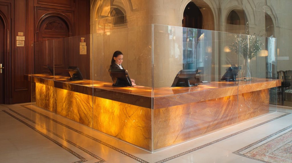
Standard barriers work in simple counters. But many environments have special shapes, special workflows, or strict requirements. This is where customization becomes less about style and more about avoiding operational pain.
The decision I make here is based on repetition: if the same service interaction happens hundreds of times per day, I push harder for a custom fit, because small friction turns into real cost.
Retail chains and franchise stores
Chains love standardization, but their counters are not always identical across locations. That mismatch creates problems.
Customization often includes:
- Standard cutout location for payment
- Consistent branding
- Unified dimensions that match POS setup
Healthcare and medical environments
Healthcare needs more control:
- Stronger cleaning routine
- More sensitive customer interaction
- Sometimes more strict separation
Customization might include:
- Larger coverage
- Better stability
- More precise openings
Hospitality and tourism
Hotels and concierge desks care about appearance. A barrier that looks too industrial can hurt the feeling of the lobby.
Custom designs often focus on:
- Cleaner base design
- Rounded shapes
- Minimal visual disruption
Offices and coworking spaces
These spaces are tricky. People need collaboration, but also want separation in shared desks.
Customization can include:
- Cable cutouts
- Desk clamp solutions
- Modular partitions
Events and temporary service booths
Temporary setups need fast install and fast removal.
Custom barriers here focus on:
- Quick assembly design
- Lightweight packaging
- Stable feet for uneven floors
Here is a quick “who needs custom most” table:
| Industry | Why custom matters | Typical custom feature |
|---|---|---|
| Retail chains | POS layout conflicts | Terminal cutout + stable base |
| Healthcare | Cleaning + close talk | Bigger coverage + safe opening |
| Hospitality | Customer feel | Rounded edges + clean look |
| Coworking | Cables + shared desks | Cable gaps + clamp mounts |
| Events | Fast setup | Slot-in feet + flat pack |
Now, once customization is on the table, buyers always ask the next question: what material and manufacturing specs should I care about?
What material and manufacturing factors should buyers evaluate?

This is where I see buyers over-focus on one thing: thickness. Thickness matters, yes. But it is not the full story.
Acrylic quality, fabrication method, and finishing all shape the final result. And the wrong choice can cause warping, poor fit, or ugly edges. A barrier can be thick and still feel cheap if the finish is rough.
Here’s my real-world decision: I match thickness to the base design and the expected bump level, because thickness alone does not stop wobble.
Acrylic thickness options
Common thickness range: 3mm–8mm
A simple guide:
| Thickness | Best for | Risk |
|---|---|---|
| 3mm | Light desk dividers | Flexing, easy wobble |
| 4mm–5mm | Most counter barriers | Needs good base |
| 6mm–8mm | Busy counters, larger spans | Heavier shipping cost |
Fabrication techniques
Common methods:
- Laser cutting (clean shapes, fast)
- CNC machining (precision cutouts)
- Heat bending (L-shape, U-shape forms)
Each has trade-offs:
| Technique | Strength | Watch-out |
|---|---|---|
| Laser cutting | Smooth contours, speed | Heat marks if not controlled |
| CNC machining | Precise openings | Tool marks if finish is rushed |
| Heat bending | Strong structure | Stress if bending is poorly controlled |
Surface quality and transparency
Two things matter a lot:
- Optical clarity (how “glass-like” it looks)
- Surface protection during shipping
I’ve seen perfect panels arrive with micro-scratches because protective film was weak or removed too early.
Custom branding and printing
Branding is common in B2B:
- UV printing
- Screen printing
- Engraved logos
A quick comparison:
| Branding method | Best for | Risk |
|---|---|---|
| UV printing | Full color logos | Scratch if no protection layer |
| Screen printing | Solid colors, durable | Setup cost for small qty |
| Engraving | Premium look | Visible dust in grooves |
At this point, you know the barrier options. The final step is choosing the right one for the real workflow. That is where buyers like Jacky usually want something practical and fast.
How should businesses choose the right acrylic barrier for their workflow?

This is the “decision” section. And I’ll be honest: I don’t trust drawings alone. I like drawings, but real counters have real chaos—hand movements, cleaning habits, device cables, and customer behavior.
So I push buyers to think like this: the barrier is part of a system. If one part is wrong, people will fight it every day.
Here is how I decide, step by step.
My own judgment in this stage is blunt: if the barrier solves protection but forces staff to invent new workarounds, I treat it as a failed design and redo the layout.
Analyze the service interaction path
I map:
- Where customers stand and speak
- Where hands move to pay
- Where items pass through
A quick way:
- Ask staff to “act out” a normal transaction
- Mark the hand travel zones
- Place the opening where hands naturally meet
Measure the real working space
Measurements that matter:
- Counter depth
- POS device placement
- Distance between staff and barrier
- Customer reach distance
I prefer real measurements from the actual counter, not standard guesses.
Balance protection and usability
This is the trade:
- Bigger coverage can reduce direct exposure
- But bigger panels can block workflow and comfort
So I look for the “minimum effective barrier,” not the maximum size.
Plan for cleaning and long-term maintenance
Long-term success depends on:
- Easy cleaning surfaces
- Replaceable panels if scratched
- Removable designs for counter changes
Here’s a practical decision table I often share with B2B buyers:
| Question | If YES | If NO |
|---|---|---|
| Is the counter layout fixed for 2+ years? | Consider clamp or fixed base | Use freestanding design |
| Is payment terminal customer-facing? | Add side cutout or offset | Standard center slot works |
| Is cleaning frequent and fast? | Improve finish + spare panels | Standard finish may be fine |
| Is the space customer-sensitive (hotel/clinic)? | Choose softer shapes | Simple straight panel ok |
And one last point: barriers work best when they feel “invisible.” Not literally invisible, but emotionally invisible. People should not think about them. They should just do their job.
Now let me wrap this up in a clean, honest summary.
Conclusion

Acrylic barriers are still a useful tool for service counters because they help reduce direct exposure while keeping business interactions open. But they are not magic panels you can copy from one shop to another.
The barriers that work best come from understanding the real operation:
- how people talk
- how hands move during payment
- how items are passed
- how cleaning happens every day
If you are ordering for a chain, a clinic, a reception desk, or a shared office, focus on the system, not only the sheet thickness. Look at opening placement, stability, finish quality, and how the barrier will be used in real life.
If you want, you can send me your counter sketch and a few photos of the real setup. I can help you spot the friction points before you place an order. That small check often saves the biggest headache later.