Skip to content
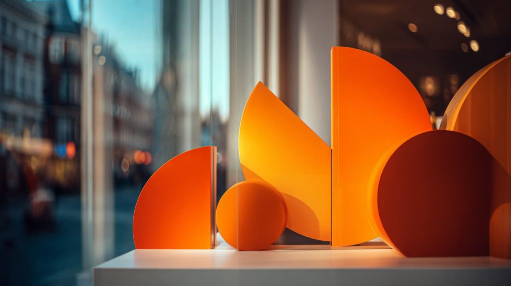
A store can be full of good products, yet still feel invisible. People pass. They do not stop. They do not look. A weak sign often causes that silence.
Creative signage boosts brand visibility by stopping people, guiding their eyes, and making the brand feel “real” in one second. The best signs mix clear words, smart placement, and a look that matches the customer’s mood, so more shoppers notice, enter, and buy.
I learned this the hard way when a buyer told me, “We have traffic, but we have no memory.” That sentence stuck. So I started watching what shoppers notice first—and what they ignore like wallpaper.
What are some creative welcome sign ideas?
A welcome sign is not a greeting. It is a filter. It tells the right people, “Yes, this is for you.”
The most creative welcome signs feel personal and specific. They use short words, a clear promise, and a visual hook like a shape, light, or texture. A good welcome sign also points the next step: where to walk, what to touch, what to try.

Welcome sign ideas that feel warm, not cheesy
- “Pick your flavor in 30 seconds.”
- “Try it. Touch it. Decide.”
- “New drop today → left shelf.”
- “If you love clean design, start here.”
Shape-based ideas that work well with acrylic
- Arch-shaped sign at the door (soft, friendly)
- Circle sign on a stand (simple, modern)
- Tall vertical blade sign (easy to spot in a crowd)
Quick table: welcome sign styles and where I use them
| Welcome sign style | Best place to put it | What it signals |
|---|---|---|
| Countertop stand | Checkout / entry table | “Ask me anything” vibe |
| Hanging panel | Front window | “We are open, come in” |
| Floor stand | Entrance path | “Follow this route” |
| Wall-mounted logo | Behind cashier | “This brand is real” |
What are popular sign trends right now?
Trends change, but shopper behavior stays simple. People want fast clarity. People also want a little fun.
Popular sign trends focus on clean fonts, bold contrast, and fewer words. Many brands also use layered acrylic, soft edge lighting, and modular sign sets that change weekly. The best trend is still the one your buyer remembers later.
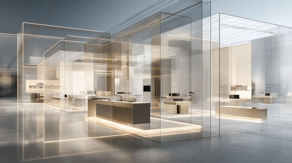
Trends I keep seeing in real stores
- Minimal copy: 3–7 words
- “Tag” style signs: small, repeatable, easy to swap
- Mixed materials: acrylic + wood + metal accents
- Soft lighting: backlit glow, not harsh neon
Trend vs. reality checklist
| Trend | Looks good on photos | Works in busy retail? | My note |
|---|---|---|---|
| Thin script fonts | Yes | Sometimes | I keep it for close-up zones |
| High-contrast blocks | Yes | Yes | I use it for direction signs |
| Layered acrylic | Yes | Yes | I use it to add depth fast |
| Mirror acrylic | Yes | Risky | It can reflect glare and hide text |
One small story I keep repeating to myself
I once watched a shopper stare at a “beautiful” sign for three seconds… then walk away because she could not read it. Pretty is not enough.
What are some unique sign ideas?
Unique does not mean strange. It means “I have not seen this here before.”
Unique sign ideas usually come from one twist: a surprising shape, a playful message, or a sign that does a job beyond branding—like sorting choices, guiding hands, or creating a quick photo moment. The sign feels useful, so people keep looking.
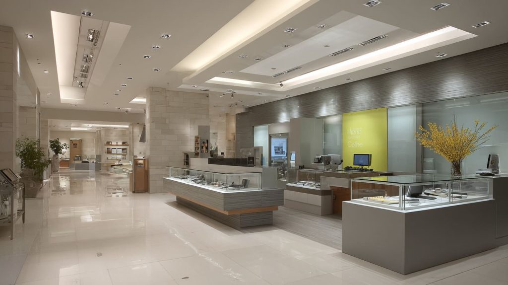
Unique ideas that still sell
- “Decision board” sign: 3 options, each with a simple benefit
- “Touch sample” sign: clear callout + small material swatches
- “Before / after” sign: show the result, not the feature
- “Build your set” sign: modular choice path
Table: simple twists that feel new
| Twist | Example | Why it works |
|---|---|---|
| Interactive | Lift a flap, spin a wheel | People stay longer |
| Layered depth | Floating letters on clear panel | Eyes read it twice |
| Odd scale | One oversized word | It wins from distance |
| Texture | Frosted + clear contrast | It feels premium fast |
A practical rule I follow
If the idea needs a staff explanation, I simplify it. The sign should speak first.
What are some creative running sign ideas?
Running signs often get ignored because they become background noise. I treat them like small “reminders,” not big banners.
Creative running sign ideas work best as a system: repeating cues that guide flow. They can mark lanes, show quick rules, and highlight fresh items. When signs repeat a style, shoppers trust the path and move faster with less confusion.
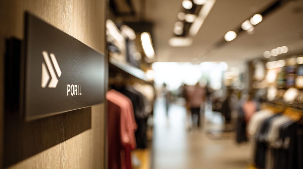
Running sign formats that stay readable
- Direction arrows with one short word
- Category markers: “New,” “Best,” “Try,” “Sale”
- Shelf-edge tags that match the brand color set
Table: running signs by retail “moment”
| Retail moment | Sign type | Copy example |
|---|---|---|
| Entry | Path sign | “Start here” |
| Middle aisles | Category blade | “Skin / Hair / Body” |
| Feature wall | Highlight tag | “Staff pick” |
| Checkout | Reminder sign | “Add-on under $10” |
What I avoid
I avoid long paragraphs on running signs. People do not “study” while walking.
What are the most effective creative signage ideas for retail stores?
In retail, the most effective sign is the one that changes behavior. It makes people stop, turn, pick up, or ask.
The most effective creative signage combines three things: a clear promise, a strong visual hierarchy, and smart placement at decision points. In retail stores, that usually means window signs, category markers, feature displays, and checkout prompts that feel consistent.
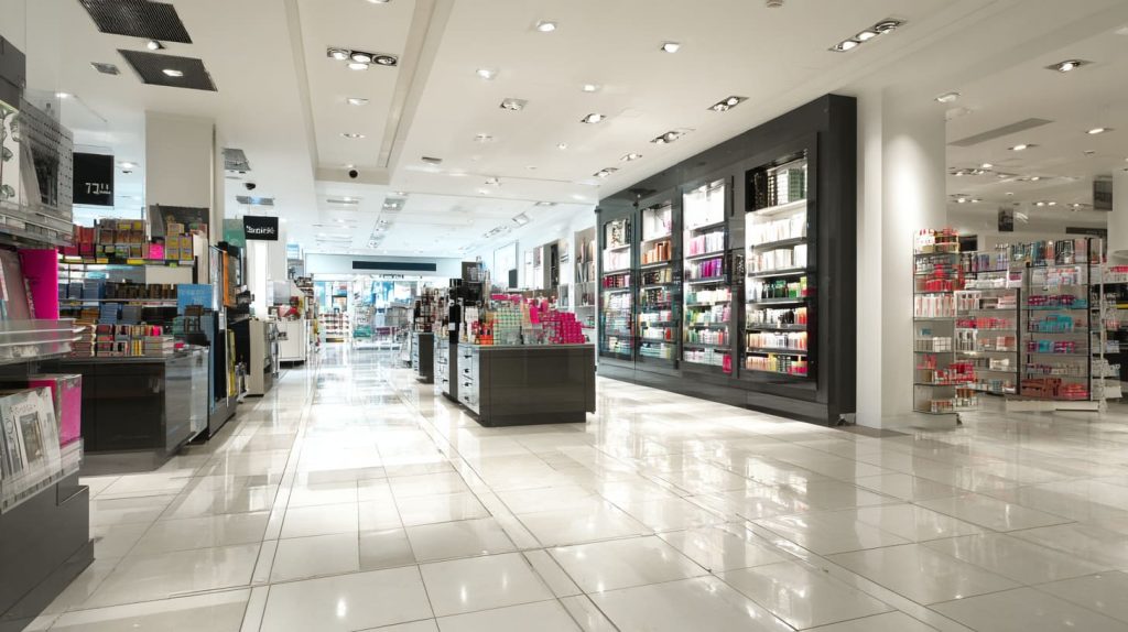
The 5 sign spots I treat like “money zones”
- Front window (first impression)
- Entrance table (first decision)
- Feature wall (main story)
- Shelf edge (micro decision)
- Checkout (last chance)
Table: signage ideas that often lift sales
| Sign idea | Where it works | Why it works |
|---|---|---|
| “Top 3 picks” | Feature wall | It reduces choice stress |
| “Try me” | Demo station | It gives permission |
| “Bundle and save” | Near sets | It changes the basket size |
| “New today” | Entry table | It creates urgency without hype |
One honest note
If the product is hard to explain, I do not “decorate” the sign. I clarify it.
How can custom acrylic signage improve brand visibility?
Acrylic has a quiet power. It looks clean. It catches light. It can feel high-end without shouting.
Custom acrylic signage improves brand visibility by adding clarity and polish. Acrylic can be cut into strong shapes, layered for depth, and finished with clean edges that look premium in photos and in real life. When the sign looks “designed,” the brand looks established.
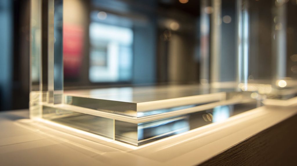
What acrylic does well in brand signage
- Crisp edges for logos
- Transparency for modern retail
- Easy layering for depth
- Good light spread for illumination
Table: acrylic options I often recommend
| Acrylic type | Look | Best use |
|---|---|---|
| Clear | Modern, clean | Logos, stands, menus |
| Frosted | Soft, calm | Beauty, wellness, luxury |
| Black | Bold, sharp | Direction signs, price headers |
| Colored | Fun, branded | Seasonal promos, kid zones |
My personal bias
I like acrylic when the brand wants “clean confidence.” I do not like it when the brand wants “rustic warmth.” Then I mix it with wood.
Which types of signage attract the most customer attention in-store?
Attention is not random. People notice contrast, light, faces, and movement. Signs can borrow two of those without being noisy.
The signage that attracts the most attention in-store is usually high-contrast, well-lit, and placed at eye level at a decision point. Backlit logos, bold category markers, and simple “Top pick” signs win because shoppers understand them in one glance.
What pulls attention fastest
- Light (soft glow beats harsh glare)
- Contrast (dark on light, light on dark)
- Big shape (one strong silhouette)
- Clear “why” (one benefit)
Table: attention types and sign examples
| What grabs attention | Sign example | Where I place it |
|---|---|---|
| Light | Backlit logo | Behind cashier / feature wall |
| Contrast | Black header panel | Category top shelf |
| Surprise | Odd-shaped cutout | Entry table |
| Clarity | 3-word benefit sign | Next to product |
A simple test
I stand 3 meters away. If I cannot read it fast, I rewrite it.
How do creative signage designs influence customer buying behavior?
A sign does not “force” a purchase. It makes the choice easier. That is the real win.
Creative signage influences buying behavior by reducing doubt and guiding decisions. Good signs answer silent questions like “What is this?”, “Why should I care?”, and “Which one should I pick?” When the sign reduces effort, shoppers touch more items and buy faster.

The 4 silent questions I design for
- What is it?
- Who is it for?
- Why is it better?
- What should I do next?
Table: signage → behavior mapping
| Sign purpose | Shopper feeling | Likely action |
|---|---|---|
| Explain | “Now I get it” | Stops and reads |
| Compare | “This is simpler” | Chooses faster |
| Reassure | “This is safe” | Buys with less doubt |
| Invite | “I can try it” | Touches / tests |
A small story from factory life
Sometimes buyers want a “premium sign,” but the copy is vague. I always push for clearer words first. Good copy beats fancy material.
What materials work best for high-impact brand signage?
Material is not just cost. It is mood. It is also durability and cleaning reality.
The best materials for high-impact signage depend on the space and the lighting. Acrylic works for clean and modern looks. Metal works for strong and industrial vibes. Wood works for warm and handmade feelings. The best choice is the one that survives handling and cleaning.
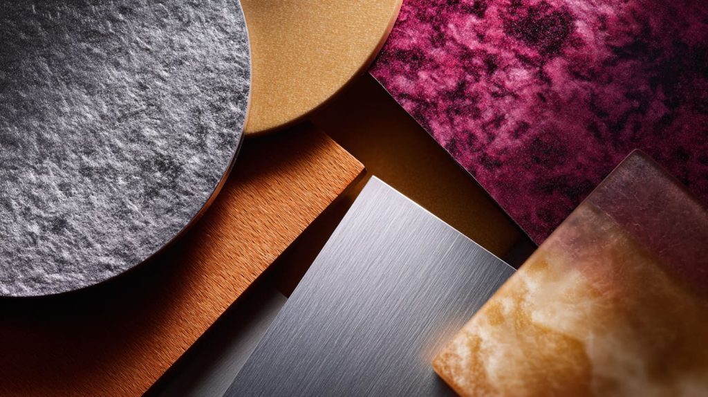
Quick material guide
| Material | Visual impact | Durability | Best for |
|---|---|---|---|
| Acrylic | High | High | Modern retail, cosmetics |
| Metal | High | Very high | Industrial, outdoor, premium |
| Wood | Medium | Medium | Handmade, lifestyle, cafés |
| PVC foam | Medium | Medium | Short-term promos |
| Fabric lightbox | High | Medium | Mall kiosks, seasonal walls |
Hidden factor: cleaning
In real stores, staff wipe signs fast. If the surface scratches easily, the “high impact” fades quickly.
My decision rule
I pick the material after I know the cleaning plan, the lighting, and the sign’s lifespan.
How do backlit and illuminated signs increase brand awareness?
Light is memory. People remember a glow more than a flat print, especially at night or in deep indoor spaces.
Backlit and illuminated signs increase brand awareness by making the brand visible in low light and more readable from a distance. They also create a “signature look” that shoppers recognize later, especially when the lighting color and brightness stay consistent across locations.
Where illumination helps most
- Window displays after sunset
- Deep stores with weak ceiling light
- Feature walls that need a “hero” moment
Table: illumination types and use cases
| Type | Look | Best place |
|---|---|---|
| Edge-lit acrylic | Clean line glow | Menu boards, logo panels |
| Backlit box | Even bright face | Storefront, feature wall |
| Spotlit letters | Dramatic shadows | Premium boutiques |
| Shelf lighting | Practical highlight | Product shelves |
What I watch out for
I avoid lighting that is too bright. If it hurts eyes, it hurts trust.
What are cost-effective signage ideas for small and medium businesses?
Small businesses need signs that work hard. I like signs that can be reused, updated, and moved around.
Cost-effective signage ideas include modular acrylic stands, interchangeable inserts, small category headers, and one strong feature sign instead of many weak ones. The goal is to build a simple sign system that can refresh weekly without reprinting everything.
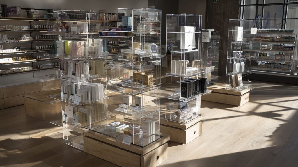
Low-cost ideas that still look sharp
- Acrylic stand + paper insert
- One “hero” logo sign + small matching tags
- Reusable price holders
- Seasonal overlay stickers on a base sign
Table: cost control methods I often suggest
| Method | What you buy once | What you replace often |
|---|---|---|
| Insert system | Stands and frames | Printed cards |
| Modular set | Same shape tags | Short copy updates |
| One hero sign | Logo wall sign | Small promos |
Honest advice
I would rather do 6 strong signs than 30 weak ones. Too many signs can look like noise.
How can custom signage help brands stand out in crowded retail spaces?
Crowded retail is visual fighting. You do not win by being louder. You win by being clearer.
Custom signage helps brands stand out by creating a consistent “look and logic” that shoppers can follow. When the shape, finish, and copy style match, the brand becomes easy to spot. In busy spaces, a clear system beats a random collection of signs.
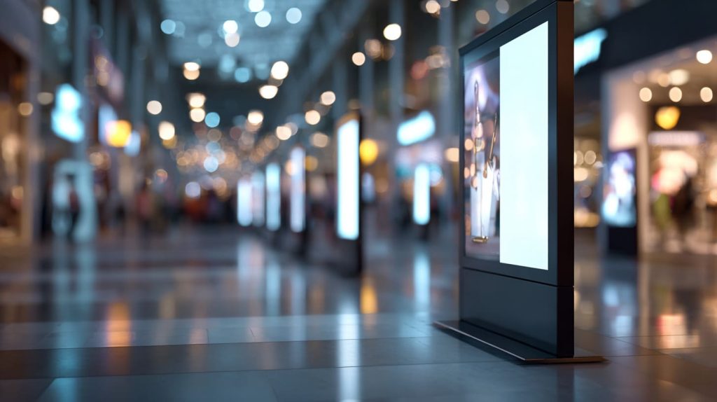
Ways to stand out without shouting
- Own one shape (like an arch or circle)
- Own one lighting style (soft glow, not rainbow)
- Own one copy rhythm (short, direct, human)
Table: crowded space problems and fixes
| Problem | What shoppers do | Sign fix |
|---|---|---|
| Too much visual clutter | They ignore everything | Use fewer, bigger signs |
| Similar competitors | They confuse brands | Use a unique silhouette |
| Weak wayfinding | They leave fast | Add path signs |
A small personal note
When I walk a crowded mall, I follow the brand that “guides me.” I do not follow the brand that “yells at me.”
What mistakes should brands avoid when designing creative signage?
Most mistakes come from one thing: designing for the owner’s taste, not the shopper’s reality.
Brands should avoid signs with too many words, weak contrast, hard-to-read fonts, and bad placement. They should also avoid copying trends that do not match the brand. A creative sign fails when shoppers cannot understand it in one glance.
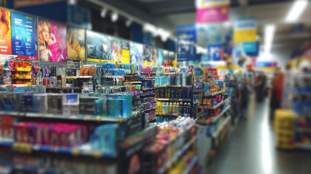
Common mistakes I see again and again
- Long sentences on small signs
- Thin fonts in low light
- Gloss glare that hides text
- Placing signs too high or too low
- Too many styles in one store
Table: mistake → quick fix
| Mistake | Quick fix |
|---|---|
| Too much copy | Cut to 5–7 words |
| Low contrast | Dark text on light panel |
| Fancy font | Use a clean, simple font |
| Bad placement | Move to eye level |
| No system | Repeat one style set |
One thing that surprises buyers
A sign can look perfect on a computer screen and still fail in the store. Real light and real distance change everything.
How do you choose the right signage design for your target customers?
The best sign design starts with the customer, not the material. I always ask: what does the shopper fear, want, and avoid?
You choose the right signage design by matching the customer’s shopping mood, reading speed, and taste. You should test copy from a distance, keep a consistent style set, and focus on the decision points. A good sign feels “made for me” to the shopper.
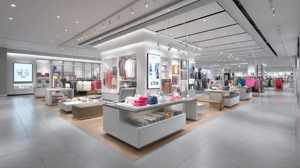
My simple customer-based process
Step 1: Name the shopper in one line
Example: “Busy office worker who wants a quick, safe choice.”
Step 2: Choose a sign tone
| Customer type | Best sign tone | Copy style |
|---|---|---|
| Premium buyer | Calm, confident | Fewer words |
| Value buyer | Clear, direct | Price + benefit |
| Trend buyer | Fresh, playful | Short punchy lines |
| Technical buyer | Precise, factual | Spec highlights |
Step 3: Build a small sign system
- 1 hero brand sign
- 3 category signs
- 6 shelf tags
- 2 checkout prompts
My test that never lies
I show the sign to someone who does not know the product. If they “get it” in 5 seconds, I keep it. If they ask questions, I rewrite.
Conclusion
Creative signage works when it stops people, guides them, and makes the brand easy to remember. If you want help turning your signage ideas into clean, custom acrylic pieces, you can reach me at info@xflacrylic.com or visit flacrylic.com.