Skip to content
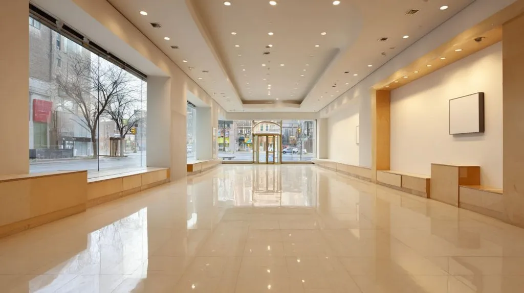
Creative signage still matters. I know this because I see what happens when it is missing. A brand can have a great website, clean ads, and good products, yet the space itself feels quiet. Almost invisible. People pass by. They forget the name. They do not feel pulled in.
I work with acrylic signs and displays every day. Most projects start with a simple goal. “We want people to notice us.” That sounds basic, but it is not easy. Physical signs shape the first feeling. They decide if someone slows down or keeps walking. They also decide what stays in the mind after people leave.
This guide is written for people like Jacky. Buyers and designers who already know materials. People who have been inside factories. People who care about cost, risk, and long-term results, not just looks.
Before we talk about materials and ideas, we need to agree on one thing. Creative signage is not about being loud. It is about being remembered.
That question leads directly to the next part.
What Makes Signage “Creative” in Modern Branding?
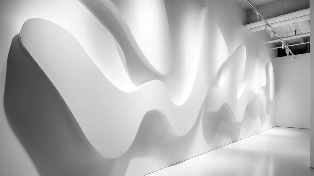
Moving beyond basic logos and text
A logo on a wall is not creative by default. I have seen many clean logos fail to hold attention. Not because they are bad, but because they say nothing beyond the name.
Creative signage tells a small story. Sometimes it uses shape. Sometimes it uses space. Sometimes it uses light. The key point is intent.
I often ask buyers one question: What do you want people to feel in five seconds?
If there is no answer, the sign usually becomes decoration.
Here is how I compare two approaches:
| Approach | What it shows | What people remember |
|---|---|---|
| Text-only logo | Brand name | Almost nothing |
| Story-driven sign | Brand mood or value | A feeling |
Creativity starts when the sign does more than identify.
The balance between creativity and clarity
Creativity can also go too far. I have seen signs that look like art pieces but confuse customers. People stop, stare, and then walk away unsure.
Clarity still matters. If people cannot read the message fast, the sign fails.
From what I see in successful projects, these rules work well:
- One clear message per sign
- Simple words
- Strong contrast
- Enough empty space
Too much design can slow decisions. Simple design can guide them.
Once creativity and clarity are balanced, signage starts to work harder. And that brings us to different sign types.
How Different Types of Signage Boost Brand Visibility
Storefront and window signage
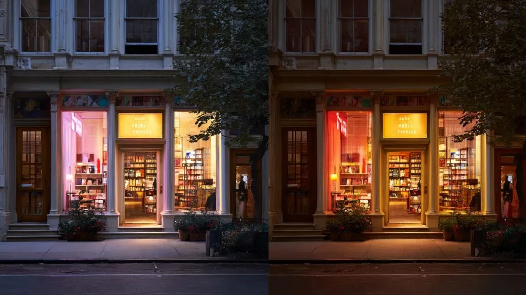
The first three seconds decide everything. People look, judge, and move.
Storefront signs need to work from far away and up close. Day and night matter. Natural light changes everything.
I often compare window signs like this:
| Time | Main risk | Design focus |
|---|---|---|
| Day | Glare and reflections | Contrast and thickness |
| Night | Darkness and shadows | Lighting and edge detail |
If the sign only works at noon, it is incomplete.
In-store and point-of-sale signage
Inside the space, signage has a different job. It guides movement. It answers questions before staff need to speak.
Good in-store signs:
- Lead customers forward
- Highlight key products
- Support price or value
Bad signs interrupt flow. They feel added later. Customers feel it.
Event, exhibition, and pop-up signage
Temporary signs still shape long-term memory. I have seen pop-up signs reused for years because the design was modular.
Buyers now ask for:
- Easy transport
- Quick setup
- Parts that can be reused
This saves cost and keeps branding consistent.
Temporary does not mean careless. It means flexible.
That flexibility becomes very powerful when acrylic enters the picture.
Creative Acrylic Signage Ideas That Stand Out
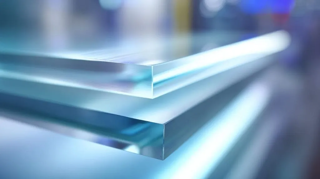
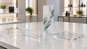
Clear and frosted acrylic signs
Clear acrylic feels calm and premium. Frosted acrylic feels soft and controlled.
I like clear signs when the space already has confidence. Frosted signs work better when brands want distance from noise.
Here is a simple comparison:
| Type | Best use | Risk |
|---|---|---|
| Clear acrylic | Minimal brands | Shows dust easily |
| Frosted acrylic | Busy spaces | Can look flat |
Transparency works when the environment supports it.
Backlit and edge-lit acrylic signage
Light attracts eyes. But too much light feels cheap.
Edge-lit acrylic is popular because it stays quiet. The light follows the shape, not the surface. That keeps the brand clean.
Common uses I see:
- Store logos
- Reception walls
- Hospitality signage
The light should support the sign, not replace it.
Layered, engraved, and dimensional acrylic signs
Depth changes how people judge quality. Flat signs feel basic. Dimensional signs feel planned.
Engraving adds detail without adding noise. Layers add shadow, which the eye loves.
From my experience, depth makes signs feel more expensive even if materials stay the same.
And once depth becomes part of the design, industry use cases become clearer.
Custom Signage Design Ideas by Industry
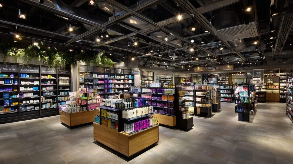
Retail and shopping spaces
Retail signs need to change often. Campaigns come and go.
I suggest using stable base signs and flexible inserts. This keeps cost under control.
Good retail signage supports:
- Seasonal themes
- Promotions
- Product launches
Bad signage needs full replacement every time.
Hospitality and commercial interiors
In hotels and offices, signs should feel part of the space. Not added later.
Wayfinding signs work best when people do not notice them. That sounds strange, but it is true.
Subtle branding often lasts longer than loud branding in these spaces.
Corporate offices and showrooms
Offices tell visitors what kind of company this is.
Reception signs set the tone. Meeting room signs support order. Showroom signs support trust.
I often see buyers underestimate internal signage. Employees see it every day. That matters.
All these designs depend heavily on one quiet decision. Material choice.
How Material Choice Affects Signage Impact
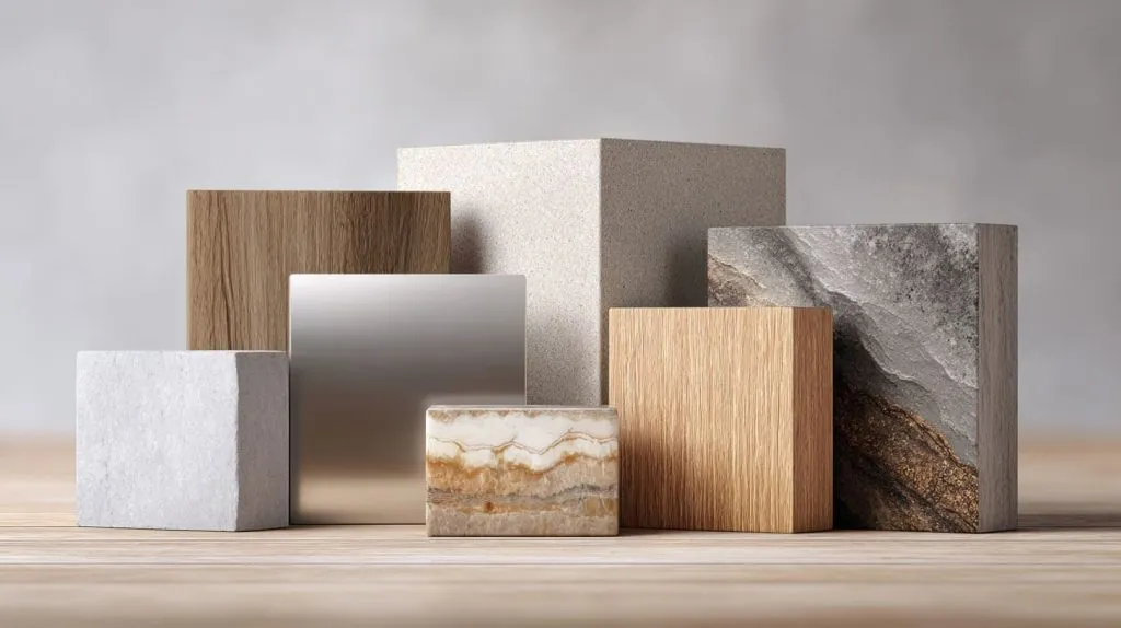
Why acrylic is popular for creative signage
Acrylic gives designers freedom. It cuts clean. It finishes well. It holds light.
Compared with other materials:
| Material | Strength | Limitation |
|---|---|---|
| Acrylic | Clear and flexible | Scratches if misused |
| Metal | Strong and solid | Cold appearance |
| Wood | Warm look | Hard to keep consistent |
| PVC | Low cost | Low perceived value |
Acrylic sits in the middle. That balance makes it popular.
Common material mistakes buyers make
I see these mistakes often:
- Choosing thin acrylic for large signs
- Ignoring edge finish
- Forgetting mounting stress
These issues do not show in samples. They show after installation.
Material choice shapes how the sign ages. Not just how it looks on day one.
Once materials are right, design details matter even more.
Practical Tips for Designing Effective Custom Signage

Designing for visibility and readability
If people cannot read the sign fast, it fails.
Key points I always check:
- Font size matches distance
- Colors contrast well
- No crowded layouts
Clear signs respect the viewer’s time.
Designing for manufacturing and installation
Designs must survive production and install.
Before production, I confirm:
- Mounting method
- Hole positions
- Edge finish
These details prevent delays and rework.
Designing for cost control in B2B projects
Not all customization adds value.
High value:
- Thickness choice
- Lighting method
- Structure
Low value:
- Too many small details
- Complex shapes with no purpose
Cost control comes from smart choices, not cutting corners.
And when these choices repeat, brands start to grow quietly.
How Custom Signage Supports Long-Term Brand Growth
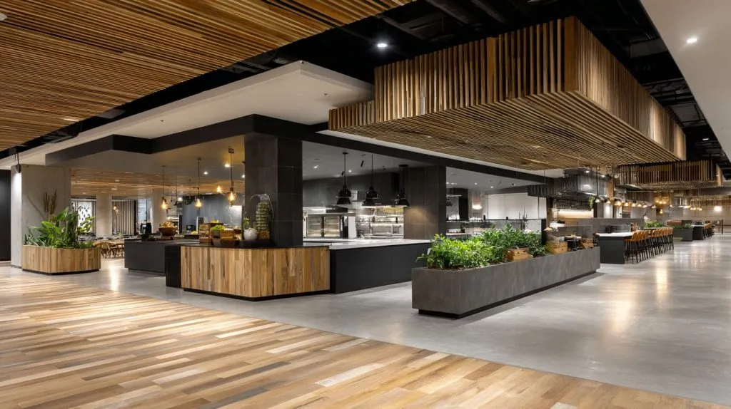
Consistency across locations and campaigns
Brands feel stronger when signs look related. Not identical, but connected.
Using the same materials, edges, or lighting builds recognition.
People trust what feels familiar.
Signage as a silent salesperson
Good signage explains without words. It builds confidence without pressure.
When signs are clear and well made, staff explain less. Customers decide faster.
That silent support is often the biggest return.
At this point, the role of creative signage becomes clear.
Conclusion
Creative signage is not decoration. It is a long-term tool. It shapes first impressions, guides behavior, and supports trust.
From my work with custom acrylic signage, the best results come from clear thinking. Know the message. Respect the space. Choose materials with intent.
If you are planning a signage project and want it to last, start with questions, not shapes. When you are ready to turn ideas into real acrylic signs, that is where we can help at Feilong Acrylic.