Skip to content

Acrylic material choices often look small on a quotation sheet.
One line may say clear acrylic.
Another line may say non-glare acrylic.
Another supplier may write anti-reflective acrylic.
At first, these names feel close. They all sound like they solve the same problem.
Too much reflection.
Too much light bouncing back.
Too much glare in front of the customer’s eyes.
So a buyer may think, “Okay, I just need the acrylic that reflects less light.”
I understand this thinking very well. In many custom acrylic display projects, the buyer is not trying to become an optical material expert. He only wants the final display to look clean, sharp, and professional. He wants the product inside the display to look more valuable. He wants the artwork, photo, sign, or retail sample to be easy to see.
That sounds simple.
But this is where the trap starts.
Non-glare acrylic and anti-reflective acrylic are not the same material. They reduce reflection in different ways, and they create very different visual results. Non-glare acrylic may reduce harsh glare, but it can also make the image look softer or slightly hazy. Anti-reflective acrylic can keep the image clearer, but it usually costs more and needs more careful handling.
I have seen buyers pay more money because they wanted “less glare,” but later they were unhappy because the image did not look premium. The problem was not only the price. The problem was that the material did not match the real use.
For me, this is the real cost trap.
It is not just paying a higher price.
It is paying for the wrong visual result.
I do not judge this choice by the material name first. I judge it by the final viewing experience, because the customer does not care what the quotation calls it. The customer only sees whether the product looks clear, dull, sharp, soft, premium, or cheap.
That is why this topic matters in B2B display work.
If you are buying acrylic for picture framing, retail displays, cosmetic displays, art protection, signage, museum cases, electronics displays, or product presentation tools, this decision can affect much more than the acrylic sheet.
It can affect:
| Area | Why It Matters |
|---|---|
| Visual quality | The product or image may look sharp or dull |
| Customer experience | End users may complain if the view is unclear |
| Brand image | A premium product can look cheaper behind the wrong acrylic |
| Project cost | Wrong material can cause replacement, rework, and delay |
| Supplier communication | Similar material names can create wrong expectations |
The small word on the quotation can become a big problem on the display table.
And that is why I slow down before I say yes to “non-glare” or “anti-reflective.”
Because less glare is not always better.
Sometimes less glare comes with a hidden price.
The next question is simple: what is non-glare acrylic really doing to the light?
What Is Non-Glare Acrylic?
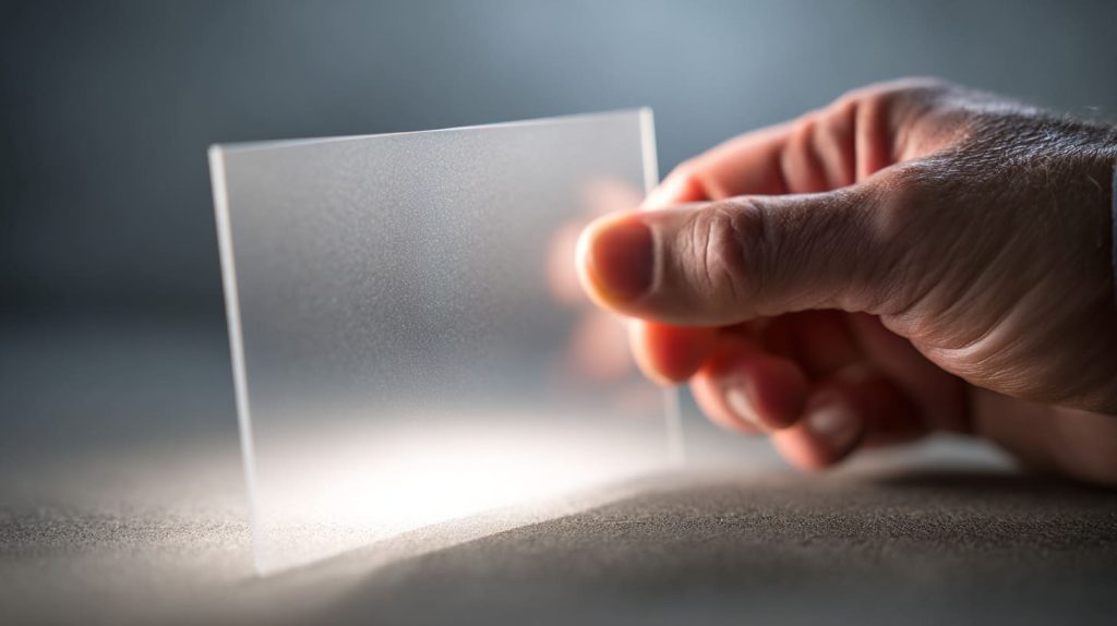
Non-glare acrylic is usually made with a matte, frosted, or lightly textured surface.
The surface is not perfectly smooth like standard clear acrylic. It has a fine texture. That texture breaks up strong reflections, so the viewer does not see one sharp bright spot from a lamp or window.
That sounds useful.
And it is useful.
But the same surface that breaks up glare can also break up image sharpness.
This is the part buyers often miss.
Acrylic is not only a protective cover. It becomes part of the viewing path. Light must pass through it, reflect from the image or product, and come back to the viewer’s eyes. If the acrylic surface scatters light too much, the image can lose crispness.
A small amount of softness may be acceptable.
Too much softness can make the display feel cheap.
I often treat non-glare acrylic like a soft-focus camera filter. It can hide a harsh reflection, but it may also take away some detail that the buyer wanted to show.
How Surface Diffusion Works
Non-glare acrylic works mainly by diffusing light.
That means the surface scatters light in many directions instead of letting it reflect back like a mirror.
Think about a clean glass window and a frosted bathroom window.
A clean window lets you see through clearly, but it can reflect light strongly. A frosted window reduces direct reflection, but it also makes the view softer.
Non-glare acrylic sits somewhere in that family.
It is not usually as frosted as privacy glass, but it still uses the same basic idea: scatter the light to reduce glare.
| Surface Type | Light Behavior | Viewing Result |
|---|---|---|
| Clear acrylic | Light passes through with little scattering | Sharp view, but more reflection |
| Non-glare acrylic | Light is scattered by matte texture | Less harsh glare, but softer image |
| Frosted acrylic | Light is strongly scattered | Privacy effect, poor image clarity |
This is why non-glare acrylic can feel helpful and risky at the same time.
It solves one problem by creating another smaller problem.
The key question is: which problem matters more in your project?
Typical Visual Effect
The most common visual effect of non-glare acrylic is a slight haze.
Sometimes it looks soft.
Sometimes it looks a little cloudy.
Sometimes black areas lose depth. Fine text may look less clear. Small details in photos may lose their sharp edge.
This effect becomes more obvious when the acrylic sits farther away from the image.
For example, if non-glare acrylic touches a printed poster directly, the softness may be mild. But if there is a gap between the acrylic and the print, the image may look much softer.
This is a detail I always watch carefully in framing projects.
A buyer may test a small sample by placing it directly on top of a printed image. It looks okay. Then the final frame has a spacer, air gap, or deeper structure. Suddenly the image looks more blurred than expected.
That is not magic.
That is distance.
| Factor | Effect on Non-Glare Acrylic |
|---|---|
| Acrylic touches the image | Less visible softness |
| Small air gap | More softness |
| Large air gap | Haze and blur become more obvious |
| Fine image detail | More likely to look soft |
| Large bold graphics | Usually more acceptable |
This is where many samples can mislead buyers.
A small sample on a desk does not always show the final result.
Common Applications
Non-glare acrylic can still be a good choice.
I do not think it is a bad material. I only think it is often misunderstood.
It works well when glare control matters more than perfect image clarity.
Good examples include:
- Large posters viewed from a distance
- Indoor signs under strong ceiling lights
- Menu boards
- Education displays
- Office information boards
- Large graphic panels
- Simple retail signs
- Low-detail prints
For these applications, the viewer does not need to inspect tiny details. The buyer mostly wants the display to be readable under light.
That is where non-glare acrylic can make sense.
| Best Fit | Why It Works |
|---|---|
| Large-format poster | Small softness is less noticeable |
| Simple graphic sign | Bold shapes stay readable |
| Indoor display board | Glare control helps visibility |
| Low-cost frame | Budget may matter more than perfect clarity |
The problem starts when buyers use non-glare acrylic for the wrong type of content.
If the image has fine lines, small text, dark colors, or premium product details, non-glare may hurt the result.
I once saw a buyer use non-glare acrylic for a high-end cosmetic display with small printed product claims behind the sheet. The glare was lower, yes. But the small text lost sharpness. The display looked calm, but not premium. The buyer solved the light problem and created a trust problem.
That is the painful trade.
Non-glare acrylic can help the eye relax.
But sometimes it also makes the product look less alive.
And that naturally brings us to anti-reflective acrylic, because it tries to solve glare without softening the view in the same way.
What Is Anti-Reflective Acrylic?
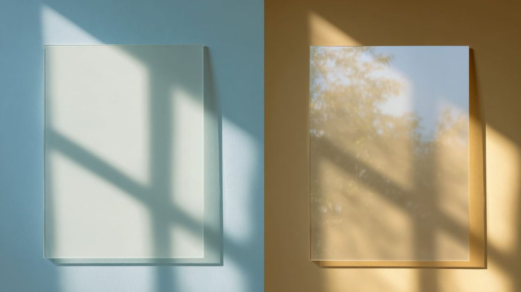
Anti-reflective acrylic is different from non-glare acrylic.
It does not mainly depend on a matte surface to scatter light. Instead, it usually uses a special coating to reduce reflection while keeping the surface clear.
This is why anti-reflective acrylic often looks more transparent and sharper than non-glare acrylic.
The goal is not to blur reflection.
The goal is to reduce reflection while keeping clarity.
That is a big difference.
When I compare anti-reflective acrylic with non-glare acrylic, I do not only look at the glare. I look at whether the customer can still feel the depth, color, and value of the product behind the sheet.
Optical Coating Technology Explained
Anti-reflective acrylic usually uses optical coating layers.
These coatings help reduce the amount of light that bounces back from the surface. More light passes through. Less light reflects into the viewer’s eyes.
The result can be very clean.
When the material is used well, the acrylic surface almost disappears.
That is the feeling many premium displays want.
You do not want the viewer to notice the cover sheet first. You want the viewer to notice the artwork, the jewelry, the product, or the brand story behind it.
| Material | Main Method | Visual Result |
|---|---|---|
| Non-glare acrylic | Matte surface scatters light | Less glare, softer view |
| Anti-reflective acrylic | Coating reduces reflection | Less glare, clearer view |
| Standard clear acrylic | Smooth surface | Sharp view, stronger reflection |
This difference matters in real buying decisions.
If a buyer asks for “less glare,” I need to know whether he accepts some softness. If he cannot accept softness, anti-reflective acrylic may be closer to the real target.
Visual Performance Differences
Anti-reflective acrylic usually performs better when the display needs strong visual quality.
It can maintain:
- Better sharpness
- Better contrast
- Better color depth
- Better transparency
- Better product presentation
This is especially important for close viewing distance.
When people stand near the display, they see every small detail. They can notice haze, color shift, reflection, coating marks, and surface defects.
A large poster on a wall can forgive many things.
A small luxury product display cannot.
| Visual Need | Non-Glare Acrylic | Anti-Reflective Acrylic |
|---|---|---|
| Sharp photo detail | Medium | Strong |
| Fine text readability | Medium to weak | Strong |
| Dark color depth | May look flatter | Better depth |
| Premium product display | Risky | Better fit |
| Strong reflection control | Good | Very good |
This is why anti-reflective acrylic is often used in higher-end applications.
It protects the view without making the view feel tired.
But it also has its own cost and handling issues.
Typical Applications
Anti-reflective acrylic is often used where clarity matters more than price.
Common applications include:
- Museum framing
- Gallery displays
- Premium retail showcases
- Jewelry displays
- Electronics displays
- Luxury packaging displays
- High-end photo frames
- Brand presentation boxes
- Detailed product sample displays
If the customer must see fine detail, anti-reflective acrylic usually makes more sense.
But I do not recommend it blindly.
It can be more expensive. The coating may need careful cleaning. The surface may be more sensitive than standard acrylic. If the display will be touched by many people every day, maintenance becomes part of the decision.
| Application | Why Anti-Reflective Acrylic Helps |
|---|---|
| Jewelry display | Keeps sparkle and detail visible |
| Museum frame | Reduces reflection without hiding artwork |
| Electronics showcase | Keeps screen-like products looking sharp |
| Premium retail display | Helps product look more valuable |
| Detailed sample box | Keeps small details easy to inspect |
A buyer once asked me why anti-reflective acrylic costs more if both materials “reduce glare.”
I told him the difference is like two ways to quiet a room.
One way is to cover the speaker with a towel. The sound becomes softer, but also less clear.
The other way is to reduce the echo in the room. The sound stays clear, but the treatment costs more.
That is how I see non-glare and anti-reflective acrylic.
Both reduce disturbance.
But they do not protect clarity in the same way.
And because the names sound so close, many buyers mix them up before the project even starts.
Why Buyers Confuse Non-Glare and Anti-Reflective Acrylic

Buyers confuse these two materials because the words sound friendly.
Non-glare.
Anti-reflective.
Both sound like they mean “no annoying light.”
A busy purchasing manager may not stop and ask, “What is the optical method behind this sheet?” He may just forward the drawing, ask for a quote, and expect the supplier to understand.
I do not blame the buyer.
In real business, people move fast. There are deadlines, budgets, emails, samples, approvals, and shipping schedules. Material names become shortcuts.
But shortcuts can be dangerous.
The mistake often happens before production. It happens during communication. One person says “anti-glare.” Another person hears “non-glare.” A third person writes “AR acrylic” in the quote. Nobody checks the actual surface, coating, haze, or final use.
The quote looks normal.
The sample arrives.
Then the disappointment begins.
The mistake I worry about most is not that a buyer uses the wrong word. It is that everyone thinks they are talking about the same visual result when they are not.
Similar Naming, Very Different Results
The words create confusion because they point to the same pain: reflection.
But they do not point to the same solution.
| Term Buyers Use | What They May Mean | What Supplier May Provide |
|---|---|---|
| Non-glare | Less reflection | Matte acrylic |
| Anti-glare | Less harsh light | Matte or textured sheet |
| Anti-reflective | Clear view with less reflection | Coated acrylic |
| Museum acrylic | UV protection and/or anti-reflection | Depends on supplier |
| Optical acrylic | High clarity | Needs detailed check |
This is why I prefer to ask about the result, not just the word.
I may ask:
- Do you want less reflection even if the image becomes softer?
- Is the image viewed from close distance?
- Is the print directly touching the acrylic?
- Does the product have small text or fine detail?
- Is this for premium retail display or general signage?
- Will end users clean the surface often?
These questions may sound simple, but they save money.
A material name alone cannot answer them.
Supplier Communication Gaps
Different suppliers may use different terms.
Some suppliers call matte acrylic “anti-glare.” Some may call it “non-reflective.” Some may use “AR” too loosely. Some may only translate the local material name into English, and the meaning becomes softer or less exact.
This is common in international custom manufacturing.
The buyer may be in Canada. The supplier may be in China. The end customer may be in the United States or Europe. One material name may pass through three teams and two languages.
Small meaning changes happen.
And small meaning changes can become big project changes.
| Communication Risk | Possible Result |
|---|---|
| Vague material name | Wrong acrylic quoted |
| No haze data | Buyer cannot judge clarity loss |
| No surface description | Matte sheet mistaken for coated sheet |
| No real sample | Final display surprises everyone |
| No lighting test | Material looks different after installation |
This is why I like clear, boring questions.
Boring questions protect projects.
For example:
| Better Question | Why It Helps |
|---|---|
| Is the surface matte, etched, or coated? | Confirms how glare is reduced |
| What is the haze level? | Shows possible softness |
| What is the light transmission rate? | Helps judge brightness |
| Is the coating on one side or two sides? | Affects performance and handling |
| Can we test it with our printed content? | Shows real visual result |
Acrylic is a physical product.
It does not care about nice words.
It only shows what the surface and structure allow it to show.
The Role of Lighting Conditions
Lighting can change everything.
A sample can look good in a supplier’s office and look poor in a retail store.
A display can look clean under soft light and terrible under spotlights.
A frame can look fine at one angle and full of reflection at another angle.
This is why I never treat a small desk sample as the final truth.
It is only a clue.
Real testing should consider:
- Light direction
- Viewing angle
- Viewing distance
- Background color
- Product color
- Print detail
- Acrylic thickness
- Air gap
- Cleaning method
| Test Condition | Why It Matters |
|---|---|
| Ceiling light | Common source of glare |
| Window light | Creates strong reflection |
| Spotlight | Can create harsh bright points |
| Dark artwork | Shows reflection more easily |
| Fine text | Shows softness more clearly |
| Angled display | Changes reflection path |
I have seen a non-glare sample look acceptable on a white desk. Then we placed it over a dark product photo, and the haze became obvious.
The buyer looked at me and said, “Why did it change?”
It did not change.
The background changed.
That is the lesson.
The material does not live alone. It lives inside a lighting environment.
And once buyers understand this, the real cost trap becomes easier to see.
The Real Cost Trap: Where Buyers Lose Money
The cost trap does not always appear on the first quotation.
That is why it is dangerous.
The unit price may look acceptable. The buyer may think he is paying a little more for a better visual experience. The sales team may feel safe because the material name sounds upgraded.
But the real cost appears later.
It appears when the display does not look right.
It appears when the customer says the image looks dull.
It appears when the buyer needs to remake the acrylic panels, reprint graphics, or explain the issue to his own customer.
By that time, the material cost is only one part of the loss.
The hidden cost is the time, trust, and energy spent fixing a preventable mistake.
Before I call a material “expensive,” I first ask whether it reduces risk or creates new risk, because a cheaper wrong material can become more expensive than a costly correct one.
Paying Premium Price for the Wrong Material
Many buyers think the higher-priced option must look better.
That is not always true.
A non-glare sheet can cost more than standard clear acrylic. But if the project needs high clarity, that extra cost may not bring the right benefit.
The buyer paid more.
But the display looks worse.
That feels unfair, but it happens.
| Buyer Expectation | Possible Reality with Wrong Choice |
|---|---|
| Less glare | Yes, but image becomes softer |
| More premium look | Maybe not, if haze is visible |
| Better customer experience | Maybe worse, if detail is lost |
| Higher material cost means better result | Not always |
| Simple upgrade | Actually a trade-off |
This is why I do not like the word “upgrade” without context.
Upgrade for what?
For glare control?
For image sharpness?
For luxury presentation?
For outdoor durability?
For cleaning?
A material can be an upgrade in one area and a downgrade in another.
That is the part that many purchase orders do not show.
Hidden Cost of Customer Dissatisfaction
Customer dissatisfaction is expensive because it is hard to measure.
A customer may not say, “The haze percentage is too high.”
He may say something simpler.
“This display looks cheap.”
“The photo looks blurry.”
“The product does not stand out.”
“The acrylic looks cloudy.”
These words hurt because they attack the feeling of quality.
And in retail display work, feeling matters.
A cosmetic product may be good. A jewelry piece may be beautiful. A printed photo may be high resolution. But if the cover sheet makes the view dull, the customer judges the whole display.
Not the acrylic alone.
The whole display.
| Complaint | Possible Root Cause |
|---|---|
| Looks blurry | Non-glare surface too diffused |
| Looks cloudy | Haze too high |
| Product color looks flat | Contrast reduced |
| Text is hard to read | Fine detail softened |
| Display feels cheap | Visual quality does not match brand |
This is why I take customer complaints seriously.
They may not use technical language, but they often point to a real material mismatch.
Rework and Replacement Costs
Rework is where the trap becomes painful.
If the acrylic panels are small and simple, replacement may not be too bad.
But in custom B2B work, panels may be laser cut, CNC routed, bent, polished, printed, bonded, packed, and shipped overseas.
A simple material mistake can touch many steps.
| Rework Item | Cost Impact |
|---|---|
| New acrylic sheets | Material cost again |
| CNC or laser cutting | Processing cost again |
| Edge polishing | Labor and machine time |
| Printing or assembly | Extra production work |
| Packing | More materials |
| Shipping | High cost, especially urgent |
| Delay | Customer trust loss |
The worst part is not always the money.
Sometimes the worst part is the phone call.
The buyer must explain to his customer why the approved material does not look right. The supplier must explain why the sample did not reveal the issue. Everyone becomes defensive.
That is not a good place to be.
I prefer to spend more time before production than spend more money after production.
A few sample tests feel slow at first.
But they are faster than a remake.
This is why visual trade-offs need to be clear before the order starts.
Visual Trade-Offs: Clarity vs Glare Control

Acrylic material choice is often a trade between clarity and glare control.
Most buyers want both.
I want both too.
But the real world likes to make us choose.
Non-glare acrylic reduces glare by scattering light. This can soften the image.
Anti-reflective acrylic reduces reflection by coating technology. This can keep the image clearer, but cost and handling become more important.
Clear acrylic gives strong sharpness, but reflection may be a problem.
So the question is not, “Which material is best?”
The better question is, “Which weakness can this project accept?”
My real decision usually starts from the weakest part of the display, not the strongest part, because the buyer will not notice the perfect area first; he will notice the one thing that looks wrong.
Side-by-Side Comparison
Here is a simple comparison.
| Feature | Non-Glare Acrylic | Anti-Reflective Acrylic |
|---|---|---|
| Reflection Control | Good | Excellent |
| Image Sharpness | Reduced | High |
| Transparency | Medium | Very High |
| Surface Finish | Matte | Clear with coating |
| Price Level | Medium | High |
| Best For | General glare reduction | Premium clear viewing |
| Risk | Haze and softness | Higher cost and handling care |
| Cleaning | Usually easier than coated surfaces | Needs more care |
| Close Viewing | Risky for fine details | Better |
| Large Distant Viewing | Often acceptable | Sometimes over-budget |
This table looks simple.
But the real choice depends on the content behind the acrylic.
A black-and-white safety sign is not the same as a luxury watch display.
A large poster is not the same as a small photo frame.
A cosmetic display with tiny printed text is not the same as a bold brand logo.
When Reduced Glare Hurts More Than It Helps
Reduced glare can hurt when the display depends on fine visual detail.
This is very common in:
- High-resolution photos
- Museum prints
- Luxury product displays
- Jewelry cases
- Electronics showcases
- Cosmetic packaging displays
- Small text labels
- Dark background graphics
- Fine line drawings
Dark colors are especially tricky.
Black surfaces show reflection clearly, but they also show haze clearly. So the buyer may choose non-glare to solve reflection, but then the black color looks grey and weak.
That is a cruel trade.
The display may reflect less light, but it may also lose drama.
| Content Type | Non-Glare Risk |
|---|---|
| Small text | Letters may look soft |
| Dark photo | Black tones may look washed out |
| Fine artwork | Detail may lose edge |
| Jewelry | Sparkle may reduce |
| Premium packaging | Brand may look less sharp |
| Technical drawing | Thin lines may blur |
I often compare this to cleaning a window with the wrong cloth.
The smudge may reduce the mirror reflection, but nobody calls that a better window.
The goal is not only to remove glare.
The goal is to keep the right viewing feeling.
The Role of Viewing Distance
Viewing distance changes the decision.
If the viewer stands far away, small softness may not matter much.
If the viewer stands close, even a slight haze can feel obvious.
| Viewing Distance | Better Material Direction |
|---|---|
| Far distance | Non-glare may work |
| Medium distance | Test both materials |
| Close distance | Anti-reflective often safer |
| Handheld viewing | Clarity becomes very important |
| Retail counter display | Anti-reflective may justify cost |
This is why I always ask where the viewer stands.
Not where the buyer sits in the meeting room.
Where the real viewer stands.
That one question can change the material choice.
And when the answer points to large signs or budget-controlled projects, non-glare acrylic may still be the right choice.
When Should You Choose Non-Glare Acrylic?
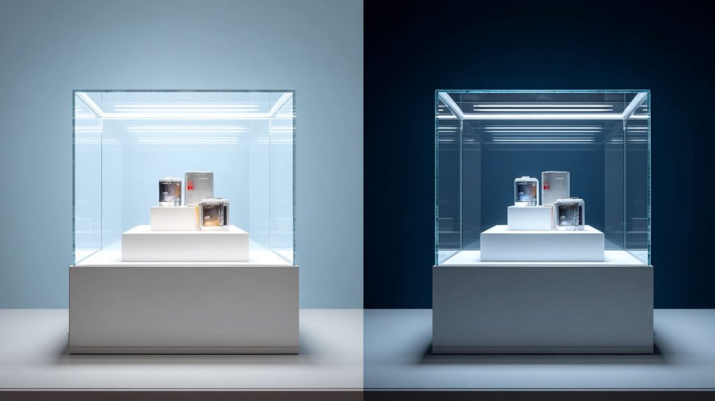
Non-glare acrylic is useful when the project can accept some softness.
I do not avoid it.
I only avoid using it for the wrong promise.
If a buyer expects crystal-clear viewing, I become careful. If a buyer needs better readability under strong light and the content is simple, non-glare acrylic can be a practical choice.
This is where material judgment becomes less romantic and more honest.
Not every display needs museum-level clarity.
Some displays need to survive real lighting, real budgets, and real installation limits.
The point I usually check is whether the viewer needs to admire details or simply understand the message, because those are two very different jobs for the same acrylic sheet.
Practical Scenarios
Non-glare acrylic can work well for large signage.
For example, if a poster is viewed from several meters away, a slight softening effect may not hurt the message. The viewer mostly sees the headline, color blocks, and general design.
It can also work in indoor spaces with strong ceiling lights.
In offices, schools, stores, and public areas, lighting is not always friendly. You may not control the lamp position. You may not control window reflection. In that case, non-glare acrylic can make the display easier to view.
Good use cases include:
| Application | Why Non-Glare Acrylic Can Work |
|---|---|
| Large posters | Detail loss is less visible |
| Office display boards | Reduces annoying light spots |
| Menu boards | Helps readability |
| Public information signs | Message matters more than perfect clarity |
| Retail promotional signs | Large graphics can tolerate softness |
| Training boards | Practical viewing matters more than premium finish |
A buyer should still test it.
But these are the projects where non-glare acrylic has a strong argument.
Budget-Sensitive Projects
Budget is real.
I know some articles like to pretend every buyer should choose the best optical material.
That is not how manufacturing works.
A buyer may need 500 pieces. Or 5,000 pieces. Or a full retail rollout across many stores. A small price difference becomes a large number very quickly.
In that case, non-glare acrylic can be a smart middle choice.
It may not offer the same clarity as anti-reflective acrylic, but it can reduce glare at a more workable cost.
| Buyer Priority | Non-Glare Fit |
|---|---|
| Lower reflection | Good |
| Lower cost than anti-reflective | Good |
| Perfect clarity | Not ideal |
| Large quantity order | Often practical |
| Short project timeline | Easier sourcing in many cases |
The key is not pretending it performs like anti-reflective acrylic.
The key is accepting the trade-off from the start.
If the customer knows the visual effect and approves the sample, non-glare acrylic can be a very reasonable choice.
Industrial or Functional Displays
Some displays are not meant to look luxurious.
They are meant to work.
Think about:
- Factory notice boards
- Equipment instruction panels
- Safety signs
- Control room information boards
- Warehouse labels
- Basic product information panels
In these cases, readability may matter more than color depth.
A small amount of haze may be acceptable if it reduces bright reflection and helps workers read the content.
| Functional Need | Why Non-Glare May Help |
|---|---|
| Read under overhead lights | Reduces strong light reflection |
| View from different angles | Softens harsh glare |
| Protect printed panel | Adds physical cover |
| Control cost | Better than premium coated material |
| Simple graphics | Less risk of visible softness |
This is where non-glare acrylic earns its place.
It is not the luxury answer.
It is the practical answer.
And many projects need practical answers.
But if the project moves into premium retail, gallery, or close-view display, the decision changes.
That is when anti-reflective acrylic starts to make more sense.
When Should You Choose Anti-Reflective Acrylic?

Anti-reflective acrylic is usually the better choice when the display must look clear and premium.
It is not only about reducing glare.
It is about protecting the feeling of quality.
Some products need that.
A luxury watch behind dull acrylic loses some of its charm. A detailed art print behind hazy acrylic feels wrong. A high-end cosmetic display with soft text looks less trustworthy.
In these cases, the acrylic should not fight the product.
It should disappear.
For high-value displays, I judge the acrylic by whether it helps the product sell itself, because a cover sheet that steals attention is already too expensive, no matter what the invoice says.
Premium Display Environments
Anti-reflective acrylic is often used in spaces where presentation matters.
This includes:
- Retail showcases
- Gallery frames
- Museum displays
- Brand showrooms
- Exhibition displays
- High-end product counters
In these places, customers look slowly.
They compare details.
They notice small problems.
Acrylic haze, reflection, scratches, coating marks, and color changes become part of the buying experience.
| Environment | Why Anti-Reflective Acrylic Helps |
|---|---|
| Gallery | Keeps artwork clear |
| Museum | Reduces reflection without hiding details |
| Jewelry store | Keeps sparkle visible |
| Cosmetic counter | Keeps packaging text sharp |
| Electronics store | Keeps product surfaces clean-looking |
| Brand showroom | Supports premium feeling |
The material cost is higher, but the visual value can also be higher.
If the display supports a high-value product, anti-reflective acrylic may protect the brand image better than a cheaper option.
Close Viewing Distance Applications
Close viewing distance is one of the strongest reasons to choose anti-reflective acrylic.
When people stand close, they notice everything.
They see:
- Small text
- Fine lines
- Color depth
- Surface reflection
- Slight haze
- Dust
- Cleaning marks
Non-glare acrylic can become risky here, especially if there is an air gap between the acrylic and the image.
| Close-View Content | Why Anti-Reflective Is Safer |
|---|---|
| Product labels | Text stays clearer |
| Fine art prints | Details stay visible |
| Technical images | Lines stay sharp |
| Luxury packaging | Colors stay stronger |
| Photography | Contrast stays better |
This is why I ask about viewing distance early.
If the viewer can touch the display or stand very close to it, I become more careful with non-glare acrylic.
A sample test should be done at the same distance as real use.
Not from far away.
Not under perfect office light.
At the real distance.
Under real light.
With real content.
High-Value Products
The higher the product value, the less room there is for visual compromise.
Jewelry, watches, electronics, collectibles, art, cosmetics, and luxury goods depend heavily on visual trust.
A dull cover sheet can quietly reduce that trust.
The customer may not know why the display feels wrong.
But he feels it.
That is enough.
| Product Type | Visual Risk with Wrong Acrylic |
|---|---|
| Jewelry | Less sparkle |
| Watches | Less depth and shine |
| Electronics | Screen or surface looks dull |
| Cosmetics | Packaging color looks flat |
| Art | Detail and contrast suffer |
| Collectibles | Display feels less premium |
In these projects, anti-reflective acrylic often makes more sense.
But I still do not treat it as automatic.
I also consider:
- Cleaning method
- Touch frequency
- Coating durability
- Packing protection
- Shipping risk
- Budget
- Quantity
- Installation environment
A premium material still needs a practical plan.
A beautiful surface can become a problem if the customer cleans it with the wrong cloth every day.
This is why purchasing should not stop at material selection.
It should include prevention.
And that leads to the most important buyer question: how do we avoid the cost trap before production starts?
How to Avoid the Cost Trap in B2B Purchasing

The best way to avoid the cost trap is to test the real application before mass production.
This sounds obvious.
But many problems happen because the buyer tests the wrong thing.
A small sample.
A different print.
A different light.
A different distance.
A different background.
Then the buyer approves the material, but not the real result.
In custom acrylic work, a sample is only useful when it copies the real use as closely as possible.
When I help buyers compare materials, I try to make the test boring and honest, because beautiful sample photos can hide problems that real shop lights will expose in one minute.
Always Request Real Application Samples
A good sample should not only show the acrylic sheet.
It should show the acrylic sheet with the actual content or product behind it.
For example:
- If the final display uses dark artwork, test with dark artwork.
- If the final display uses small text, test with small text.
- If the display has an air gap, test with the same air gap.
- If it will be used under spotlights, test under spotlights.
- If it will be cleaned often, test cleaning too.
| Sample Test Item | Why It Matters |
|---|---|
| Actual print | Shows real sharpness and color |
| Actual viewing distance | Shows what the customer will see |
| Actual lighting | Shows glare and reflection risk |
| Actual structure | Shows gap, angle, and shadow |
| Actual thickness | Shows real haze and edge effect |
| Cleaning test | Shows maintenance risk |
This kind of sample may take more work.
But it prevents expensive guessing.
Acrylic does not forgive imagination.
It only follows physics.
Ask the Right Technical Questions
Buyers do not need to become optical engineers.
But they should ask a few practical questions.
These questions can prevent many misunderstandings.
| Question | Why I Ask It |
|---|---|
| Is the surface matte, etched, or coated? | Confirms material type |
| What is the haze percentage? | Helps judge softness |
| What is the light transmission rate? | Shows how much light passes through |
| Is coating one side or both sides? | Affects reflection and handling |
| What cleaning method is recommended? | Prevents surface damage |
| Can the material be cut, polished, bent, or printed? | Confirms customization limits |
| Is there protective film during processing? | Reduces scratch risk |
The words “non-glare” and “anti-reflective” are not enough.
I prefer numbers and surface descriptions.
Even simple technical details can make communication much clearer.
Align Material Choice with End Use
The end use should lead the material choice.
Not the material name.
Not the trend.
Not the most expensive option.
I like to map the project like this:
| Project Question | Why It Guides the Choice |
|---|---|
| What will people look at? | Text, product, photo, art, sign |
| How close will they stand? | Close viewing needs more clarity |
| What lighting will hit the display? | Strong lights create glare |
| Is the product high-value? | Premium products need better presentation |
| How often will people touch it? | Coatings may need care |
| What is the budget and quantity? | Cost must match project scale |
| Can the customer approve a sample? | Reduces final complaint risk |
This is simple, but it works.
Acrylic material choice becomes easier when the real use is clear.
Work With Experienced Custom Manufacturers
An experienced manufacturer should not only quote the material.
He should help you think through the application.
In custom acrylic work, the supplier should understand:
- Cutting
- Polishing
- Bonding
- Bending
- Printing
- Packaging
- Surface protection
- Lighting effect
- Customer usage
- International shipping risk
At Feilong Acrylic, we deal with custom acrylic displays, boxes, frames, stands, racks, cabinets, blocks, organizers, and furniture parts. Many projects look simple at the drawing stage, but the final result depends on small details.
A clear panel can become a brand experience.
A small haze can become a complaint.
A wrong surface can become a remake.
So I like side-by-side comparisons.
Show clear acrylic.
Show non-glare acrylic.
Show anti-reflective acrylic if the project needs it.
Put the same printed sample behind them.
Use the same light.
Let the buyer see the difference.
That is much better than arguing through email.
| Supplier Support | Buyer Benefit |
|---|---|
| Side-by-side samples | Easier visual approval |
| Clear material explanation | Less confusion |
| Processing advice | Fewer production surprises |
| Packaging planning | Lower scratch risk |
| Custom structure review | Better final performance |
This is not about selling the most expensive material.
It is about choosing the material that protects the project.
And once customization enters the picture, the material choice becomes even more sensitive.
How Customization Affects Performance and Cost
Customization can change how acrylic performs.
This is something many buyers forget.
They may test a flat sheet sample. Then the final product includes cutting, drilling, bending, polishing, printing, bonding, or assembly with metal, wood, or LED parts.
The material is no longer just a sheet.
It becomes part of a structure.
And structure changes light.
Angles change reflection.
Thickness changes visual depth.
Edges change perceived quality.
Mounting changes glare.
So the final result depends on more than the acrylic type.
The small detail I watch here is whether the design makes the material weakness more visible, because a good material can still look bad if the structure puts it in the wrong position.
Thickness and Edge Finishing Impact
Thickness can affect visual performance.
A thicker sheet may feel more premium and stronger, but it can also make haze more noticeable in non-glare acrylic. This is especially true when the viewer looks through the sheet at an angle.
For clear acrylic, polished edges can look beautiful.
For non-glare acrylic, the surface effect may be more important than the edge.
For anti-reflective acrylic, handling and coating protection become more important during processing.
| Custom Factor | Possible Impact |
|---|---|
| Thicker acrylic | Stronger feel, but may show more haze |
| Polished edge | Premium look, but adds cost |
| Laser cutting | Clean shape, may need edge attention |
| CNC routing | Good for accurate custom parts |
| Bending | May affect optical view depending on angle |
| Drilling | Needs care to avoid cracks |
| Printing | Must match surface and visual goal |
A buyer may say, “Just use thicker acrylic. It will look more premium.”
Sometimes yes.
Sometimes no.
If the material is non-glare and the content is detailed, thicker is not always better.
This is why material choice and structure choice should be discussed together.
Coating Durability Considerations
Anti-reflective coatings can improve clarity, but they also need care.
The surface may need specific cleaning methods. It may be more sensitive to rough cloth, harsh chemicals, or careless handling.
This matters a lot in retail.
If staff clean the display every day with the wrong cloth, the beautiful surface may not stay beautiful.
| Risk | What to Check |
|---|---|
| Scratches | Use proper protective film and packing |
| Cleaning marks | Confirm cleaning instructions |
| Coating damage | Avoid harsh chemicals |
| Fingerprints | Test real handling |
| Processing damage | Confirm coating side and workflow |
A premium material without a maintenance plan is risky.
I have seen buyers focus only on the first-day look.
But displays live longer than one day.
They are touched, cleaned, moved, packed, unpacked, and sometimes abused.
That real life should be part of the material decision.
Integration With Display Structure
The display structure can increase or reduce reflection.
For example, a tilted panel may reflect ceiling lights directly into the viewer’s eyes. A flat vertical panel may behave differently. A deep frame may create shadows. LED lighting may create bright points. A black background may make reflection stronger.
| Design Detail | Effect on Viewing |
|---|---|
| Panel angle | Can increase or reduce reflection |
| LED position | Can create bright hot spots |
| Deep frame | May increase shadow or gap effect |
| Black background | Shows reflection and haze more clearly |
| White background | Haze may be less obvious |
| Open display | Easier to clean, more touch risk |
| Closed display | Better protection, more reflection planning needed |
This is why I do not like judging acrylic from the sheet alone.
Acrylic needs a home.
The display design is that home.
If the home is wrong, even good acrylic can perform badly.
A smart buyer looks at the full system:
- Material
- Thickness
- Surface
- Coating
- Lighting
- Structure
- Viewing distance
- Cleaning
- Packaging
- Installation
That may sound like a lot.
But in real custom work, these details are where the money hides.
The right acrylic choice protects visual quality.
The right structure protects that choice.
Now we can bring the whole idea back to the main point.
Non-glare and anti-reflective acrylic are not enemies.
They are different tools.
The danger is using the wrong tool and calling it a better one.
Conclusion
Non-glare acrylic and anti-reflective acrylic both deal with reflection.
But they do not solve the problem in the same way.
Non-glare acrylic reduces harsh glare by scattering light through a matte or textured surface. It can be useful for large signs, general display boards, and budget-sensitive projects. But it may also soften the image, reduce contrast, and make fine details look less sharp.
Anti-reflective acrylic reduces reflection through optical coating. It usually keeps the image clearer and more premium. It is often better for high-end retail displays, museum framing, detailed product displays, and close-view applications. But it costs more and needs more careful handling.
This is why I do not treat “less glare” as a simple upgrade.
It is a trade-off.
And trade-offs need context.
My own view comes from working with custom acrylic products for years. I have seen beautiful drawings fail because the material was chosen by name only. I have also seen buyers save money by choosing non-glare acrylic in the right place. The difference was not luck. The difference was whether we tested the real viewing condition before production.
For me, the biggest risk is not the material price.
The biggest risk is mismatch.
A buyer expects sharp and premium.
The supplier provides matte and soft.
The display arrives.
Everyone feels disappointed.
That is the cost trap.
The smarter path is simple:
| Step | Why It Matters |
|---|---|
| Define the real use | The application should guide the material |
| Check viewing distance | Close viewing needs more clarity |
| Test real lighting | Glare depends heavily on environment |
| Use actual content | Fine detail reveals softness |
| Compare samples side by side | Visual approval becomes easier |
| Ask technical questions | Surface, haze, coating, and cleaning matter |
| Consider customization | Thickness, edges, and structure affect results |
I believe buyers should not choose acrylic by material name alone.
They should choose by final viewing experience.
If the display needs practical glare reduction and the content is simple, non-glare acrylic may be the right choice.
If the display needs sharp detail, premium color, and close viewing, anti-reflective acrylic may be worth the extra cost.
At Feilong Acrylic, we focus on custom acrylic displays, boxes, frames, stands, racks, cabinets, blocks, organizers, and related acrylic parts for B2B projects. We do not treat every order like a catalog item, because custom work needs more judgment than that.
If you are comparing non-glare acrylic and anti-reflective acrylic for a custom project, the best next step is not guessing from the material name.
Send the drawing, viewing distance, lighting condition, product photo, and quantity requirement.
Then we can help compare the practical options and make samples that show the real result before mass production.
That small step can save a lot of money later.
And more importantly, it can protect the final display from looking “almost right” but still wrong.